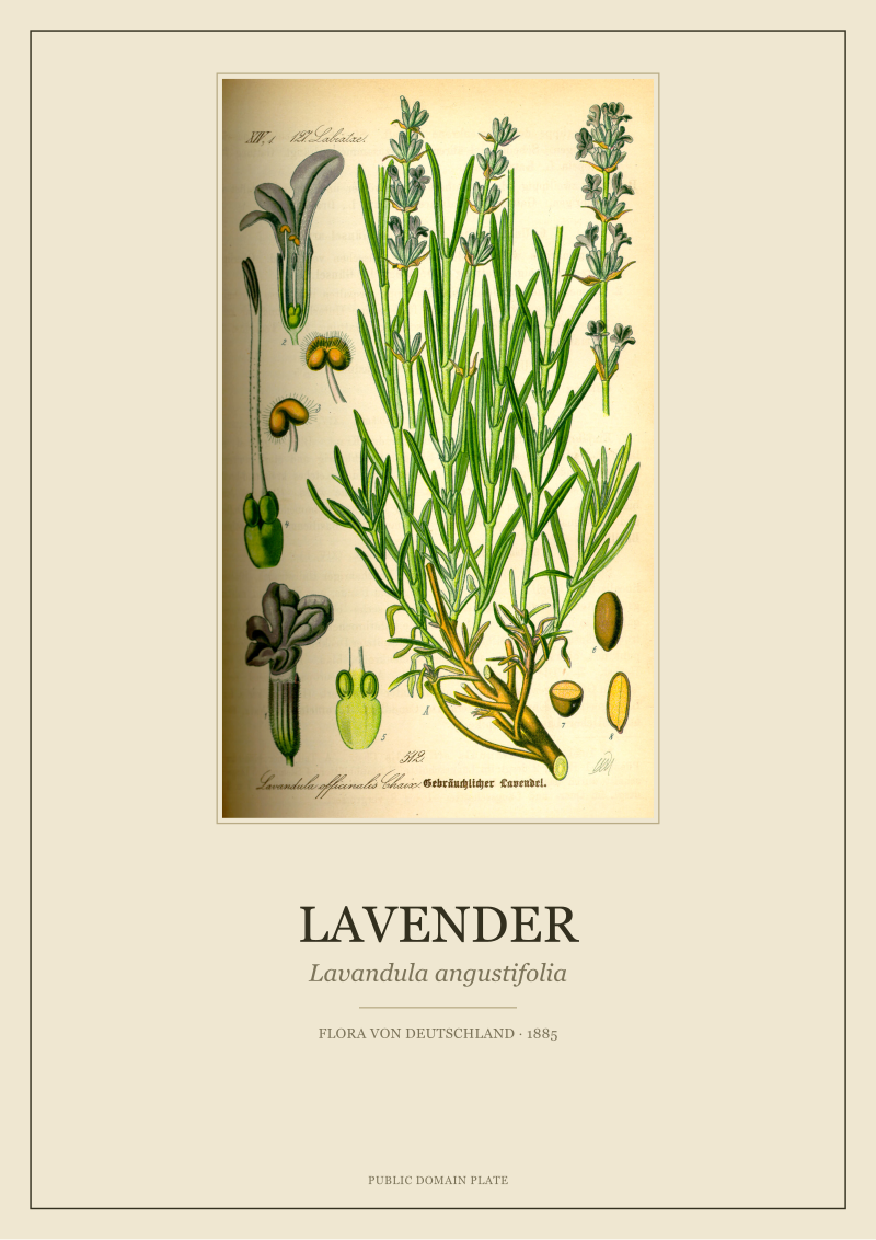
There is a pattern we keep seeing on the restoration bench. A buyer sends us a reference image — a chamomile, an ivy, a cornflower — pulled from a poster site, hoping we can "do it like that but better." The reference is almost always traced from the same source: a plate by O.W. Thomé from *Flora von Deutschland, Österreich und der Schweiz*, printed in 1885 and long in the public domain. What arrives on the buyer's wall under the word "botanical" is often three or four generations removed from that plate, flattened by compression, recoloured by a filter, and sold as a poster. The gap between those two objects is the subject of this piece.
The "Botanical" That Isn't Botanical
The majority of prints sold under the "botanical" label on large poster platforms are not botanical in any technical sense. They are photographs of a plant lying on linen, or a watercolour of a leaf with no diagnostic value, or a scan whose provenance stops at an image aggregator. The word has been detached from its discipline. We know this because every month we see the same conversion funnel from the buyer's side: they searched for "botanical print," they found something beige and leafy, and they want us to make a version of it that feels, in their words, "more real."
Real botanical illustration is a technical discipline with conventions that developed over three centuries. A proper plate shows a specimen in a diagnostic view — the habit of the plant from root to flower, often with a dissected floral part at a known scale, the Latin binomial beneath, and the artist's or publisher's attribution somewhere on the sheet. When we handle the Thomé plate of *Matricaria chamomilla*, chamomile, we are looking at a drawing that carries enough information that a nineteenth-century student could identify the plant from the illustration alone. The disc florets are sectioned. The ligulate rays are counted. The pinnate leaf is drawn with the correct number of divisions.
A poster-site "chamomile" rarely does any of this. It shows a bunch of flowers tied with twine against a cream background, or a single stem photographed under a softbox, with the words *Matricaria chamomilla* set in a tasteful serif beneath. The Latin binomial is doing all the botanical work the image refuses to do. It is a design signal, not a species identification. The distinction matters because once you see it, you cannot unsee it, and most of what the mass-market industry calls a botanical print turns out to be a still life wearing a Latin name as a costume.
The Line Underneath the Color
The second pattern is subtler and more technical. What makes a nineteenth-century botanical plate hold up on a wall is not the color — it is the line underneath the color. The under-drawing in Thomé's *Flora* is a precise ink line that carries the species' identity before any pigment sits on top. Lose the line and the plate collapses into decorative pattern. Keep the line and even a faded, imperfect scan still reads as a specific plant.
The reason sits in the printing method. Chromolithography, the dominant color-print technology of the 1870s and 1880s, worked in registered layers. The line stone was pulled first, in black or a dark neutral, and the color stones were then registered to it — one for yellow, one for red, one for a cool blue, often three to five additional stones for the greens and warm earths of a botanical plate. The line stone was the skeleton. The color stones were the skin. When a plate is scanned at archival resolution and processed honestly, the line stays sharp; the color sits inside its boundaries the way it was meant to.
What goes wrong on poster-site reprints is almost always a resampling and auto-contrast step. The source scan has already been through two or three JPEG compressions by the time it reaches the vendor. Someone pushes the levels to make the colors "pop" for the thumbnail, and the thin ink lines that defined the leaf margin of *Hedera helix* — the five-lobed juvenile leaf form that lets you call it ivy at a glance — soften into fuzz. The color stays bright, but the plant becomes generic. From across the room, the viewer sees green shapes on cream paper. They cannot tell you what is depicted, because the information has been printed out.
If you cannot read the species from twenty feet away, you have a decorative pattern, not a botanical plate.
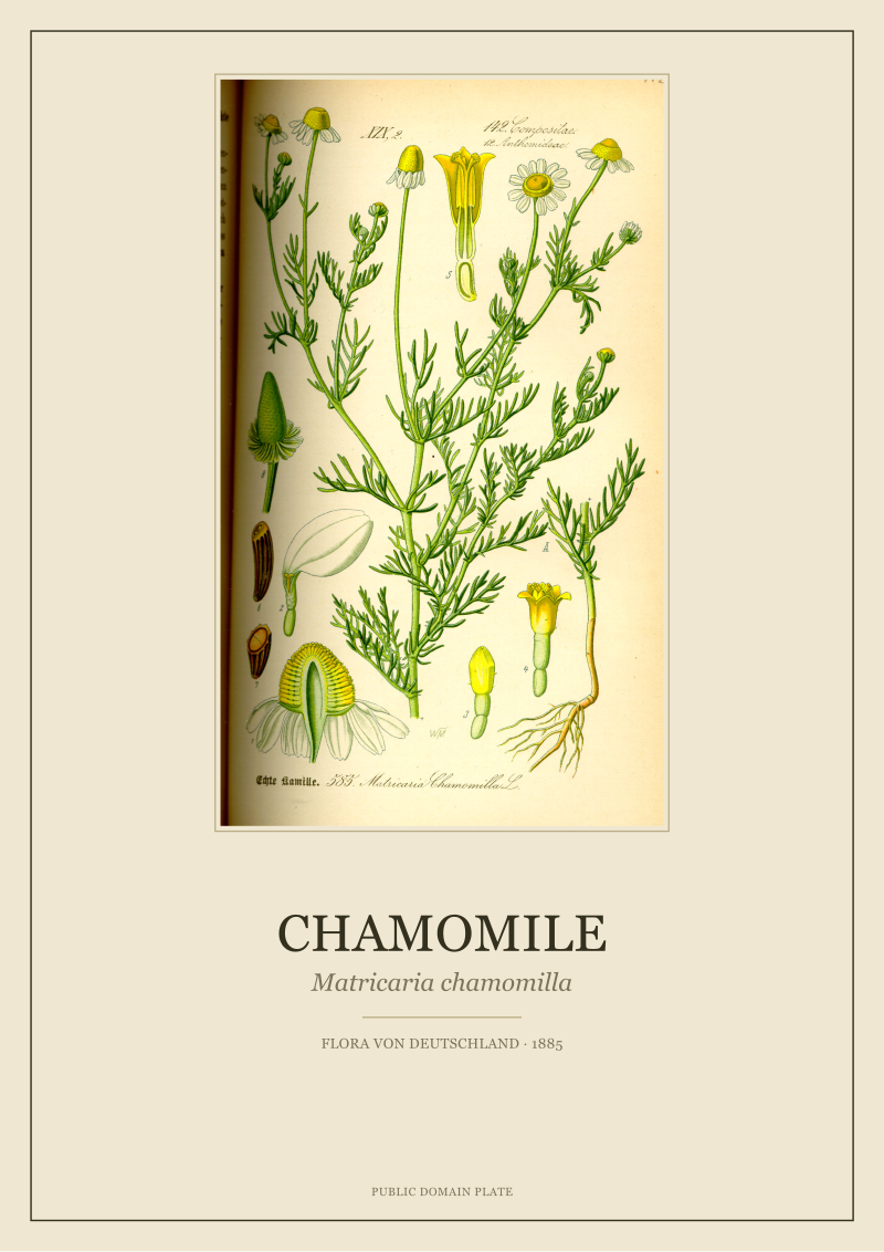 Chamomile
The print from this article · from €29.95
View the print →
The Paper Problem Nobody Mentions
The third pattern involves a surface the buyer never asks about and the seller almost never discloses: the paper itself. Substrate is where mass-market posters fail silently. Nothing dramatic happens for the first few weeks on the wall. Then, somewhere in the second season, the print has moved — a quarter stop warmer, a half stop less saturated, the cornflower blue of a *Centaurea cyanus* plate drifted toward teal — and the buyer attributes the shift to light, or memory, or framing. It is almost always the paper.
Nineteenth-century plates were printed on wove paper with a specific weight and surface tooth that accepted lithographic ink into the fibre rather than letting it sit on a coating. The ink became part of the paper. That is why a Thomé plate from 1885, properly stored, still carries its line and most of its color after one hundred and forty years. The archival restoration we do uses heavyweight cotton or alpha-cellulose stock, generally around 300gsm, with a matte, unbleached surface that mimics the original tooth and resists the yellowing that lignin-rich papers develop under UV. The pigment set is chosen for lightfastness, not shelf appeal. A print on that stock will shift measurably less in a decade than a mass-market poster shifts in a year.
Mass-market poster paper is a different animal. Most of what is sold under names like "fine art paper" or "museum paper" on print-on-demand platforms is 170 to 200gsm, semi-gloss or satin-coated, and formulated to accept inkjet CMYK dyes rather than archival pigments. The dyes are optimized for immediate saturation — the print looks electric in the first photo on the product page — and the lightfastness ratings, when they are published, are rarely better than two to five years at typical indoor light levels. The cornflower is the canonical casualty. Cyan dyes are the shortest-lived in the standard poster-print palette, which means the one color that gives a *Centaurea cyanus* plate its name is also the color that leaves first.
The Provenance Shortcut
The fourth pattern is the one that frustrates us the most, because it is the easiest to fix and the one the market has the least incentive to fix. The word "antique" or "vintage botanical" on a poster listing almost never comes with a verifiable chain of custody. The seller writes "19th-century lithograph" in the description. The buyer assumes that means a scan of a nineteenth-century lithograph. In practice, what usually happened is this.
A high-resolution scan of a public-domain plate — a Thomé, a Köhler, a Besler — was uploaded by a research library to a digital archive, which was legitimate and useful. That scan was downloaded, cropped, auto-levelled, and re-uploaded to an image aggregator, which stripped the original metadata. From the aggregator it was pulled into a stock-art marketplace, sometimes with a new filename and a new attribution, sometimes with none. From the stock marketplace it was imported into a print-on-demand catalogue, where another compression cycle softened the file. Each hop is small. The cumulative loss is not. By the time the plate reaches the buyer's wall, four generations of resample have passed, and the diagnostic detail that made it a plate rather than an image is gone.
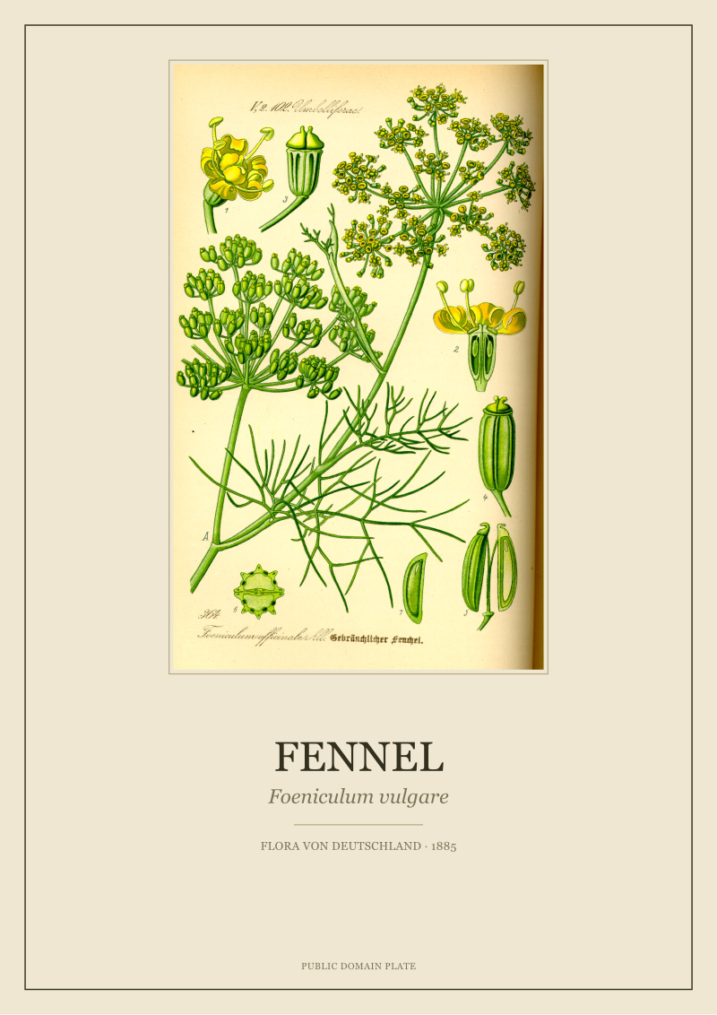
The Thomé fennel, *Foeniculum vulgare*, is a good tell. The original plate shows a compound umbel — a flat-topped cluster where each primary ray branches into secondary rays, each terminating in a tiny five-petalled flower. In a well-restored version you can count the rays. In a fourth-generation poster the umbel has become a soft green halo. The feathery leaves, which should sit at a specific aspect ratio against the stem to read as fennel and not dill, have softened into a general feathery texture. The buyer still gets a green plant on cream paper. They do not get fennel. We date and source every plate we release because the alternative is a provenance that reads "we found it somewhere," and somewhere is not an acceptable answer when the point of the object is that it preserves something specific.
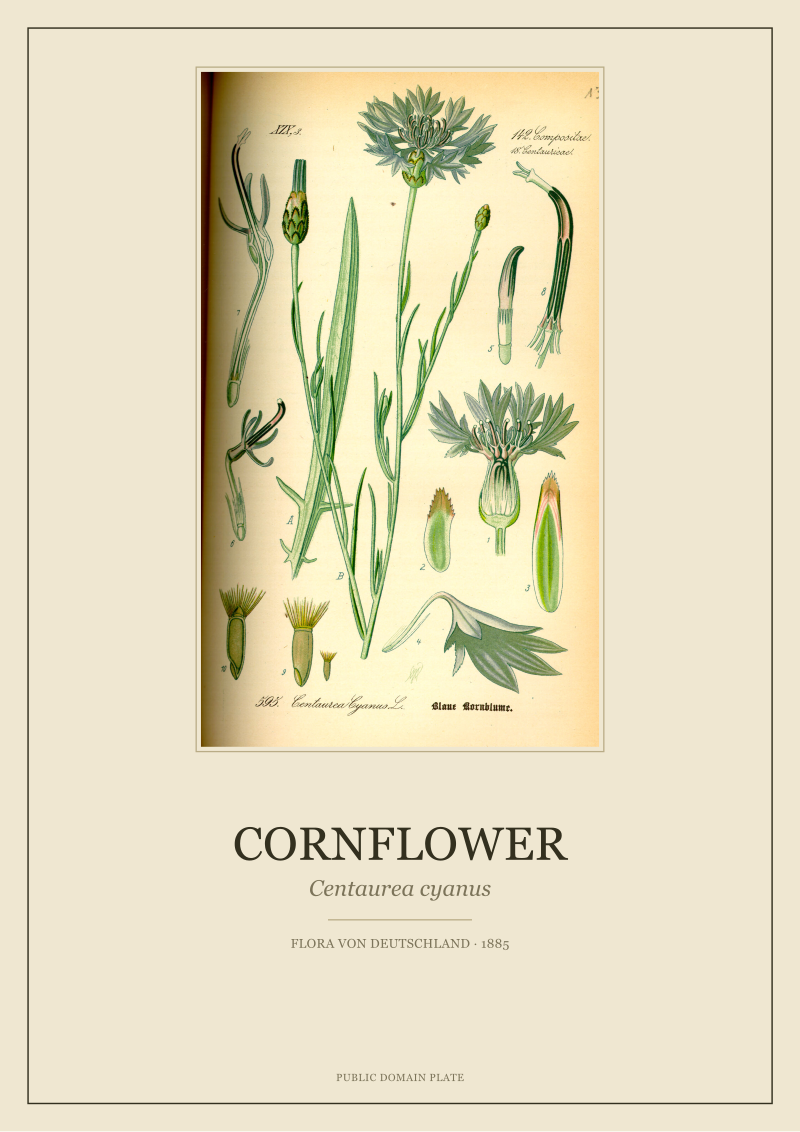 Cornflower
The print from this article · from €29.95
View the print →
So What Do You Actually Do
If you are buying a botanical print and you do not want to end up with a filtered photograph wearing a Latin name, there are three questions to ask the seller before you ask the price. What is the source scan — the specific plate, the specific publication, the year. Who made the original drawing and when was it published. What paper is this printed on and what is the pigment set. If the answer to the first question is a vague "nineteenth-century lithograph" with no plate work, no artist and no year, you are buying decor dressed in botanical costume. That is a legitimate thing to buy if you know that is what you are buying, but it is not what the word *botanical* was meant to describe.
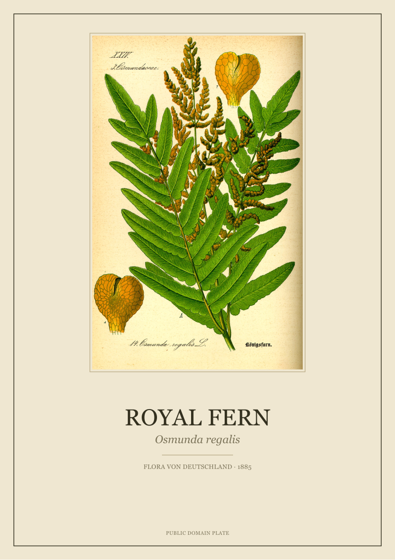
If the answer to the second question is silence, assume the vendor does not know, which is the same as assuming the print has gone through enough hops that no one along the chain cared enough to preserve the attribution. If the answer to the third question is a stock-paper SKU with no lightfastness rating, assume the color on your wall is a lease and not a purchase. Our own restored plates — the chamomile, the ivy, the cornflower, the fennel, drawn by O.W. Thomé for *Flora von Deutschland, Österreich und der Schweiz* in 1885 — are sourced from archival scans, re-registered against the original line stone where the file allows, and printed on 300gsm cotton with pigment inks. They live at see the Chamomile print and we are glad to answer any of the three questions above about any plate we sell.
None of this tells you whether a botanical print belongs on your wall. That is a question about the room, the light, the plant you want to live with, and the kind of attention you want the object to repay. What this piece tells you is only how to recognise the difference between a plate and a poster of a plate, which is where any honest conversation about botanical prints has to start.
New plates from the archive and 10% off your first print.
One email now with your code. No noise after.