On a Tuesday in March we laid two plates from Otto Wilhelm Thomé's Flora von Deutschland, Österreich und der Schweiz — the 1885 edition — side by side on the studio table under a 5000K daylight bulb. On the left, Osmunda regalis, the royal fern, its fronds unfurling across nearly the full height of the sheet. On the right, Lavandula angustifolia, one slender stem, a magnified corolla, a cross-section of a calyx. Same illustrator, same year, same public-domain source. And yet, measured against the only question a wall actually asks — how much of the paper is filled — they are not comparable objects.
The comparison people ask us for is a taste comparison. Which plant is prettier. Which colour is more fashionable. Which name sounds better under a linen sofa. We have learned to answer a different question, because the taste answer is worthless once the frame is on the wall and the light shifts and the room is real. The question we answer is compositional. What does the plate actually do to the square metre of wall it occupies. And on that measure, Thomé's royal fern and Thomé's lavender behave in opposite ways.
What follows is not a ranking. It is the calculation we make on the studio table before we recommend either one. We measured. We looked. We argued about it for a week. The conclusion is not the one we started with.
The Royal Fern Fills a Wall the Way Lavender Never Will
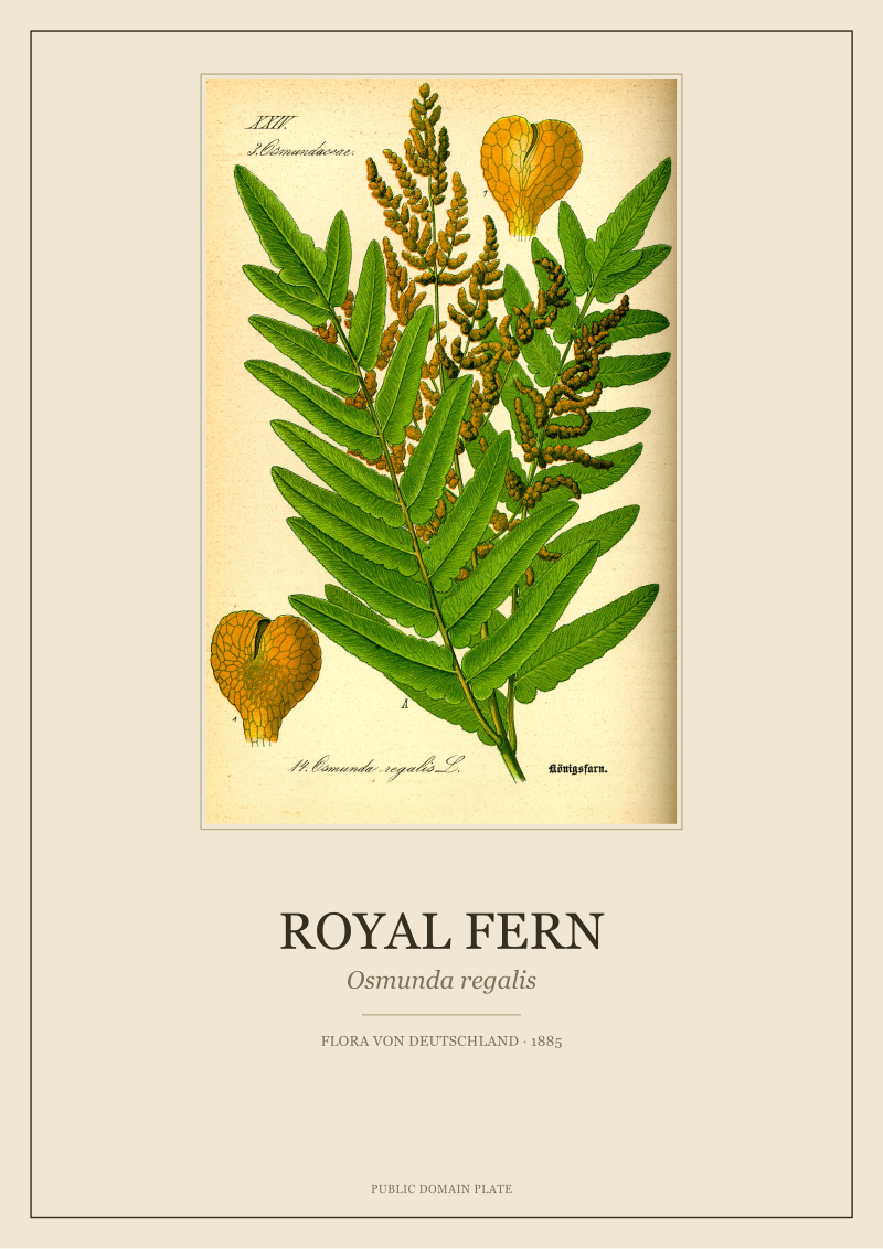
The royal fern plate is a study in vertical volume. Thomé drew Osmunda regalis at what looks, from the composition, like something close to life-scale for a young frond — a bipinnate leaf climbing from the lower quarter of the plate to the top margin, with the fertile fronds crowning the upper third in a rust-brown spike that is unlike anything else on any lavender plate ever printed. When we measure the coverage — the percentage of the sheet that carries pigment or line — the royal fern plate sits somewhere in the range of sixty to seventy per cent of the working area. There is almost no negative space above the specimen, and only a small margin below.
That is not a small distinction. A framed print with high coverage reads, from four metres away, as a solid object on the wall. A framed print with low coverage reads as a piece of paper in a frame. Neither is wrong. But if the wall is a long stretch above a sofa in a north-facing room with grey light, the first print holds the wall and the second one disappears into the moulding by three in the afternoon.
The fern also does something the lavender cannot do, which is deliver a colour that Thomé's chromolithographers evidently reached for on purpose: two greens in tension. The sterile fronds are the cooler, blue-green of shaded understory. The fertile spike, when it appears, is a warm foxed brown that in the 1885 print run reads as almost sienna against the cool green. It is a two-note plate. Most botanical prints from the era are one-note by design — a stem, a flower, a root, all in service of the flowering diagnostic. The royal fern is not a flower. It is a Devonian holdover, a genus older than the class Angiospermae by roughly two hundred million years, and the plate treats it as an entire organism because a fern is what it is at every stage.
That fact matters when the plate is framed. A viewer coming close to the wall reads the plate as botany. A viewer standing across the room reads it as texture. The royal fern is the rare Thomé plate that survives both reading distances. Most do not. The lavender does not, and that is not a criticism.
Lavender Is a Line Study; the Fern Is a Room
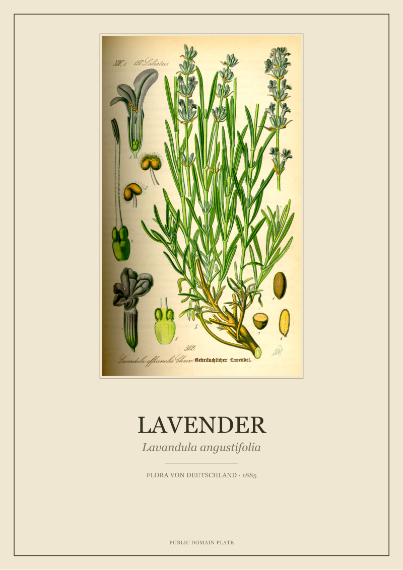
The lavender plate is, technically, a masterpiece of what nineteenth-century floras were actually trying to accomplish. A single upright stem of Lavandula angustifolia rises up the centre of the sheet, its whorls of small violet flowers arranged with the discipline of a botanist who needed the plate to serve as an identification key. To the right of the main stem, Thomé placed the diagnostic details that mattered to a working botanist in 1885: a magnified corolla with the two upper lobes and three lower lobes drawn to the correct proportion, a cross-section of the calyx showing the ribbed tube, an isolated fruiting calyx. These are not decoration. They are the reason the plate was drawn. Flora von Deutschland was, in the original run, a working reference for teachers and pharmacists, and the lavender page is a page from a reference book.
Coverage on the lavender plate is, by our measurement, somewhere between eighteen and twenty-five per cent of the working area — a full third of what the fern occupies, and possibly less. The rest is white. That white is not a defect. In a reference plate, the negative space is the reading room around the specimen; it is where the eye rests between the whole plant and the enlarged detail. It is what makes the botany legible.
It is also what makes the print, framed and hung, behave like a completely different kind of object than the fern. A framed lavender plate is a punctuation mark. It is a comma in a sequence, not a full stop. Hang one on its own on a large wall and it looks lost — not because the plant is small, but because Thomé did not draw it to fill a sheet. Hang three or five or seven of them in a horizontal line, and the negative space suddenly becomes the design element, the whitewalled gallery moment on a domestic wall, and the sequence reads as a herbarium page from a working botanist's cabinet.
We say this to almost every client who arrives asking for a lavender print alone. The plate is beautiful. It will not carry the wall by itself. It was never asked to. The royal fern was asked to, and it does.
There is also the question of what the specimens mean when they enter a room, and we do not mean the folklore. Lavender arrived at Thomé's page carrying centuries of European associations — apothecary, monastic garden, the herbalist's shelf — and we mention that here because it is history, not because we recommend the plate for what the plant is said to do. The royal fern arrived carrying almost no cultural weight at all outside of botanical literature. It is a fen plant, a plant of wet ditches and river margins in Central Europe, and Thomé drew it because Flora von Deutschland aimed to describe what actually grew in the German-speaking landscape, not what was fashionable in a drawing room. That difference — a cultivar plant with a resume, and a wild plant without one — is the last thing to understand before deciding between them.
 Lavender
The print from this article · from €29.95
View the print →
Lavender
The print from this article · from €29.95
View the print →
Both Are 1885, But They Do Not Belong to the Same Interior
Here is where our recommendation stops being a general one and starts being a room-by-room one. The plates share a year, a printer's craft, a paper stock, and an illustrator's hand. They do not share a room.
The royal fern belongs on a single wall, framed generously in a wide off-white mount and a dark hardwood moulding, hung at eye level, alone or with at most one other broad-leaved plate from the same era at similar coverage. It belongs in rooms with tall ceilings, north light, and enough distance for the viewer to step back. It reads well above a fireplace in a room where the fireplace is not the primary event. It does not read well above a low console in a narrow hallway. Its ambition is architectural.
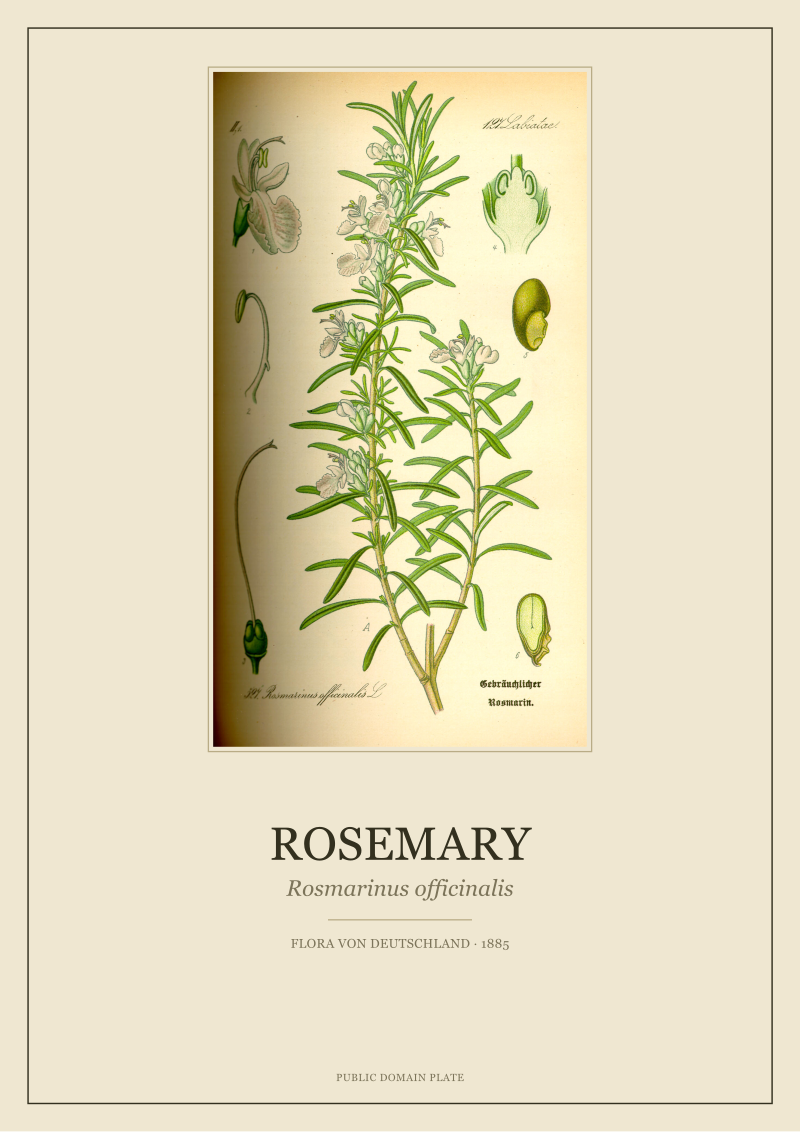
The lavender belongs in a grid. Three across, or a two-by-three, or a five-by-one in a long corridor above a bench. It belongs in a kitchen wall where four different aromatic-herb plates from the same 1885 edition — lavender, thyme, sage, rosemary — can be hung with identical mounts and identical mouldings so that the eye reads the wall as a page from a herbal, not as four separate paintings. Its ambition is editorial. It is a plate from a book, and it wants the rest of the book around it.
This is where the "which should I choose" question dissolves. If you have one wall and you want that wall to have a plant on it, and you want to walk past that wall for the next twenty years without redecorating around it, the royal fern is a more honest choice, because it will do the work alone. If you have a kitchen, a corridor, a bathroom, a study wall — any surface that can hold a sequence — the lavender is the more honest choice, because it was drawn to be part of a sequence and it disappoints when it is not.
We hold both restored plates in the studio's current catalogue, scanned from the 1885 print run and cleaned by hand and by code without changing the pigment values the chromolithographers set down. What we sell is not the answer to which plant you like. What we sell is a plate that will still be the same plate after the sofa is replaced and the paint is changed and the room is different, because the botany does not go out of fashion and Thomé's line work does not either.
The honest recommendation, if we are pushed to give one, is this: buy the plate that matches the wall you already have, not the plant you already love. The two things are almost never the same.
This piece started as a lavender-versus-fern comparison and turned, halfway through the second draft, into a coverage-versus-composition argument. We had planned to give the fern the win and call it a day. The lavender rescued itself in the last paragraph, once we stopped asking which plate was better and started asking which plate was drawn for which wall. That reframe is the piece.
FAQ
Are both of these plates from the same edition of Thomé's flora?
Yes. Both the royal fern and the lavender plates in our catalogue come from the 1885 print run of Otto Wilhelm Thomé's Flora von Deutschland, Österreich und der Schweiz. Same illustrator, same publication year, same chromolithographic process, same paper stock. That shared provenance is what makes the compositional differences interesting — the divergence is Thomé's editorial choice about how each plant should be drawn, not an artefact of different eras or different studios.
Which plate fills a large wall better on its own?
The royal fern, without contest. Osmunda regalis was drawn at a scale that occupies roughly sixty to seventy per cent of the working area of the plate, with fronds reaching from the lower margin nearly to the upper edge. Hung alone in a wide mount, it holds a wall of two square metres comfortably. The lavender plate covers less than a quarter of its sheet by design, because it was drawn as a botanical reference with negative space around the specimen for the enlarged diagnostic details.
Is the lavender plate less valuable because the coverage is lower?
No, and this is a common misreading. Low coverage is not a deficiency in a nineteenth-century botanical plate — it is the format speaking. Reference plates were drawn with generous white space around the specimen because the negative area was the reading room. The lavender plate is a masterpiece of the reference-page format. It is simply the wrong object to hang alone on a large wall, which is a compositional fact about the plate, not a quality judgement.
Can I hang the royal fern and the lavender together?
In most rooms, no. They are drawn at incompatible coverages and address the wall in incompatible registers. Placing them side by side creates a visual imbalance where the fern reads as an object and the lavender reads as an unfinished sketch. If both plates appeal to you, we would suggest the royal fern on one wall as a solitary piece and the lavender as part of a herbal-grid arrangement on a separate wall in a different room.
Does the royal fern print work in small rooms?
It can, but only if the room has a single dominant wall and enough viewing distance for the eye to step back at least two and a half metres. In tight corridors or narrow bedrooms, the fern's coverage becomes overwhelming — the print eats the wall rather than furnishing it. In a small room with limited stand-back distance, the lavender in a grid arrangement almost always outperforms the fern alone.
Are the historical uses of lavender mentioned on the plate?
Thomé's plate is a botanical description, not a materia medica. Lavender has, of course, a long documented history in European apothecary and monastic garden literature going back centuries, and we mention this in our catalogue notes as history — not as anything the plate itself claims. The 1885 plate documents the plant's structure. Any use-history sits around the plate in the historical record, not on it.
Why do you scan and restore from the 1885 edition specifically?
The 1885 Flora von Deutschland is the source we know best and the source whose chromolithographic values we have learned to read without over-correcting. Later editions and later reprints exist, but the pigment relationships in the 1885 plates — the way the two greens sit against each other in the royal fern, the exact violet of the lavender corolla — are the ones we can restore with the highest fidelity. Working from a single edition also means our catalogue is internally consistent when clients build a wall from multiple plates.
What if I want a plant that behaves like the royal fern but is not a fern?
We would point you toward the other broad-leaf, high-coverage plates in Thomé's flora — the ones drawn as whole organisms rather than as diagnostic keys. Ivy, certain grasses drawn as full clumps, and some of the larger deciduous studies read the wall in a similar register to Osmunda regalis. What you are looking for, compositionally, is coverage above roughly fifty per cent and a specimen that fills the vertical rather than the horizontal. That is a small subset of the flora, but it exists.
 Royal Fern
The print from this article · from €29.95
View the print →
Royal Fern
The print from this article · from €29.95
View the print →
New plates from the archive and 10% off your first print.
One email now with your code. No noise after.