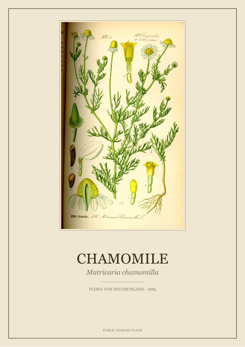
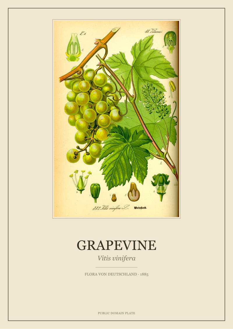
The chamomile plate wins on a small wall; the grapevine plate wins on a large one. Both come from the same volume — O.W. Thomé's Flora von Deutschland, Österreich und der Schweiz, first issued in 1885 and long since in the public domain — but they were engraved for very different eyes. Thomé drew Matricaria chamomilla as a specimen page: airy, spare, weighted almost entirely toward the flower head. He drew Vitis vinifera as a botanical argument, with leaves, tendrils, and fruit competing for the same square. Choosing between the two is not a question of taste. It is a decision about the room.
Methodology: What We Actually Compared, and How
We restored both plates from the same source volume and worked from the same tonal baseline, so the comparison here is not between two impressions of different quality. It is between two drawings, made by the same illustrator in the same year, that were meant to do different things on the printed page.
For each plate we measured four attributes we can defend: composition weight (where the eye lands first and where it stays), line register (the density and thickness of the engraved lines relative to the page), palette temperature (whether the surviving pigment reads warm or cool once cleaned), and scale behaviour (how the image holds up as it is enlarged from book size to wall size). We did not measure sentiment, symbolism, or "energy". Those are real, but they belong to the reader in the room, not to the studio at the scanner.
Two limitations to flag before the findings. First, Thomé's Flora exists in several printings and a small number of the plates were re-drawn between editions; our reference is the 1885 first issue. Second, colour on a public-domain botanical plate is always a restoration decision — a defensible one, but a decision. Where our restored file departs meaningfully from the untouched scan, we say so.
Finding #1: The Two Plates Were Never Drawn to Hang Together
The most useful thing to know about these two prints is that Thomé did not imagine them as a pair. Flora von Deutschland was a teaching flora, issued in fascicles across several years, and each plate was designed to answer one question inside a specific botanical family. The chamomile plate answers a question about the Asteraceae — how the ray florets sit around the disc, how the receptacle domes upward, how the leaves dissect into hair-fine segments. The grapevine plate answers a question about the Vitaceae — how the tendril opposes the leaf, how the panicle branches, how the seed sits inside the berry.
That difference in purpose shows up as a difference in density. Matricaria chamomilla occupies roughly the top third of its plate and leaves the rest as breathing room, with only a small dissected diagram tucked into a corner. Vitis vinifera fills its plate corner to corner: a fruiting branch, a full leaf turned to show venation, a curled tendril, a cluster of berries, and cross-sectioned diagrams of the flower and the seed all sharing one page.
For a wall, this matters more than any question of "which plant is prettier". Hung side by side at the same size, the chamomile will read as quiet and the grapevine as busy, and the eye will keep returning to the grapevine and leaving the chamomile alone. That is not the chamomile plate failing. That is two different jobs being asked to share a frame.
 Chamomile
The print from this article · from €29.95
View the print →
Chamomile
The print from this article · from €29.95
View the print →
Finding #2: Line Weight and Negative Space Diverge Sharply
Thomé's engraver used a lighter hand on the chamomile. The stems are drawn with a single-weight line, the leaf segments are almost calligraphic, and the flower heads themselves are constructed from short, deliberate strokes that leave the paper visible between them. There is more page than there is plant. Read at wall scale, the chamomile plate behaves like a piece of writing: it has margins, it has silence, it invites the eye to slow down.
The grapevine is the opposite. The main leaf is rendered with heavy cross-hatching to describe the palmate lobes and the deep venation; the tendril is drawn in a firm curling line that anchors the composition; the fruit cluster is shaded so that individual berries read as three-dimensional against the flat leaf. Negative space, on this plate, is a rumour. Almost every square centimetre carries information.
The practical consequence is straightforward. A print with high negative space rewards a clean wall and a generous mount — the paper margin around the image is doing structural work. A print with high line density can survive a busier setting: a gallery wall, a bookshelf backdrop, a room where other objects are competing for attention. Try to swap them and both will misbehave. Chamomile on a cluttered wall disappears. Grapevine floating alone on a large white wall reads as heavy without the space to absorb it.
Finding #3: Palette Temperature Places Them in Different Rooms
Once restored, the two plates settle into different temperature bands. The chamomile carries a cool green in the leaves and a warm off-white in the ray florets, with a small saturated yellow at the disc. The overall reading is pale, dry, slightly silvery — a plate that will sit comfortably beside limewash, unbleached linen, oak that has been sanded rather than stained, and the kind of ceramics that lean grey rather than cream.
The grapevine reads warmer. The leaf greens have a yellow undertone that shifts toward bronze at the edges, the woody stem is drawn in a genuine brown, and the ripe berries — which Thomé rendered as a purple that leans blue rather than red — anchor the plate with the darkest value on the page. The whole thing sits comfortably against walnut, terracotta, warm plaster, and any textile with even a hint of ochre or wine in it.
We are not proposing a rule. Warm plates can hang in cool rooms; the tension is often what makes a wall interesting. But if you are choosing between these two specifically, and you know the room, the room will usually decide. A pale, north-facing kitchen with cool light will do more for the chamomile than for the grapevine. A south-facing dining room with wooden furniture will do the reverse. This is the least glamorous finding in the piece and probably the most useful.
 Grapevine
The print from this article · from €29.95
View the print →
Grapevine
The print from this article · from €29.95
View the print →
Finding #4: Scale and Repetition Decide Which One Survives a Gallery Wall
At A4 or the equivalent, both plates behave. Enlarge them, and they diverge. The grapevine's line density scales up gracefully — every enlargement reveals more of the cross-hatching the engraver put down, and at A2 or A1 the plate begins to read as a piece of architecture rather than a botanical illustration. The chamomile scales more delicately. Enlarged too far, the negative space begins to overwhelm the drawing, and the plate can start to feel underweight for its frame.
Repetition inverts the relationship. Hung as a set of three or four, at moderate size, chamomile-scale plates carry a gallery wall better than grapevine-scale plates. The airy compositions rhyme with each other; the eye moves cleanly from one to the next; the wall reads as a suite. Four grapevine-density plates on a wall become visually loud very quickly — each one competes with its neighbours instead of leading the eye onward.
The short version: grapevine wants to be big and alone, or paired with one equally weighted plate. Chamomile wants to be modest and multiplied, part of a small chorus of similarly quiet drawings. Ignore this and you will either shrink an architectural plate into decorative wallpaper or blow up a quiet plate until it looks apologetic in its own frame.
The Plates Side by Side
| Attribute | Matricaria chamomilla | Vitis vinifera |
|---|---|---|
| Composition weight | Top third; high negative space | Full page; dense edge to edge |
| Line register | Light, single-weight, calligraphic | Heavy, cross-hatched, sculptural |
| Palette temperature | Cool green, silvery off-white, small yellow accent | Warm green, brown stem, blue-purple fruit |
| Best solo scale | A4–A3; loses weight past A2 | A3–A1; gains presence with size |
| Best in a set | Yes — reads as a suite of 3–4 | No — competes with neighbours |
| Room affinity | Limewash, linen, cool light, pale oak | Walnut, terracotta, warm light, plaster |
What This Comparison Does NOT Prove
None of what we measured tells you which plate is the better drawing. Thomé and his engravers were disciplined across the whole Flora, and both plates are excellent examples of the specimen-page tradition they were working inside. The chamomile is not a lesser drawing because it uses less ink; the grapevine is not a superior one because it fills the page. They answer different botanical questions and they were composed accordingly.
Nor does this piece speak to symbolism, folklore, or the many centuries of association each plant carries in European culture. Chamomile has an old apothecary history; the grapevine has an even older one tied to viticulture and religious iconography. We have deliberately kept those out. The question here was narrower: two plates from the same 1885 volume, one wall to fill, which one belongs where. Symbolism is a real reason to choose a plate, but it is the reader's reason, not a measurable property of the print.
The Takeaway
Choose the chamomile for a quiet wall and a small suite; choose the grapevine for one strong statement in a warm room. If you find yourself wanting both, hang them apart — not because they clash, but because they were never drawn to answer to each other, and giving each its own wall lets each plate do the job Thomé actually engraved it to do.
That decision — one plate alone versus a small chorus — is where the more interesting question starts, and it is not one this piece can settle for you. Our next desk note takes it up directly: how many botanicals make a wall, and at what point a collection stops adding meaning and starts diluting it.
FAQ
Which of the two prints works better in a small room?
The chamomile, in almost every case. Its high negative space and light line weight let it sit on a wall without visually enlarging the plate beyond the room's proportions. The grapevine, at any meaningful size, carries too much information to read comfortably in a tight space — the eye never gets to rest. If the room is small and the wall is the only real surface, the chamomile plate at A3 with a generous mount will do more work than a larger grapevine crammed into the same frame.
Can the grapevine and chamomile plates hang in the same room?
Yes, but not on the same wall and rarely at the same size. Because Thomé drew them for different botanical purposes, hung together they read as mismatched weights rather than a considered pair. If both plates belong in one room, give each its own wall — the grapevine as a solo statement over a sideboard or dining table, the chamomile as part of a small set on a quieter surface. Treating them as complementary rather than paired lets each plate keep its own logic.
Do the 1885 dates mean the plates are still under copyright?
No. Flora von Deutschland, Österreich und der Schweiz was first issued in 1885 and O.W. Thomé died in the early twentieth century, which places the original plates comfortably in the public domain under every major copyright regime. Our restored files are new work — we have re-scanned, cleaned, and colour-balanced the source — but the underlying drawings themselves are free for anyone to reproduce. That is exactly why we work with this volume: the drawings deserve a second life, and the law allows it.
Are these prints suitable for a kitchen or a humid room?
On the paper side, yes, with normal framing precautions — acid-free mount, sealed backing, glass rather than acrylic if the room gets warm. Neither plate is more delicate than the other; both are printed on the same archival stock. What matters more in a humid room is placement: avoid a wall directly above a stove or a sink where steam rises repeatedly. Both plates were originally book pages designed for library conditions, and while modern archival framing handles most domestic environments comfortably, physics still applies to paper.
If I can only afford one, which plate should I start with?
Start with the plate that fits the wall you already have, not the plant you already like. If your main empty wall is generous, warm-toned, and asking for one strong image, the grapevine will earn that space. If your main empty wall is modest, cool-toned, or part of a room that will eventually hold a small set of prints, the chamomile is the better first purchase because it leaves the door open to a second and third plate that will rhyme with it. Buying for the wall almost always outperforms buying for the species.
Where can I see the restored plates before deciding?
Both restorations live in our own /shop/, with high-resolution previews at the sizes we actually print. The previews show the plate at true proportion against a neutral background so you can judge how much negative space each one carries before committing to a frame size. We do not list either plate through third-party sellers, and we do not run seasonal discounts — the pricing reflects the restoration work and the archival print run, and it is the same in December as it is in June.
New plates from the archive and 10% off your first print.
One email now with your code. No noise after.