Most interior guides recommend rosemary. Hear me out. The recommendation is not wrong because rosemary is a bad plate — it is wrong because it is safe, and safety is what a writer defaults to when they have not looked at the actual paper. O.W. Thomé drew both Ficus carica and Rosmarinus officinalis for his Flora von Deutschland, Österreich und der Schweiz in 1885, and those two plates are doing entirely different jobs on a wall. One is a study in single-note green with almost no incident. The other is a portrait of a fruit half of Europe has been drawing, arguing about, and eating for two thousand years.
We restore both plates by hand at the desk, and the questions readers send us almost never separate the plant from the print. They ask which "smells nicer in a kitchen" or which is "more calming near a bed," as if the paper on the wall carried a scent. It does not. What it carries is line weight, palette, negative space, and a compositional argument the illustrator made in 1885. The comparison below judges the two plates on those grounds, because that is the ground the print actually stands on.
The Comparison Matrix at a Glance
Before the section-by-section reading, the table. Every value below is drawn from the two Thomé plates we work from, not from stock photography of the living plants. The point is to show, in one glance, that these are not two versions of the same object with different labels.
| Dimension | Fig (Ficus carica) | Rosemary (Rosmarinus officinalis) |
|---|---|---|
| Illustrator | O.W. Thomé | O.W. Thomé |
| Source work | Flora von Deutschland, Österreich und der Schweiz | Flora von Deutschland, Österreich und der Schweiz |
| Plate year | 1885 | 1885 |
| License | Public domain | Public domain |
| Dominant motif | Large lobed leaf plus sectioned fruit | Slender stem, dense linear leaves, small flowers |
| Line weight | Heavy, varied, with vein and section detail | Fine, uniform, near-thread on the leaves |
| Palette on plate | Split: green foliage, warm fruit interior | Single-note: cool grey-green throughout |
| Negative space | Low — the leaf fills the sheet | High — the stem leaves generous margins |
| Compositional weight | Heavy, anchoring, low centre of gravity | Light, vertical, near-weightless |
| Best scale range | Large: A2 and above without losing detail | Small to medium: A4–A3 before the line dissolves |
| Best-suited rooms | Kitchens with warm materials, dining rooms, libraries | Bedrooms, bathrooms, narrow halls, cool-palette studies |
| Difficulty to restore | High — colour separation on the fruit is fragile | Medium — the risk is losing the thinnest lines to dust |
The rest of this piece reads the table row by row. Skim it once now; the sections below explain what a table cannot: why any of it matters when the plate is on your wall at eye level, in the light your room actually has.
Line Weight: The Dense Fig Leaf Against the Wire-Thin Rosemary Stem
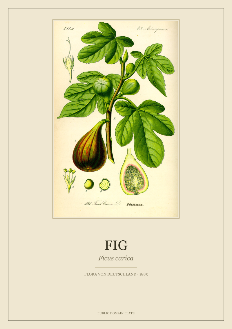
The two plates were engraved with entirely different assumptions about how a viewer would stand in front of them. Thomé's fig leaf is drawn with confident, varied line weight — the primary veins are heavy, the secondary veins step down, the leaf margin is a firm outline, and the fruit in section shows the internal cavity with a thickness of line that survives reduction to almost any print size. You can put the fig plate behind glass at A3 or blow it up to A1, and the leaf still reads as a leaf. The heavy line was the plate's design brief: a botanical readable at teaching distance, in a classroom, from a metre away.
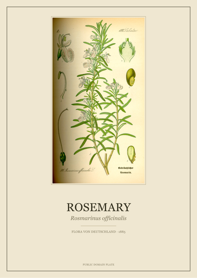
Rosemary is the opposite brief. Its leaves are needle-thin in life, and Thomé rendered them faithfully with the finest lines his medium allowed — near-hairs of ink, laid down in dozens, each about the same weight as the next. That uniformity is where the plate's fragility lives. At small sizes the rosemary reads as a delicate, almost silvery blur of parallel strokes; go larger and the eye starts to notice how few points of visual variation there are per square centimetre. A wall-sized rosemary asks the room to give it enormous quiet, or the fine line simply drowns.
This is the first place the "just get rosemary" advice fails. On a Pinterest thumbnail rosemary looks charming and generic and inoffensive. On a wall at scale it is a demanding, self-effacing object that punishes bright light and busy surroundings. Fig at the same scale is doing the opposite work — announcing itself, filling the field, taking the room's attention and holding it. Neither is better. They are answers to different questions the wall was asking.
 Rosemary
The print from this article · from €29.95
View the print →
Rosemary
The print from this article · from €29.95
View the print →
Color on the Original Plate: Single-Note Green Versus a Split Palette
Look at the two plates side by side under a raking light and the palette split is unmistakable. Rosmarinus officinalis in Thomé is essentially monochromatic — a cool grey-green across the stem, the leaves, and the small pale-violet flowers, which register more as a value shift than a chromatic event. The whole plate lives inside a narrow band of the colour wheel. That is why rosemary reads as "calming" in almost any room: there is no chromatic argument on the page, so the eye does not have to negotiate anything.
Ficus carica is a two-voice plate. Green foliage dominates the upper composition, but the fruit — drawn whole and then cut in section, in the didactic manner of the period — introduces a warm inner palette that ranges through soft pinks, ochres, and a muted red at the centre of the seed-bearing pulp. This is not a decorative flourish. Thomé needed to teach the reader what the inside of a Ficus fruit looked like, so the plate carries two complete colour stories that meet on the same sheet. Restoring it is where our desk spends its longest hours; the warm interior is where a bad scan or an aggressive levels adjustment shows first.
For a wall, the palette split has consequences no interior guide seems to mention. Rosemary sits inside almost any colour scheme without arguing with it, which is why writers keep recommending it and why it is genuinely a low-risk buy. Fig will speak to warm floors, terracotta, wood, unbleached linen, and cured leather; it will fight cool-blue schemes and stark white walls until one side gives up. The plate has a temperature. Pretending otherwise, as most listicles do, produces the very complaint we receive most often: "it looked different in the room than online."
Scale on the Wall: How Large Each Plate Can Go Before It Breaks
Every botanical print has a scale ceiling and a scale floor, and the space between them is narrower than most people realise. The fig plate has a very generous window. It survives from about A4 upward to genuinely large sizes — A1 and beyond, we have printed it for a stairwell at more than a metre tall, and the veining still reads correctly because the underlying draughtsmanship carried enough information to withstand enlargement. The scale floor for fig is roughly A5; below that the fruit-in-section becomes a smudge and the pedagogical point of the plate is lost.
Rosemary has almost the inverse window. Its ceiling is low: past A3 the fineness of the leaves starts to disintegrate into a texture rather than a set of legible needles, and the plate stops being a botanical portrait and becomes a decorative field. Its floor, on the other hand, is unusually low; rosemary works beautifully at A5 or even smaller, in a stacked arrangement or a narrow corridor gallery, because the fine line rewards close viewing the way an etching does. Standing forty centimetres from a small rosemary is a completely different experience from standing three metres from the same plate blown up.
The practical rule that follows: fig is a single-plate room-anchor; rosemary is a small-format object that can multiply. A dining room with one large fig above the sideboard is a coherent editorial decision. A hallway with four small rosemaries at eye level is another coherent decision. Swap the two — a wall-sized rosemary above a sideboard, four postcard-sized figs in a hallway — and the plates fight the wall in ways they were not drawn to do.
 Fig
The print from this article · from €29.95
View the print →
Fig
The print from this article · from €29.95
View the print →
Room Register: Where Each Print Actually Belongs
The word we use at the desk is register — the tonal frequency a plate broadcasts into a room. Fig broadcasts warmth, mass, and abundance. Its natural rooms are the ones where people already sit down and stay: kitchens with wood or terracotta, dining rooms, libraries with leather bindings, offices that already have a rug. It also handles the visual noise of those rooms — the pots, the books, the crockery — because the plate has its own gravity and does not lose the argument to background clutter.
Rosemary broadcasts coolness, air, and restraint. Its natural rooms are the ones that already contain very little: bedrooms with pale linen, bathrooms with stone or plaster surfaces, narrow halls, cool-north studies, meditation corners if that is your household's vocabulary. It cannot compete with a busy background, and it does not want to — it wants the wall to be quiet, and it rewards that quiet with a plate that changes slightly as the daylight shifts across the paper.
This is where the industry consensus does its most tangible damage. Rosemary is recommended for kitchens by roughly everyone, because rosemary the plant belongs in a kitchen. The plate, judged as paper on a wall, does not; kitchen light is usually warm, kitchen surfaces are usually busy, and the cool single-note rosemary either recedes to invisibility or looks stranded. Fig, drawn from a tree that belongs on a hot terrace in the south of Europe, is the plate that actually holds a working kitchen wall. The mismatch between plant-logic and print-logic is exactly what a comparison written from photographs, not from the paper, will always get wrong.
Which Dimension Actually Matters Most
If we had to collapse the table into one deciding row, it would be neither palette nor room register nor even line weight. It would be scale relative to wall, because scale is the dimension that turns every other dimension either kind or cruel. A rosemary at its correct small scale is a small quiet triumph in any of the rooms above; a rosemary at a scale beyond its ceiling stops being a botanical and becomes wallpaper with pretensions. A fig at its correct large scale is one of the most satisfying pieces of restored 19th-century paper we produce; a fig at a scale beneath its floor loses the section drawing that gave the plate its intellectual life in the first place.
That is why our honest answer to "which one" is a question back: how large is the wall, and how loud is the room already. A large wall in a warm, occupied room takes fig, and takes it well, once. A small wall in a cool, sparse room takes rosemary, often in a set of three or four. The two plates are not competitors on a shelf. They are two different tools for two different jobs, both drawn by the same hand in 1885, both restored at the same desk, both available in the /shop/ if the reader wants to see the paper we are actually talking about. What this article does not answer is the harder domestic question that comes next: what to hang beside either plate without turning the wall into an argument. That is where the real editing starts, and it is not where this piece ends.
FAQ
If I only have room for one botanical print, does the studio really refuse to pick between fig and rosemary?
We refuse only in the abstract. Given a photograph of the wall, its light through a day, and the surfaces near it, we will name one plate. The refusal is against the shelf-ranking format that treats the two as interchangeable products. Fig and rosemary answer different questions the room is asking; without seeing the room, picking one over the other in print would be the same laziness we spent this article criticising.
Is Thomé's 1885 Flora really in the public domain, and does that affect what I hang?
Yes. Flora von Deutschland, Österreich und der Schweiz is out of copyright everywhere its copyright regime has expired, which covers essentially all of Europe and the Americas. What that means for a buyer is that the plate itself is free source material; what you are paying a studio for is the restoration — the scan quality, the colour work on the fruit interior, the removal of foxing without falsification. The paper on your wall should look like 1885, not like a Photoshop of 1885.
Which of the two plates is more forgiving of a north-facing, low-light room?
Rosemary, by a clear margin. Its cool single-note palette does not depend on warm light to read correctly, and low light softens the finest lines rather than dulling a colour argument. Fig in a cold north room can look muted and slightly sullen; the warm interior of the sectioned fruit needs warmer light to sing. This is the one case where the interior-guide default is genuinely defensible — but only for that specific light condition.
Can I mix the two plates on the same wall, or do they fight each other?
They fight, but usefully, if the wall is large enough. A fig as the anchor with two or three rosemaries flanking at smaller scale is a compositionally sound gallery arrangement — the fig carries the mass, the rosemaries carry the rhythm. What does not work is equal-scale side-by-side hanging: two plates of similar size but wildly different visual weight look accidental. The rule is one dominant plate, quieter companions, never two co-lead sopranos.
Why do interior magazines keep pushing rosemary as the default kitchen print?
Because it photographs well as a thumbnail and it is safe copy to write. A journalist under deadline who has not stood in front of the actual paper will default to the plate that looks calming in a 400-pixel image and offends no reader. The recommendation is not corrupt, it is just uninvestigated. Once the plate is on a real kitchen wall in real kitchen light, the mismatch we described in the room-register section becomes obvious very quickly.
Does the printing surface change the comparison?
It changes it decisively. Fig on a heavier, slightly warm-toned cotton rag holds its own; rosemary on the same paper can feel weighed down. Rosemary rewards a lighter, cooler stock that lets the fine line breathe. Fig on very white bright paper loses some of the fruit's warmth and starts to look clinical. Any comparison of the two plates that does not name the paper is comparing shadows of the real object.
How large can I go before either plate stops being a botanical and becomes wall decoration?
Roughly A1 for fig, roughly A3 for rosemary, in our experience with the specific Thomé scans we work from. Past those ceilings the plate stops carrying its 19th-century pedagogical logic — the vein, the section, the leaf-count — and starts being read as pattern. Pattern is a legitimate use of a print, but it is not what these plates were drawn to do, and if that is the goal the reader is better served by a decorative source than by a restored botanical.
New plates from the archive and 10% off your first print.
One email now with your code. No noise after.