Three is the smallest number that behaves like a set. Two plates read as a pair; four read as a grid; three read as a decision — which is why most of the questions we get at the studio are about triptychs of Thomé's 1885 plates, and why most of those questions are the wrong ones first. What follows is a flowchart in prose. We will ask you three questions, in order, and route you at each fork. At the end there is a table. If you already know your walls, skip to it; if you do not, the questions are the point.
Question 1: Do You Want the Three Plants to Share a Story, or a Palette?
This is the first fork because everything downstream depends on it. A set of three can cohere in two very different ways. It can cohere narratively — the plates belong together because the plants belong together in the world, in a kitchen garden, in a hedgerow, in a field margin. Or it can cohere chromatically — the plates belong together because the pigments Otto Wilhelm Thomé's chromolithographers laid down in 1885 happen to rhyme, regardless of whether the plants would ever meet in nature.
Both approaches produce good walls. They produce very different rooms. Answering this question honestly, before you look at a single plate, saves you from the most common mistake we see: a set assembled by species affinity that clashes chromatically over the sofa, or a set assembled by color that looks arbitrary the moment a guest reads the Latin names on the labels.
If Yes — a Shared Story
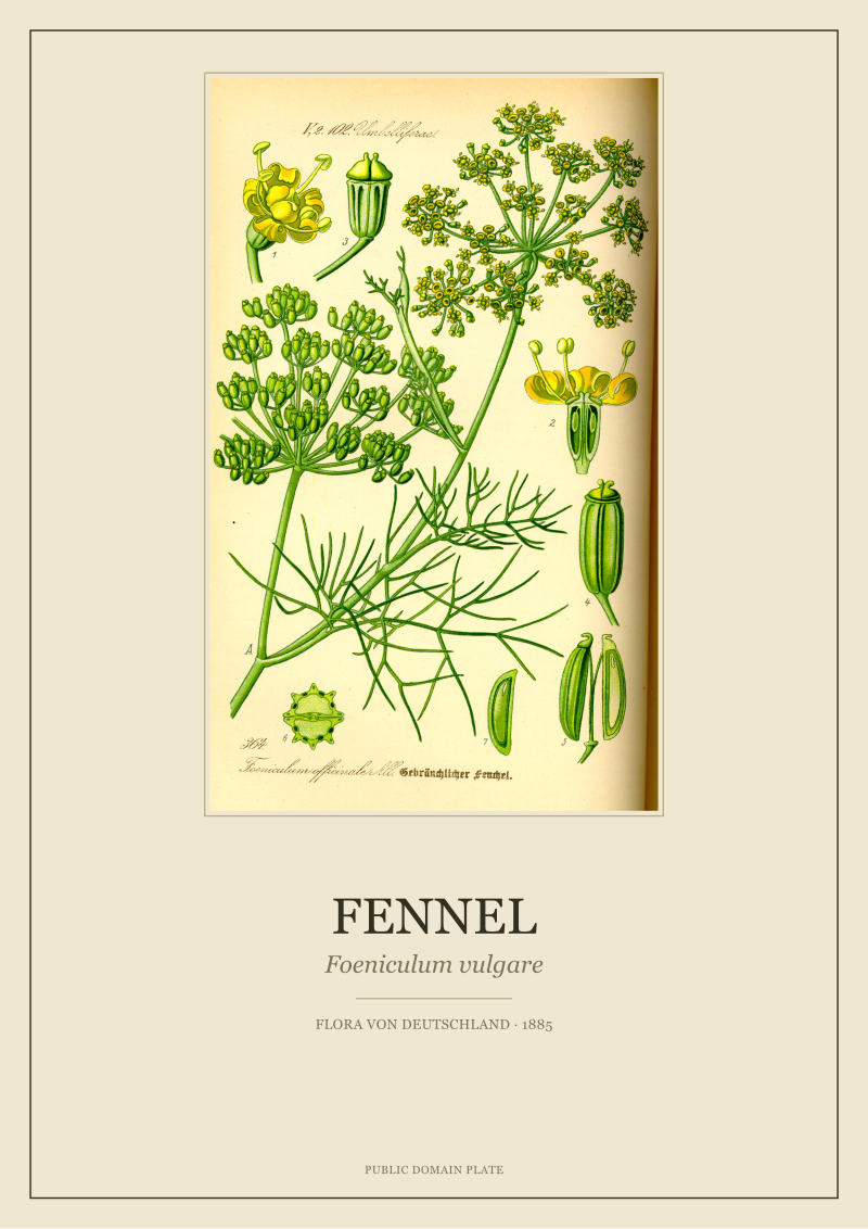
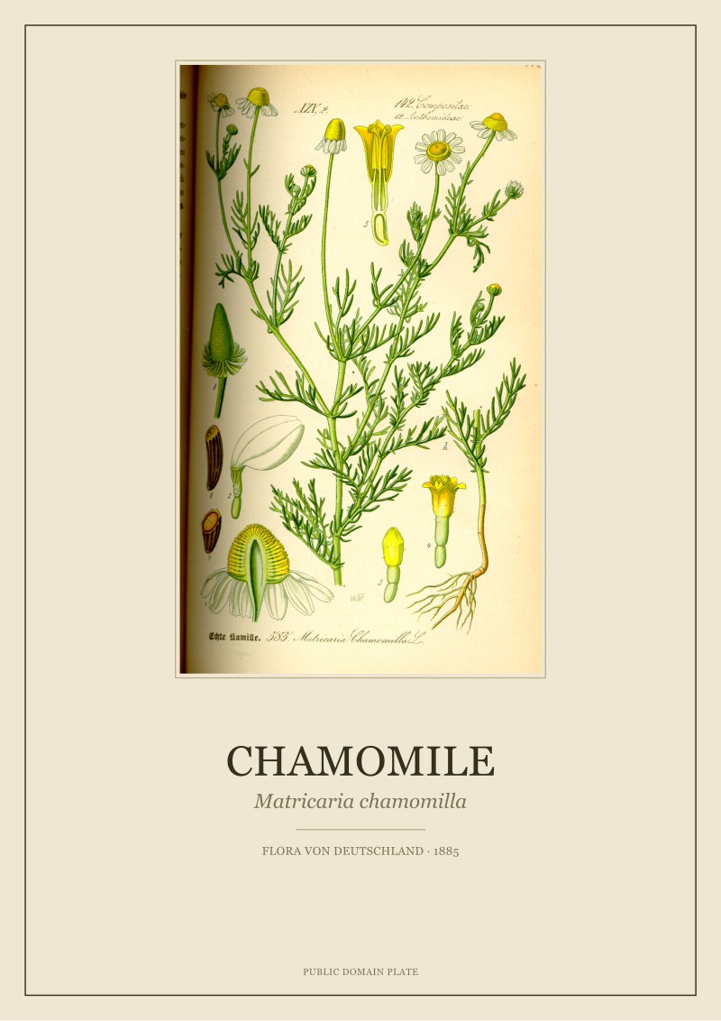
Pick a habitat, an era, a use, and let it dictate the three. From Thomé's *Flora von Deutschland, Österreich und der Schweiz* (1885) we most often build story-triptychs around the kitchen and the hedgerow. A kitchen-garden triptych of *Matricaria chamomilla* (chamomile), *Foeniculum vulgare* (fennel) and — as the third — a culinary companion from the same volume makes narrative sense to anyone who has ever brewed something warm or seasoned a fish. The chamomile brings the small daisy discs, the fennel brings the aerial umbels; the third plate breaks the axis so the wall does not read as a diptych with a spare.
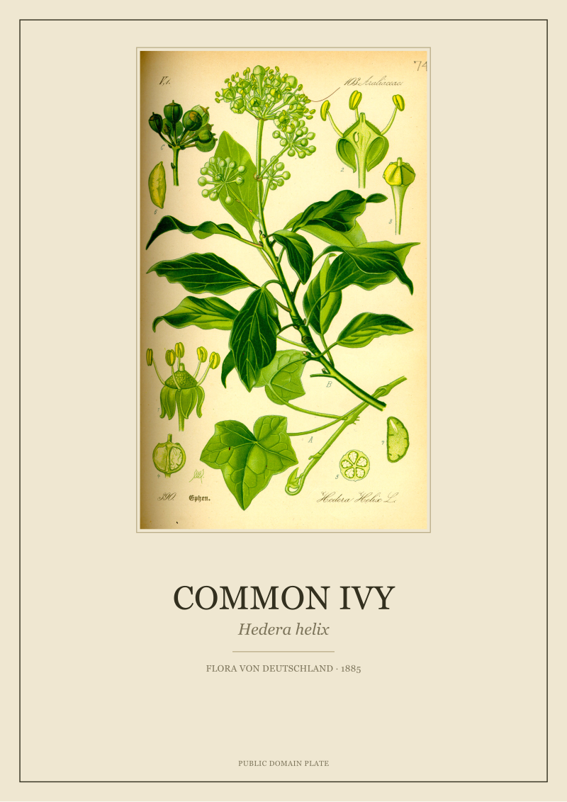
A hedgerow triptych does the same job with a different botany. *Hedera helix* (common ivy) is one of the studio's most-asked plates because it carries the plate itself: dark cordate leaves, black berries in tight clusters, the drawing register that Thomé's team reserved for evergreens. Anchor the wall in the ivy and the two flanking plates can lean lighter without the composition tipping.
Narrative triptychs age well because guests read them. Someone stands in front of a set and works out what the three have in common; the wall pays them back for looking.
If No — a Shared Palette
If you are choosing for a room where the paint, the textile and the light are already decided, palette wins. Ignore whether the three plants would ever share a meadow and look instead at what Thomé's chromolithographers actually printed.
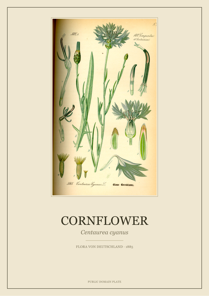
Two axes matter. First, the green register: some plates run cold and blue-shifted (ivy trends this way), some run warm and yellow-shifted (fennel's aerial foliage sits here), some are dominated by non-green — the saturated ultramarine of *Centaurea cyanus* (cornflower) is the clearest example in the 1885 volume. Second, the density of the drawing: some plates fill the frame edge to edge, some leave generous unprinted paper around a central specimen. A triptych of three edge-filling plates reads as a wall of botany; a triptych of three sparse plates reads as three specimens held apart by air. Mixing densities in a chromatic set almost never works; mixing them in a narrative set almost always does.
If your room is warm — clay walls, oak, unbleached linen — pull the palette toward chamomile-and-fennel yellows and let the third plate carry a muted green rather than a saturated blue. If your room is cool — greys, dark wood, north light — the cornflower's blue is the anchor and the ivy sits beside it as the second cold note; the third plate should be a green rather than a competing colour, or the wall reads as a swatch card.
Question 2: Is the Wall Above Something, or Standing Alone?
The second fork is about the architecture, not the botany. Where the triptych hangs determines how much visual weight the three plates must carry, and therefore how large the frames must be and how the plates must be arranged inside them.
A wall above a piece of furniture — sofa, sideboard, headboard, console — is a wall with an anchor. The furniture does the load-bearing work; the plates decorate the vertical band above it. A wall standing alone — a stairwell landing, a corridor end, a chimney breast without a mantel, a narrow section between two doors — has no anchor. The plates must generate the composition themselves, which changes the scale, the spacing, and often the plate choice.
If Above Something — the Anchored Wall
The rule we give clients is: the triptych's total width, frames included, should sit between one-half and two-thirds of the width of the furniture below. Narrower than one-half and the plates float; wider than two-thirds and the arrangement fights the sofa for attention.
Above a 220 cm sofa, that means a total triptych width of roughly 110–145 cm. Three plates hung with 6 cm gaps between frames leaves you frames of about 30–43 cm wide each — the smaller end for A4-ish restorations, the larger end for A3-ish. Above a 90 cm bedside console, the same calculation lands you in the 45–60 cm total range, which usually means a triptych of three small plates hung tight (3–4 cm gaps) rather than three normal plates hung loose.
Vertical centre-line: the horizontal midline of the middle plate should sit around 145–150 cm from the floor when the wall is anchored by a sofa, and 155–160 cm when anchored by a lower piece — sideboard, chest, low console. This is not gallery-standard eye height (which assumes a standing viewer with nothing beneath); it is the height that makes the triptych feel like it belongs to the room the furniture already defined.
If Standing Alone — the Unanchored Wall
Without an anchor, the triptych becomes the anchor. That means larger plates or wider spacing, and it means the three-plate composition itself has to do the work three plates above a sofa can outsource to the sofa.
Two arrangements work reliably. The classic horizontal row, centred on the wall's horizontal midline (usually 150–155 cm floor-to-plate-centre for a standing viewer), with generous gaps — 10 to 15 cm — so the eye reads three plates and not one broken image. The alternative is the vertical stack, which we recommend for narrow walls: three plates stacked with 6–8 cm gaps, the whole column centred horizontally on the wall and vertically at eye level. The vertical stack is where the ivy plate earns its keep — the cordate leaves and berry clusters read cleanly whether the plate is at the top or the bottom of the column.
Do not try a hung-triangle arrangement (one plate higher, two lower, or the reverse) on an unanchored wall. It reads as instability rather than composition when there is no furniture below to catch the eye.
 Fennel
The print from this article · from €29.95
View the print →
Fennel
The print from this article · from €29.95
View the print →
Question 3: Are You Framing These Yourself, or Ordering Them Framed?
This is the fork most clients answer last and should answer first. It changes what you buy, what you pay, and how forgiving the whole project is to a mistake in questions one and two.
Framing yourself gives you full control over mat, moulding, glass and depth — and full responsibility for getting the three frames to match. A triptych with three slightly-different white mats or three slightly-different oak profiles reads as an accident, not a set. Ordering the plates framed by the studio (or any framer working from a single batch of materials) gives you guaranteed match; it costs more; it forecloses the aftermarket-frame route many clients want to take.
If Framing Yourself — the DIY Route
Buy the three plates in the same format at the same time, and buy all your framing materials in a single order from a single supplier. Mat: 100% cotton rag, off-white rather than bright white — Thomé's paper was warm-toned and a bright-white mat makes the restoration look like a photocopy against it. Mat window: leave 6–8 cm of mat visible on all four sides of a mid-sized plate; the plate should feel presented, not crowded.
Moulding: a narrow profile (18–25 mm) in oak, ash or a matte black keeps the focus on the plate. Wide ornate mouldings compete with the botany and belong on oil paintings, not chromolithographs. Glass: anti-reflective museum glass is worth the premium if the wall gets direct light for any part of the day; standard glass is fine for interior walls. UV-filtering is standard on museum glass and unnecessary for our restorations, which are printed on pigment inks rated for a century of indoor light — but the anti-reflective coating is the real reason to spend, because it lets guests see the ivy's berry clusters instead of the ceiling lamp.
If Ordering Framed — the Studio Route
Say yes to matching. Ask for the three plates to be framed as a set from the same batch of moulding and the same batch of mat board, in the same session, by the same framer. Batch matters: oak stains vary lot to lot, and mat board off-whites drift between production runs. A triptych framed three months apart from three separate orders is a triptych with three subtly different frames, and the eye reads the difference before it reads the plants.
If you are ordering framed, you can also relax the plate-format constraint. A framed set can absorb slight format variance because the mat window equalises the visible botany; three plates in different original formats, matted to the same window size, will read as a set even if the underlying restorations were originally sized differently. This is the route we recommend for clients who want a specific plant that only exists in a non-standard format in the source volume.
If You Answered Everything: The Recommendation Grid
| Q1: Story or Palette | Q2: Anchored or Alone | Q3: DIY or Studio | Recommendation |
|---|---|---|---|
| Story | Anchored | DIY | Kitchen-garden triptych: chamomile, fennel, one culinary third — A4 plates, off-white cotton mat, narrow oak frame. |
| Story | Anchored | Studio | Hedgerow triptych anchored by *Hedera helix*, A3 format, studio-framed as a matched set in matte black or oak. |
| Story | Alone | DIY | Vertical stack of three culinary plates (chamomile at top, fennel middle, third at bottom), 6 cm gaps, narrow oak. |
| Story | Alone | Studio | Horizontal ivy-anchored hedgerow set at A3, 12 cm gaps, studio-framed with anti-reflective museum glass. |
| Palette | Anchored | DIY | Warm-room set built around fennel and chamomile yellows, third plate a muted green, uniform A4 frames in ash. |
| Palette | Anchored | Studio | Cool-room set anchoring on *Centaurea cyanus* blue and ivy cold-green, studio-framed at A3 in matte black. |
| Palette | Alone | DIY | Three edge-filling plates in a matched green register, horizontal row, 10 cm gaps, off-white cotton mat, oak. |
| Palette | Alone | Studio | Cornflower-centred cool triptych, vertical stack on a narrow wall, studio-matched frames and museum glass. |
The grid is a starting point, not a verdict. Every wall we have measured has produced at least one deviation from the row that seemed to fit it — a beam that shifts the anchor, a window that moves the light, a piece of furniture that is deeper than the plan drawing suggested. Use the row you land on to buy the plates; use the wall itself to decide the last five centimetres of spacing.
 Chamomile
The print from this article · from €29.95
View the print →
Chamomile
The print from this article · from €29.95
View the print →
FAQ
How many plates should I buy if I am unsure between two and four?
Buy three. The pair and the quartet are decisions about symmetry; the triptych is a decision about composition, and it is the one arrangement that works on almost every wall without demanding that the wall be symmetrical. Two reads as a matched set that a viewer completes with their eye; four reads as a grid that a viewer parses; three reads as an argument the viewer follows from left to right. If you later want to expand, three grows to five more elegantly than two grows to four.
Do the three plates need to be the same size?
For a DIY-framed set, yes — buy them in the same format at the same time so the frames match exactly. For a studio-framed set, no — the mat window equalises visible plate area even when the underlying restorations were originally different sizes. Uniformity of frame is what the eye reads as a set; uniformity of plate is only a means to that end.
Can I mix plates from different source works?
Technically yes, but the drawing register will fight you. Thomé's 1885 chromolithographs share a specific line weight, colour palette and paper tone. A plate from Redouté or Curtis pulled into a Thomé triptych reads as a visitor rather than a member of the set. If you want to mix illustrators, build the set around that mix — three plates from three different eras, treated as a study in illustration history — rather than smuggling one outsider into an otherwise Thomé wall.
Should the three plates go in a specific left-to-right order?
Yes, and the rule is chromatic weight rather than alphabet or Latin taxonomy. Put the heaviest plate — the one with the most saturated colour or the densest drawing — in the middle. Flank it with the two lighter plates. If two plates tie for heaviest, put them at the ends and let the lightest sit in the middle: the eye will still read the composition as balanced, and the negative space in the centre becomes a feature rather than an absence.
What lighting works best for a botanical triptych?
Warm-white LED at 2700–3000 K, indirect, off-axis. Direct spotlights on chromolithographs create glare on standard glass and flatten the drawing on any glass. A single wall-washer aimed at the ceiling above the triptych, or a picture light mounted above the frames with a diffuse warm bulb, both work. Cool-white lighting (4000 K+) shifts the paper tone toward grey and misrepresents what the 1885 chromolithographers actually printed.
Is there a wall colour that ruins a triptych?
Bright white gloss is the only paint we actively discourage. It bounces enough light back through the glass to double-image the plates and it makes the warm-toned paper look yellowed rather than aged. Everything else works with the right plate selection: dark walls suit the ivy and cornflower plates, warm neutrals suit the chamomile and fennel plates, and mid-greys are the most forgiving background for any of them.
How high should the centre plate hang?
For an anchored wall (above furniture), 145–155 cm from the floor to the horizontal midline of the middle plate. For an unanchored wall (standing alone), 150–160 cm, adjusted upward if the room's ceiling is above 2.8 m and downward if it is below 2.5 m. Do not follow the "150 cm gallery standard" mechanically — the standard assumes a standalone gallery wall with a standing viewer, and most home walls have furniture, seating or a doorway that shifts the correct height by five to ten centimetres.
Where should I look at the plates before deciding?
The restored 1885 plates we discussed here — chamomile, fennel, common ivy, cornflower — are in the studio's shop, sized and mat-planned for the arrangements described above. Measure the wall first, answer the three questions, then look at the plates. The order matters: plates chosen before the wall is measured are plates chosen for a room that does not exist yet.
From the collection
New plates from the archive and 10% off your first print.
One email now with your code. No noise after.