We have read, at this point, a great many articles about botanical prints in Scandinavian interiors, and they all miss the same three things. They miss the plate. They miss the paper. They miss the century. What is left, once those three absences are noted, is a wash of soft language about "Nordic calm" and pale walls, a stock photograph of a fiddle-leaf fig in a woven basket, and a suggestion to buy a frame from a mass retailer. The plants change; the sentences do not. A 1885 chromolithograph from O.W. Thomé's *Flora von Deutschland, Österreich und der Schweiz* deserves better company than that.
The complaint that follows is a specific one. It is not that these articles are unkind to plants, or ignorant of Scandinavia, or wrong about the pleasure of a botanical image on a whitewashed wall. It is that they treat the print as a decor accessory, when the print is, in fact, a piece of nineteenth-century scientific publishing that happens to look extraordinary above a linen sofa. The whole point of the object is the thing the articles never mention.
What They All Get Wrong
The shared error is a category error. The typical article opens with a mood — "Scandinavian interiors favour restraint, natural light, and a sense of quiet" — and then it proceeds to treat every green rectangle on the wall as if it were interchangeable with every other. A pressed eucalyptus stem, a modern line drawing of a monstera leaf, a scanned page torn from a paperback field guide, and an actual chromolithograph from Thomé's *Flora* all appear in the same paragraph, under the same word: "botanical." They are not the same thing. One of them is a decorative motif; another is a printed reproduction of a scientific illustration made under specific conditions in a specific decade by a specific hand.
Because the category is collapsed, the recommendations that follow are unmoored. The reader is told to "choose prints that echo the greens in the room," which is aesthetic advice about pigment, not about the print. They are told to hang three in a row above a bench, which is fine, but the same advice could apply to postcards of cats. They are told to look for "vintage botanicals," a phrase that treats a century as a colour palette. Nothing in the article helps the reader distinguish a plate that was drawn from a living specimen in Berlin in 1885 from a print-on-demand file uploaded to a marketplace last Tuesday.
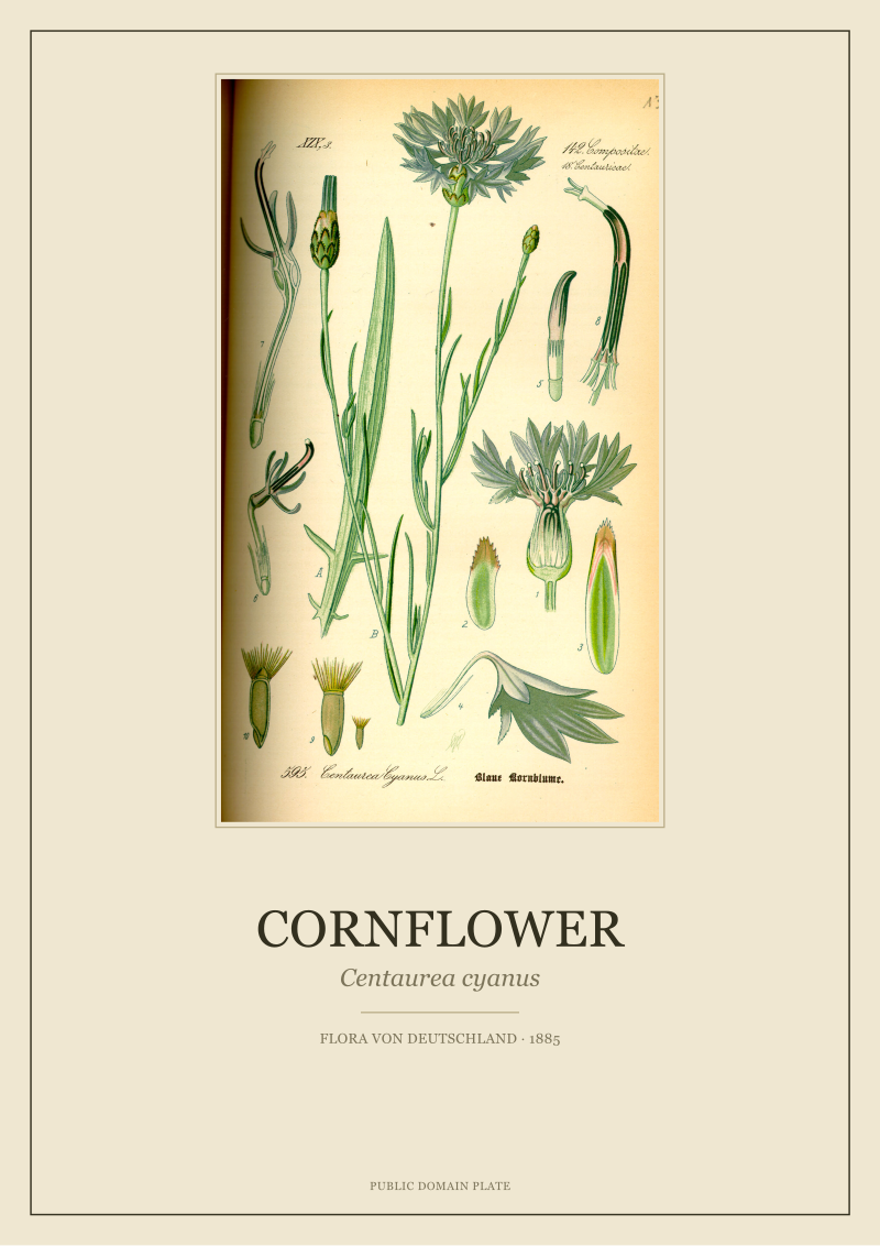
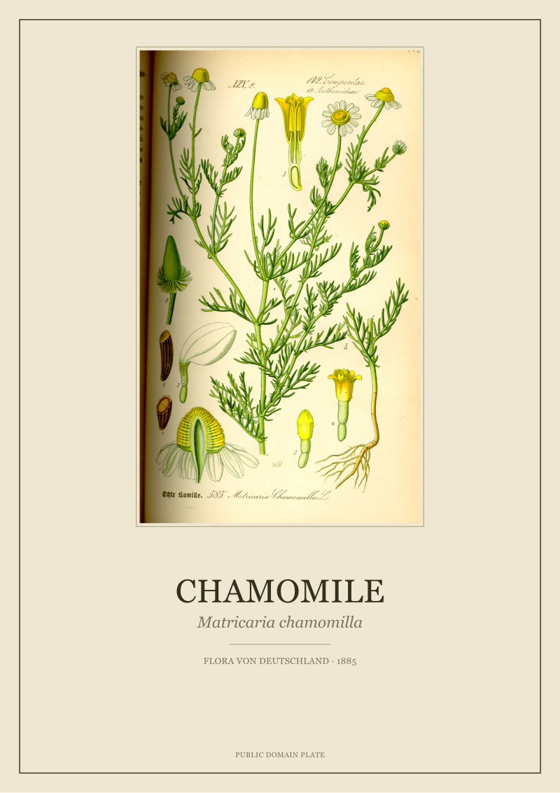
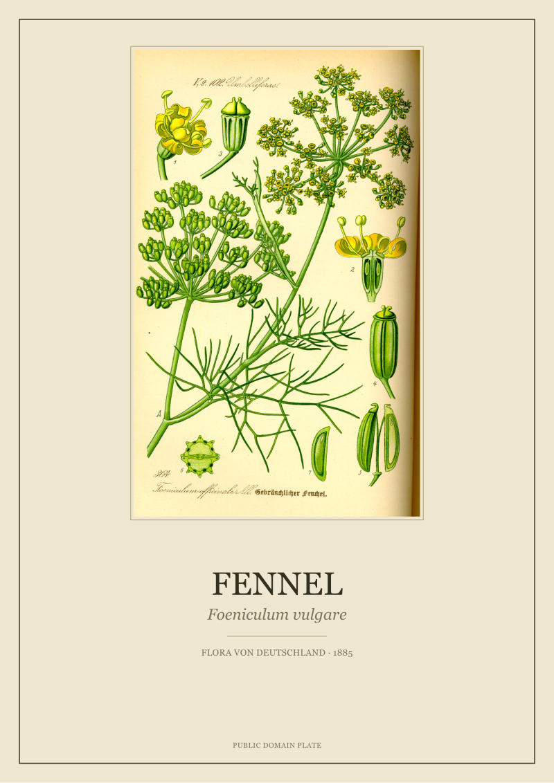
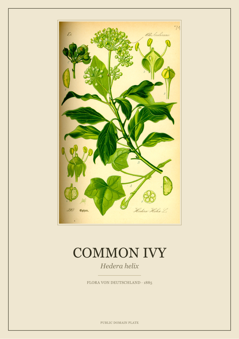
The second error is one of species. In an article about Scandinavian interiors, one repeatedly meets the same three plants: the fiddle-leaf fig, the Swiss cheese plant, the fern shot in a bathroom. These are houseplants of the twentieth-century apartment. They have almost nothing to do with the flora that actually blooms across the northern latitudes, and nothing at all to do with the plants Thomé chose to document — cornflower (*Centaurea cyanus*) sprawling through rye fields, chamomile (*Matricaria chamomilla*) volunteering along a path, fennel (*Foeniculum vulgare*) tall in a kitchen garden, common ivy (*Hedera helix*) climbing whatever it can reach. A Scandinavian room hung with the flora of nineteenth-century central Europe is not off-brand. It is closer to the northern European visual record than the fiddle-leaf fig will ever be.
What Is Almost Always Missing
What is missing, first, is the plate. No article we have read explains what a chromolithograph is, or why the ones from the 1880s look the way they do. This omission is astonishing, because it is the technical reason the images are so beautiful, and the reason they are so difficult to reproduce well now. A chromolithograph is a print built by pressing paper against a sequence of separately drawn stones, each carrying one colour, each aligned by hand. The colours are laid down as flat, opaque inks rather than mixed on the surface, which is why the greens sit next to the reds without muddying, and why the outlines feel drawn rather than scanned. When a reader hangs a chromolithograph on a wall, they are hanging the record of an obsolete craft. That is worth a sentence.
What is missing, second, is the paper. Every article recommends a frame, usually oak or ash, sometimes black, always thin. Almost none mention the paper stock the print is on, which is the variable that decides whether the finished object looks like an heirloom or an office decoration. A restored plate printed on a warm, matte, uncoated stock reads as a piece of paper that has been in the world. The same file printed on a bright, glossy, coated stock reads as a poster. Scandinavian interiors, with their bias toward soft daylight and untreated wood, are unforgiving of glossy paper. This is the kind of practical detail an article about botanical prints ought to lead with, and the kind of detail we do not see.
What is missing, third, is the century. The nineteenth-century botanical publishing project was one of the great encyclopaedic efforts of European science, and the plates that survive from it — Thomé's among the most beloved — are the visible remainder. To place one of these plates on a wall without knowing that it was drawn to catalogue a flora, not to decorate a foyer, is to lose most of what makes it interesting. The frame is not around a picture of a plant. The frame is around a page from a book that tried to name everything green in a large part of Europe. That fact does not need to be printed on a card beside the frame. It only needs to be known by whoever chose the print.
 Cornflower
The print from this article · from €29.95
View the print →
Cornflower
The print from this article · from €29.95
View the print →
What I Would Say Instead
We would begin by saying that the Scandinavian interior and the nineteenth-century botanical plate are, historically, closer neighbours than the styling shoots suggest. The pale rooms, the pared-back palette, the trust placed in a single well-made object over a wall of clutter — these are dispositions that suit a printed plate exceptionally well, because a printed plate rewards being looked at rather than skimmed. The room is quiet enough for the drawing to speak.
We would then choose the plants seriously. A room with a north light and a pale grey wall does not need three ferns. It might want one cornflower plate, because the cornflower — small, blue, sharply drawn — is the kind of image that holds a large field of wall without competing with the rest of the room. The chamomile plate does something else: its loose habit and pale flowers echo the informality of a kitchen table, and it looks correct above a dining bench in a way that a dramatic tropical does not. Fennel, tall and finely divided, wants a vertical space — a stairwell, a narrow panel next to a door. Ivy, which climbs, looks better in a room that already has vertical lines to answer it. These are not styling laws. They are the small pleasures of matching an image to a place, and they are the reason a specific plate belongs on a specific wall.
We would take the paper seriously. A restored 1885 chromolithograph should be printed on paper that behaves like paper — matte, with a warm base, with enough weight to hold flat inside a frame. We would resist glass with too much sheen; museum glass, or simple non-reflective glass, will do more for the image than any decision about frame profile. And we would leave a generous margin. A botanical plate crowded against the frame edge looks embarrassed. The same plate given three or four centimetres of white paper around it looks like what it is: a scientific illustration presented with the seriousness it earned in 1885.
We would speak plainly about scale. A single well-restored plate at a generous size will do more for a Scandinavian room than a grid of nine small ones, because the room is already committed to restraint and rewards a single strong gesture. If a wall wants more than one, three is honest, three is enough, three lets each plate be seen. This is the studio's honest answer to the question the styling articles never quite ask, which is how many botanicals make a wall. The answer, in a Scandinavian room, is fewer than you think, chosen with more care than the articles admit, printed on better paper than the market defaults to, and framed as if the drawing inside the frame is the point — which, since Thomé drew it in 1885 and it has survived on into a room in Stockholm or Copenhagen or Bergen in the current century, it plainly is. That is the article we would write instead, and it ends here, on the plate, where any honest one should.
 Fig
The print from this article · from €29.95
View the print →
Fig
The print from this article · from €29.95
View the print →
New plates from the archive and 10% off your first print.
One email now with your code. No noise after.