The frame is the second half of a botanical plate. Thomé drew *Matricaria chamomilla* in 1885 against the implicit rectangle of a scientific atlas page, and when that rectangle is wrong — too thick, too gilded, too modern — the drawing stops being itself. In our studio we restore plates from Thomé's *Flora von Deutschland, Österreich und der Schweiz*, and the question we are asked most, by far, is which frame the plate wants. The answer is never universal and never a product recommendation. It is a short list of decisions about wood, mat, glass and proportion, each with a defensible reason and a cost if ignored.
The Frame Is Part of the Plate, Not a Decoration Around It
A botanical plate is not a picture of a plant. It is a page from a book of pictures of plants, torn out of its binding by time and reproduction. The plate was composed with margins that were never arbitrary: Thomé's engravers planned the white around the stem, the position of the Latin label, the inch of air above the inflorescence. Those margins are a structural part of the image. Frame a plate badly and you overwrite them with a competing margin that belongs to someone else's design decade.
The useful mental model is simple. The frame is a second rectangle around a first rectangle, and the two rectangles are in conversation. If the inner rectangle is a dense chromolithograph from 1885, drawn with crisp outline and flat zones of colour against bone-white rag paper, the outer rectangle must speak the same vocabulary — restrained line, flat surface, cool neutrals — or it will shout the plate down. Baroque gilding on a wildflower reads as costume. A high-gloss black art frame reads as a photograph of a plant, which is the opposite of what Thomé drew. In both cases, the plate is still there, but you have to ignore the frame to see it.
The frame is not a decoration. It is the plate's second margin, and it is doing exactly as much work as the first.
Wood, Metal, or Painted: What the Plate Was Drawn Against
Three material families cover roughly 95% of the frames we recommend. Each has one honest answer and several wrong ones.
Solid wood — oak, walnut, maple, ash — is correct for the plates we restore in the overwhelming majority of cases, because Thomé's atlas was itself a bound wood-and-cloth object sitting in wood-panelled studies and herbaria. A quartersawn oak profile between 20 and 30 mm wide, finished with wax rather than lacquer, lets the plate sit in the century it was drawn in without caricaturing it. Walnut does the same thing one degree warmer and reads well against *Hedera helix* and *Foeniculum vulgare* — plants with olive, bronze and green-brown tonalities. Pale maple or ash cools the field down and belongs to *Centaurea cyanus*, where the cornflower blue needs no extra warmth around it.
Thin metal frames — aluminium around 8 to 12 mm, matte black or matte champagne — are the second honest answer, used in a specific case: the plate is going into a built environment that is already contemporary (concrete, poured plaster, matte-painted trim) and a wood frame would read as nostalgia. Here the metal frame disappears, which is what it is for. Avoid high-gloss finishes, bevelled edges, and anything described as "ornate" or "gallery gilded".
Painted wood — matte MDF or poplar, chalked in off-white, warm grey or ivory — is a defensible third option on wide-mat compositions. It is the wrong answer when it is used as a cheap stand-in for the first two. A painted frame photographs well and ages badly: it chips, it yellows, and the chipping is not patina.
Mat Board: The Quiet Decision Everyone Underestimates
The mat is the decision that most framing shops get wrong, and it is the decision that most changes the plate.
Three variables matter. The first is composition. The mat must be 100% cotton rag, acid-free, with an alpha-cellulose backing or better. Standard wood-pulp mat releases acids over 10–20 years and burns a brown halo into the paper visible along the window bevel. On a plate restored from a 140-year-old source, acid migration from a $3 mat is the fastest route to undoing the restoration.
The second is width. For a Thomé plate at roughly 24 × 32 cm image area, we specify a mat window between 7 and 10 cm on the long side, with the bottom margin 1 to 1.5 cm wider than the top — the "weighted" mat convention inherited from print and plate framing since the 19th century. A square mat on a vertical plate reads as a modern poster. A narrow mat (under 5 cm) crowds the drawing and makes the frame look heavy by comparison. A very wide mat (over 12 cm) turns the plate into a graphic element in an interior and away from itself as an object.
The third is colour. White mats come in roughly 40 industry shades, and the only two that reliably work for 1885 plates are a warm off-white at approximately L*94 a*0 b*4 — the colour of unbleached rag — and a very pale cream, L*92 a*1 b*7, used when the plate paper has aged yellow and a stark white mat would make the plate look stained. Stark white, L*98 a*0 b*–1, is wrong for every botanical we have ever framed. It belongs to black-and-white photography.
Glass and Glazing: The Argument Between Shine and Survival
Glazing is a two-axis decision — optical clarity and UV protection — and the two axes trade against each other at different price points.
Standard float glass, 2 mm, costs between €5 and €15 per plate at frame-shop scale. It reflects roughly 8% of incident light per surface, which on a south-facing wall at midday means the plate becomes a mirror of the room between 11:00 and 15:00. UV transmission is around 90%, which on an unrestored original would be catastrophic and on a modern pigment-ink reproduction is still enough to drift the yellows and greens over 5 to 7 years in bright daylight.
Anti-reflective coated glass — Tru Vue Conservation Clear, Groglass Artglass AR70, Mirogard — reduces surface reflection to below 1% and transmits roughly 97% of visible light. The plate reads as if there were no glass at all, which is the correct experience of a botanical plate; the drawing was made to be seen, not to be seen through a window. UV protection on these grades blocks approximately 70–99% of UV, depending on the brand. At our studio we specify Tru Vue Museum Glass or Groglass Artglass UV70 as the baseline for any plate we restore and resell at the shop, because the restoration work is only visible if the glass does not interrupt it.
Acrylic glazing (Optium Museum Acrylic, Plexiglas UV100) is lighter, UV-rated, and the right call above approximately 60 × 80 cm or when the plate hangs in a high-impact zone (hallway, children's room, kitchen). It is softer than glass and will scratch under abrasive cleaning; it needs a specific anti-static cleaner. For plates below 50 × 70 cm hung in low-traffic rooms, glass remains the structurally correct choice.
Proportion: Why a 1885 Plate Resists a Modern Ratio
Thomé's plates were engraved for a book page in the 2:3 vertical range, close to today's A4 (1:√2, roughly 1:1.41) and the ISO 216 series. The drawings were composed inside that proportion: the length of a stem, the position of a cross-section, the placement of the plant's root ball all assume a tall, narrow rectangle.
Modern frame catalogues standardise on three ratios that do not match. A 40 × 50 cm or 50 × 70 cm frame is close enough — the ratio sits between 1:1.25 and 1:1.4 and the plate accommodates it with mat adjustment. A 60 × 80 cm frame holds a Thomé plate well when generous mats are specified. The ratios that fight the plate are 50 × 50 cm (square — crops the drawing's intention), 45 × 60 cm in landscape (the plate was never landscape), and anything approaching 16:9 or 2:1.
The decision rule we use in the studio is: match the mat opening to the plate's original 1:1.35 ratio within 5%, then let the external frame dimensions follow. A 24 × 32 cm image area with an 8 cm weighted mat produces a 40 × 50 cm outer dimension almost exactly — the same proportion as the plate, just scaled up. The eye reads this as rightness without being able to say why.
When the Plate Decides the Frame: Four Plates From Our Studio
The general rules compress to four specific cases on the plates we restore from Thomé's *Flora*.
*Matricaria chamomilla* — chamomile — is a plate dominated by small white florets, feathery leaves, and large white space around a central stem. The frame it wants is pale: natural oak or ash, 22 mm profile, matched with a warm off-white rag mat at 8 cm. A dark walnut frame on chamomile swallows the white space and makes the drawing look fragile; a black metal frame turns the plate into a graphic.
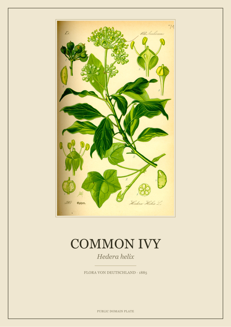
*Hedera helix* — common ivy — carries dense green-black foliage with glossy highlights and a woody stem. The plate holds up against walnut, dark-stained oak, or matte black metal at 10 to 15 mm. The high-contrast tonality of the drawing lets the frame be more present without competing. Pale frames on ivy under-serve the plate's gravity.
*Centaurea cyanus* — cornflower — is the exception plate. The blue is specific, saturated, and sits against very little else. The correct frame is minimal: thin pale maple or thin matte-champagne aluminium, 15 mm or less, with a wide cool-white mat (10 cm) that lets the blue breathe. Any warm or dark frame pulls the eye toward the frame instead of the colour.
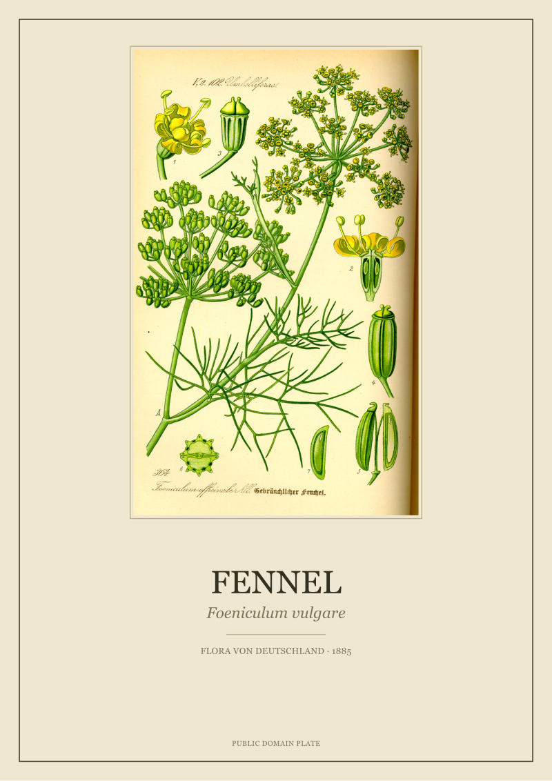
*Foeniculum vulgare* — fennel — is architectural, with tall vertical stems, finely divided leaves, and small umbels. The plate reads as drawing-dominant rather than colour-dominant, which lets the frame carry warmth: walnut or warm-stained oak at 25 to 30 mm with a cream mat holds the plate inside a visual language of 1885 botanical draughtsmanship without over-decorating it.
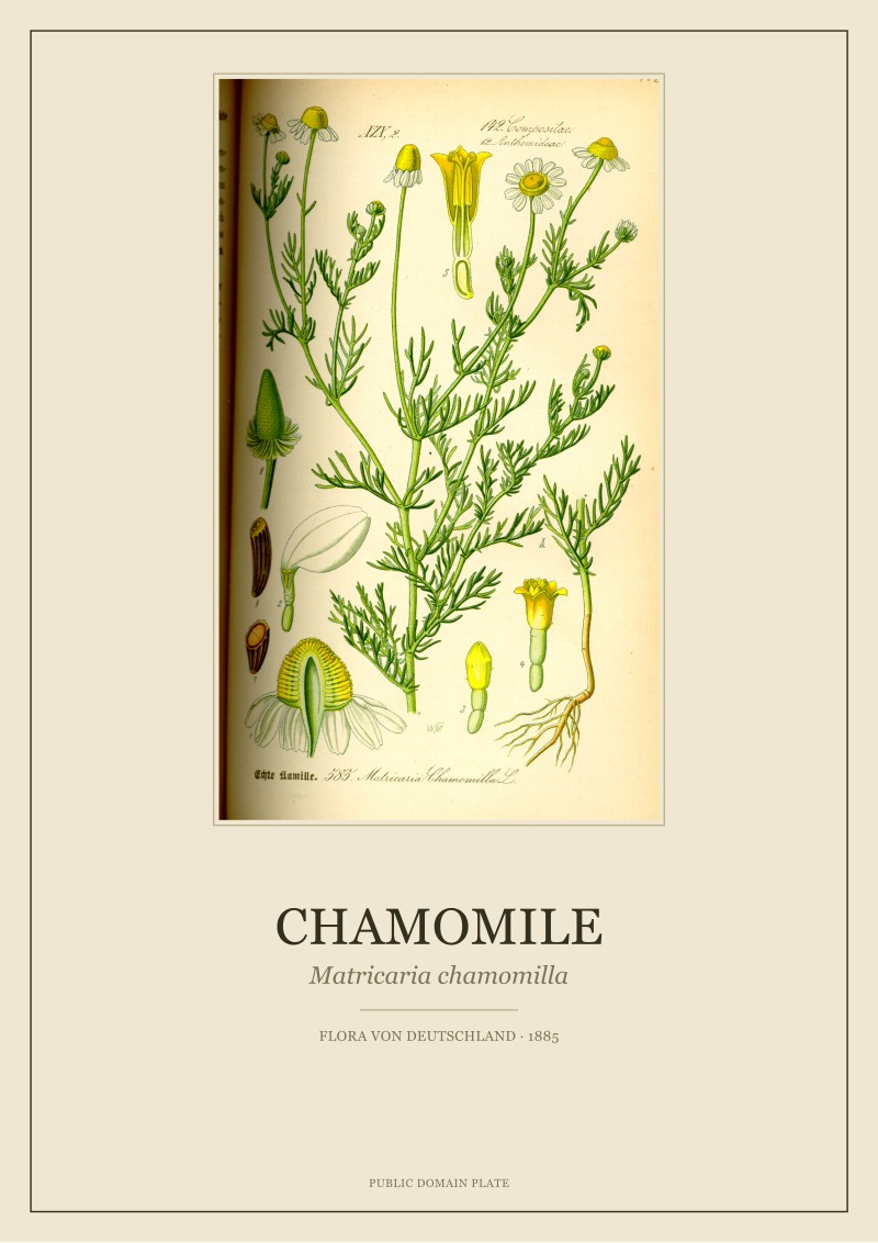 Chamomile
The print from this article · from €29.95
View the print →
Chamomile
The print from this article · from €29.95
View the print →
What a Wall of Botanicals Needs the Frame to Do
A single framed plate solves one problem. A wall of botanicals — three, six, nine plates arranged as a grid or salon hang — solves a different problem, and the frame decision changes accordingly.
The counter-intuitive rule is: on a wall of multiple plates, the frame should be more consistent than it would be on any single plate. If chamomile wants pale oak and ivy wants walnut, a six-plate grid of mixed species does not want three different frame profiles. It wants one profile — the most neutral of the three candidates — repeated across all six, with the mat colour taking on the species-specific adjustment. The eye tolerates variation in the plates and demands repetition in the frames; the inverse is visually chaotic.
The second rule concerns spacing. Frames on a gallery wall should sit between 5 and 7 cm apart edge-to-edge for a tight grid, and between 8 and 12 cm for a looser arrangement. Closer than 5 cm and the frames read as a single object; wider than 12 cm and the wall reads as scattered pictures rather than a composition. The mat width inside the frame and the gap between frames should be in rough proportion — a 10 cm mat with a 5 cm gap feels compressed; a 7 cm mat with an 8 cm gap feels resolved.
The third rule is about hanging height. The centre of the composition (not of each plate) should sit around 145 to 150 cm from the floor in rooms with standard 2.4–2.6 m ceilings — slightly below conventional "gallery height" because botanical plates reward being read closely, and reading closely means not having to tilt the head up.
None of this answers the question of how light will fall on the finished wall at 10:00 in May versus 16:00 in November, or whether the room's existing palette will accept the plates or override them. Those are the next questions, and they are not framing questions — they are placement questions. That is where the real work starts, and it is not where this piece ends.
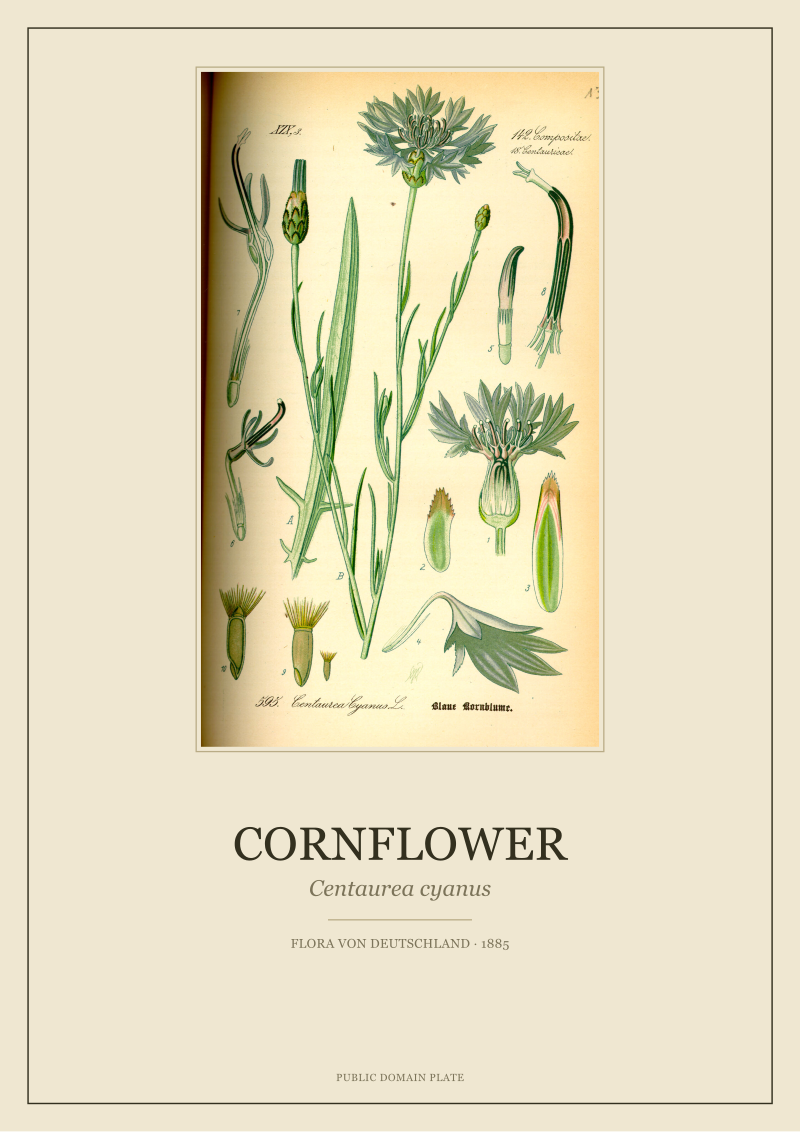 Cornflower
The print from this article · from €29.95
View the print →
Cornflower
The print from this article · from €29.95
View the print →
New plates from the archive and 10% off your first print.
One email now with your code. No noise after.