We have read maybe forty articles about botanical prints for a north-facing room, and they all quote the same thin canon: put green things in low light, avoid yellow because it turns grey, hang plants that "love shade." The advice is not wrong so much as it is talking about houseplants that never appear on our walls. A north-facing room does something specific to a 140-year-old chromolithograph — the O.W. Thomé plates we restore from Flora von Deutschland, Österreich und der Schweiz, 1885 — and almost nobody writes about that. This piece is a meta-critique of that gap.
We restore the Thomé plates by hand and by code. We have looked at scans of *Matricaria chamomilla*, *Hedera helix*, *Centaurea cyanus* and *Foeniculum vulgare* under morning light, noon light, and the flat cold light of a Berlin north window in February. What follows is what we wish someone had written before we started.
What They All Get Wrong
The shared error, the one that runs through nearly every article on this topic, is a category confusion: the writer talks about a print as if it were a plant. A pothos "tolerates" north light. A snake plant "thrives" in low light. So — the argument goes — a botanical print of a pothos should also do well on a north wall. That reasoning is charming and completely irrelevant. A chromolithograph is a stack of superimposed inks laid down on paper by a stone press. Its behaviour under north light is a printing question, not a botanical one. Whether the depicted species prefers sun or shade has no bearing on whether the depicted pigment holds up on a north wall.
The second error, downstream of the first, is a superstition about "cool colours." Countless guides tell readers to hang blue and green prints in north-facing rooms because those colours "harmonise with cool light." That is decorator shorthand doing very heavy lifting. A north window in a temperate European city delivers a diffuse light with a colour temperature above 6500 K on an overcast winter afternoon — bluer than daylight, essentially. What that light does to a chromolithograph is *desaturate warms and lift greens*. A cornflower plate, *Centaurea cyanus*, will look correctly blue on a north wall. A chamomile plate, *Matricaria chamomilla*, whose yellow disc florets are already a warm mid-yellow on the 1885 stone, will read slightly muted. Neither result is bad, but "hang blue because the light is blue" is aesthetic tautology, not advice.
The third error is species-by-folklore. Because ivy "grows in shade," a *Hedera helix* plate must belong in a shady room. Because chamomile "grew in the herb garden," a *Matricaria* plate must go in the kitchen. This is how you end up with rooms full of prints whose only unifying logic is a Victorian book of household hints. It is also how you end up hanging a fennel plate — *Foeniculum vulgare*, an umbellifer with an intricate high-line drawing and delicate umbels — in a low-light corridor where nobody can actually see the line. The plate loses its argument. The room gains a decoration.
None of the articles we read talked about paper, ink or line. All of them talked about plants.
What Is Almost Always Missing
What almost never gets named is the *material* under discussion. A restored Thomé plate is not a screen. It is ink on paper, and the paper matters. Studio prints are typically pulled on either a bright ivory rag stock or a slightly warmer natural white; each ground reflects north light differently, and the difference is visible from across the room. Ivory dampens the coolness of a north window and gently restores warmth to the yellow ochre of a chamomile disc. Bright white, by contrast, throws that same north light straight back and can make a warm plate look tired. This is a decision the framer makes and the reader lives with, and no guide we found mentioned it.
The second missing variable is *glare geometry*. North-facing does not mean sunless. In midwinter, at high latitudes, a low sun to the south can bounce off the pale façade of a building opposite a north window and hit a north-hung frame at exactly the angle that lights up the glazing. Under museum glass this is manageable. Under standard float glass it is a mirror. Anyone hanging four plates on a single north wall has to think about the angle of that bounce for at least an hour a day in December and January — again, a thing that never appears in "prints for shady rooms" articles.
The third missing variable is *latitude*. "North-facing" in Hamburg — where Thomé taught — is not "north-facing" in Athens, and it is certainly not "north-facing" in São Paulo, where "north-facing" is in fact the sun-facing wall of the room. Guides written for one hemisphere are read in the other and quietly deliver the wrong advice. In the Northern Hemisphere, a north room is the cool, indirect, contrast-flattening room; in the Southern Hemisphere it is the opposite. A responsible article on the subject either names its hemisphere or writes for both. Almost none do.
Finally, nobody talks about *line*. A chromolithograph's argument is made in line as much as in colour: the fine engraving under the tint. Under bright direct light, line reads instantly; under flat north light, line reads only if the plate has been restored with respect for the stone's original hairline weight. A *Foeniculum vulgare* plate with its umbels reduced to a smudge in a botched scan will die on a north wall. The same plate, restored line by line, will hold up in the softest possible light. Guides tell you to buy "botanical prints." They do not tell you which restoration you are looking at, and that is the entire ballgame.
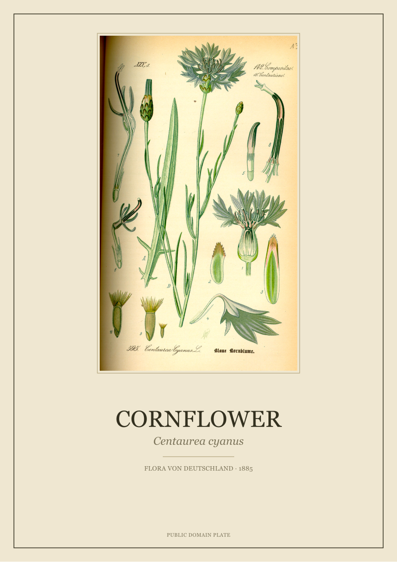 Cornflower
The print from this article · from €29.95
View the print →
Cornflower
The print from this article · from €29.95
View the print →
What I Would Say Instead
We would say: start from the plate, not the plant. North light is even, cool, contrast-flattening and steady — the kindest light a chromolithograph can live under, because it does not fade pigments the way direct south light will, and it does not throw the sharp raking shadows that flatter oil paintings and punish flatworks. A north wall is, quietly, a museum wall. Restored 1885 stones want exactly this. So the question is not "what shade-tolerant plant should I put here" but "which of our plates argues best in low-contrast light."
By that test, four Thomé species from Flora von Deutschland, Österreich und der Schweiz, 1885 do particularly well. *Matricaria chamomilla* is the anchor: a compact composite whose yellow disc and white ray florets are printed in a mid-key range that survives desaturation. Under north light the yellow steps back rather than dying, and the plate reads as an ivory-and-green study with a warm centre — quieter than in southern light, and better for a room you actually sit in. *Hedera helix* is the workhorse: essentially a study in five greens and a black line, which is precisely the vocabulary north light preserves best. An ivy plate on a north wall looks the way ivy plates were meant to look — as botany, not as decoration. *Centaurea cyanus* is the accent: a saturated cornflower blue that north light *intensifies* rather than mutes. In a room where every warm colour goes slightly grey, the cornflower is the note that will not. Hang one and it will do the work of three. *Foeniculum vulgare* is the connoisseur's choice: an umbellifer whose whole appeal is line — thousands of tiny umbels drawn against pale ground. In direct south light the line is loud; in north light it is legible in a way that rewards standing closer. It is the plate that gets studied, not just seen.
A working hang order on a single north wall, then, might read left-to-right as ivy, fennel, chamomile, cornflower — the darkest, densest plate anchoring one end; the finest line drawing next to it where the eye can slow down; the mid-key composite in the middle to warm the run; the saturated blue at the far end so that the wall ends on a chord, not a fade. Mounted on ivory rag, framed behind low-reflect glass, spaced by roughly the width of a hand rather than by decorator-standard four inches, and hung at a slightly lower centre-line than a sunlit wall would call for, because north-light viewing distances tend to be conversational rather than passing.
That is a wall built for north light, not around a plant's shade tolerance. It respects the plate as a printed object and lets the room's own quality of light finish the work Thomé started in 1885.
FAQ
Will north light fade a restored Thomé chromolithograph over time?
Direct, prolonged sunlight is the main fading risk for any print, chromolithograph or otherwise, because ultraviolet exposure degrades pigment. A north-facing wall in the Northern Hemisphere receives essentially no direct sun, which is why museums treat north light as the conservative choice. Framing behind UV-filtering glazing further reduces risk. This is one of the reasons a north room is, in practice, one of the friendliest environments for a restored 1885 plate.
Which of the four plates works best if I can only hang one on a north wall?
If the wall is narrow and you want a single plate to carry it, we would point to *Centaurea cyanus*. Cornflower is the one species in this quartet whose defining pigment — a saturated cool blue — is actively flattered rather than muted by north light. In a room where most warm tones step back, the cornflower plate holds its argument at any distance, which is exactly what a solo hang needs to do.
Does the hemisphere I live in change any of this advice?
Yes, and it is the point most guides miss. In the Southern Hemisphere the sun-facing wall is the north wall, so "north-facing" there refers to the bright, warm, high-light room — the opposite of what a European reader assumes. Everything in this piece is written from the Northern Hemisphere frame Thomé himself worked in. If you are in the Southern Hemisphere, translate: read "north-facing" as "south-facing" and the same logic about even, cool, indirect light applies.
Should I choose ivory paper or bright white paper for a north wall?
We tend to recommend ivory. North light is already cool and slightly blue; a bright-white ground amplifies that coolness and can make the warm passages of a plate — the yellow of *Matricaria*, the greenish-yellow umbels of *Foeniculum* — read a little tired. An ivory rag stock adds back a touch of warmth without falsifying the plate. It is a small decision that changes how the whole wall feels.
Are these plates historical apothecary illustrations, and can I frame them as such?
The Thomé plates are botanical scientific illustrations from Flora von Deutschland, Österreich und der Schweiz, 1885 — a systematic flora of German-speaking Europe, not a materia medica. Several of the depicted species, including chamomile and fennel, do have long historical associations with the domestic apothecary, and it is fair to mention that as history when hanging them. It is not fair, and we do not do it, to present them as illustrations of medicinal efficacy.
How many plates should I hang together on a single north wall?
There is no rule, but there is a working answer: three to five plates on one wall gives you enough vocabulary to build a chord without crowding the low-contrast light. Two plates read as a pair, which is quiet but a little formal; six or more start to compete with themselves under flat light, where the eye cannot use shadow to separate frames. Four is the number we most often recommend for a single north wall in a lived room.
Do I need museum-grade glass on a north-facing hang?
Museum-grade glazing — low-reflect, UV-filtering — is a real upgrade on any wall, including a north wall. On a north wall its most visible benefit is the reduction of the winter glare bounce we described: low sun off a pale opposite façade can still reach a north-hung frame, and standard float glass will mirror it. Museum glass tames that bounce and lets the plate keep reading as a plate rather than as a reflective surface, at any hour.
Is there a Thomé plate I should specifically *not* hang in a north-facing room?
Within the four species we restore and discuss here — *Matricaria chamomilla*, *Hedera helix*, *Centaurea cyanus*, *Foeniculum vulgare* — none is a poor choice for a north wall; all four were designed as line-and-tint studies that read well in even light. The plates we would be more careful with in flat light are ones whose entire argument depends on a single high-key warm passage against a busy ground, where north-light desaturation removes the contrast the composition was built on. That is a different conversation, and none of these four fall into it.
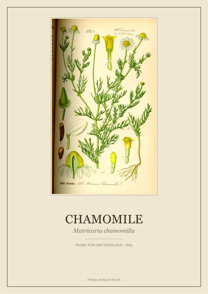 Chamomile
The print from this article · from €29.95
View the print →
Chamomile
The print from this article · from €29.95
View the print →
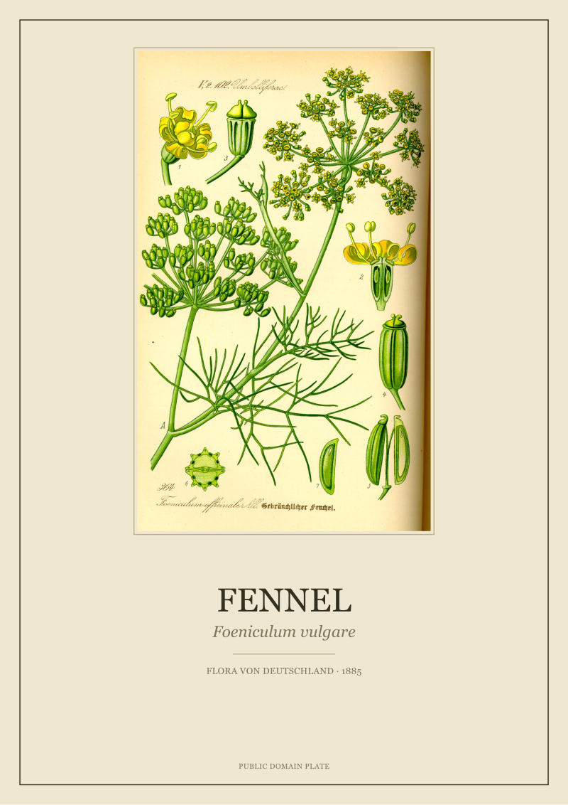
New plates from the archive and 10% off your first print.
One email now with your code. No noise after.