A botanical print is a serious gift for a plant lover, and most of what is sold under that label is not one. The difference is not taste; it is vocabulary. Ten terms separate a restored 1885 plate — Thomé's chamomile, ivy, cornflower, fennel from *Flora von Deutschland, Österreich und der Schweiz* — from a drop-shipped poster with a stock-photo daisy on it. Nobody needs a fine-art degree to give the better gift. What is needed is the ability to read a product page skeptically. This piece walks the ten terms in the order they matter, foundational to advanced.
Public Domain
Public domain means the copyright has expired and the image belongs to everyone, legally and forever. It is the foundation of every honest botanical print sold today; without it, the seller is either paying a licence or lying about the source.
Why it matters in practice: a plate from 1885 is unambiguously public domain in every jurisdiction that follows the life-plus-seventy rule, because the illustrator O.W. Thomé and everyone who worked on the original book are long dead. A shop selling a "vintage botanical" that is really a 1998 watercolour scanned off Pinterest is not in the same category, and the plant lover who receives it will, eventually, notice.
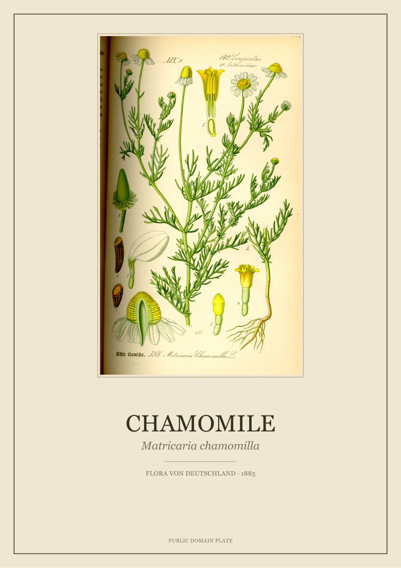
The concrete example: Thomé's *Matricaria chamomilla* plate from *Flora von Deutschland, Österreich und der Schweiz* (1885) can be legally restored, printed and sold by anyone. The plate itself is free. What is not free is the labour of restoring it well, which is what the price tag pays for. If a listing cannot tell you the year and the source book, the "public domain" claim is decoration.
Botanical Plate
A botanical plate is a single full-page illustration from a scientific flora, drawn to identify a species — habit, leaf, flower, fruit, seed, sometimes root, all on one sheet. It is not a decorative print pretending to be scientific; it is a scientific document that turned out to be beautiful.
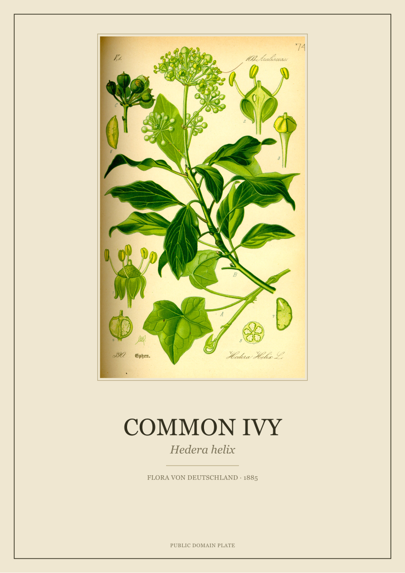
Why it matters as a gift: the plant lover on the receiving end can read a plate. They can see the venation of a *Hedera helix* leaf and check it against the ivy on their kitchen wall. They can compare the umbels on Thomé's *Foeniculum vulgare* to the fennel bolting in their raised bed. The plate rewards a second look in a way a stylised flower silhouette does not.
The concrete example: Thomé's common ivy plate shows leaf shape at multiple stages of growth, flower cluster, and berry — because a botanist in 1885 needed all of that to key the species out. The gift is that a hundred and forty years later, that same completeness is what makes the image hold a wall.
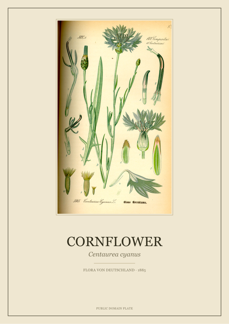 Cornflower
The print from this article · from €29.95
View the print →
Cornflower
The print from this article · from €29.95
View the print →
Flora von Deutschland
*Flora von Deutschland, Österreich und der Schweiz* is the 1885 illustrated flora of the German-speaking lands, drawn under the direction of Otto Wilhelm Thomé. It is the source book behind a large share of the serious botanical prints in circulation today, and the specific book behind every plate the studio sells.
Why it matters: knowing the source is what turns a print from a mystery poster into a citation. "Chamomile print" is a description. "*Matricaria chamomilla*, Thomé, *Flora von Deutschland*, 1885" is a provenance line — the same shape a museum uses. Anyone can verify it; nobody has to trust the seller's word.
The concrete example: Thomé's cornflower, chamomile, ivy and fennel all come from the same work, drawn in the same visual grammar in the same window of years. Hung together they read as a set because they are a set. A gift of two Thomé plates is a small conversation about one book; a gift of four is a chapter.
Chromolithography
Chromolithography is the multi-stone colour printing process that made illustrated science books affordable in the second half of the nineteenth century. Each colour was drawn on a separate limestone slab and printed in register, one on top of the other, until the plate was complete.
Why it matters for a gift: the aesthetic of a 1885 chromolithograph is not a filter that can be faked convincingly. The colour separations sit slightly differently than modern CMYK; the flat blocks of pigment have edges that a digital gradient does not. A plant lover who has looked at enough botanicals will feel the difference before they can name it.
The concrete example: the blue of Thomé's *Centaurea cyanus* is a chromolithographic blue — laid down as its own pass, on its own stone, and it reads as ink rather than as pixel. When the studio restores this plate, the goal is to keep that ink-on-paper feeling intact, not to smooth it into a stock illustration. The recipient is getting an artefact of 1885 printing, not a pastiche of it.
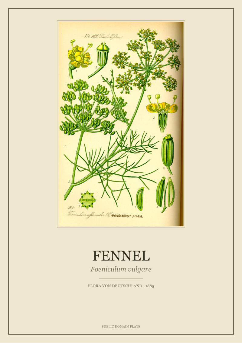 Fennel
The print from this article · from €29.95
View the print →
Fennel
The print from this article · from €29.95
View the print →
Species Portrait
A species portrait is a botanical image whose subject is a single named species, treated as an individual rather than a decorative motif. It has a Latin name attached, and the drawing is answerable to that name. This is the smallest unit of a serious botanical print.
Why it matters: gifts land harder when they are specific. "Flowers" is not a gift; *Foeniculum vulgare* is a gift, especially for someone who cooks with fennel or grows it. A species portrait says: I noticed which plant you love. It also means the recipient can hang it next to the living plant and get a small daily rhyme.
The concrete example: Thomé's fennel plate is a portrait of *Foeniculum vulgare*, not "yellow herbs". The umbel structure is drawn accurately enough that a herbalist could identify it; the seed detail is drawn because seed is how fennel is recognised in autumn. The gift, once unwrapped, keeps working — the plant lover can read new things off it in year three that they missed in year one.
Provenance
Provenance is the traceable history of an image: who drew it, in which book, in which year, under which licence. In the botanical print market it is the single strongest indicator of whether the object is what it claims to be.
Why it matters practically: provenance is what you check before spending money. A listing that says "vintage botanical illustration, high quality" has no provenance. A listing that says "*Hedera helix*, plate by O.W. Thomé, from *Flora von Deutschland, Österreich und der Schweiz*, 1885, public domain, restored from the original scan" has provenance. The gap between the two is the entire quality signal.
The concrete example: every plate the studio prints carries the same four-line label — Latin name, artist, source work, year. That label is not marketing copy; it is the same information a museum object card carries, in the same order. If the recipient wants to check any of it against a library scan, they can. The provenance is verifiable, which is the only kind that counts.
Restoration
Restoration is the work of taking a 140-year-old scan of a printed page and bringing it back to something close to what the printer's proof looked like in 1885, without inventing anything the plate never contained. It is where a public-domain image becomes a sellable object.
Why it matters: the raw scans in library archives are yellowed, foxed, occasionally torn, often bound tightly enough that the gutter warps the image. A file dragged straight off Wikimedia and printed on a home inkjet is not a botanical print; it is a photocopy of a damaged page. Restoration is the invisible labour that closes the gap between archive and wall.
The concrete example: Thomé's cornflower plate arrives from the scan with a warm yellow cast from the paper, small brown foxing spots, and a slightly bowed centre. Honest restoration removes the age-stain and the foxing, corrects the geometry, and stops there. It does not repaint the blue, does not add petals, does not "enhance" contrast until the image looks like a modern illustration. What the recipient hangs is Thomé's cornflower, cleaner.
Giclée Print
Giclée is the accepted trade term for a fine-art inkjet print made with pigment inks on archival paper. It is the current standard for reproducing restored botanical plates because it holds fine line detail and is rated to resist fading for a century or more indoors.
Why it matters for a gift: the format decides whether the print survives the recipient. A dye-based office inkjet on copier paper will fade visibly in a sunny room within a few years; pigment ink on cotton rag will not. If the listing does not say "giclée" or "pigment ink" or "archival", it is almost certainly neither.
The concrete example: a restored Thomé chamomile printed giclée on 300 gsm cotton rag reads black-where-it-should-be-black and holds the fine hairs on the stem that Thomé's original engraver bothered to draw. The same file sent to a drop-ship poster service comes back on thin coated paper with the blacks lifted to grey and the hairs blurred. Same image, different object. Only one is a gift.
Paper Weight (GSM)
Paper weight in grams per square metre (gsm) is the measurement of how heavy — and, roughly, how substantial — a sheet of paper is. In prints, it separates a poster from an art object at the moment of unwrapping.
Why it matters: below about 200 gsm, paper feels like a page torn from a magazine and will curl in a frame within a season. At 250–300 gsm, the sheet has the stiffness and hand of a museum shop print; it lies flat, holds a bevel, and takes a signature without warping. The recipient does not have to know the number to feel the difference; they will feel it when they lift the print out of the tube.
The concrete example: the studio prints its restored Thomé plates on 300 gsm cotton rag because that is the weight the plate deserves. A cornflower on 170 gsm gloss and a cornflower on 300 gsm cotton are, physically, two different gifts even before either is framed. The heavier paper also survives being pinned up in a rented flat without a frame — the print does not slouch.
Framing Margin
Framing margin is the band of blank paper the studio leaves around the printed image, sized to sit inside a standard frame with a mount and to give the plate visual room to breathe. It is the last decision that separates a print you can hang from a print that needs a trip to a framer before it can leave the tube.
Why it matters: a botanical plate crammed edge-to-edge on the sheet looks like a document; the same plate with a generous margin looks like an object. The margin is also what makes the print compatible with off-the-shelf frames — A3, A2, 30×40, 50×70 — instead of requiring a bespoke cut. A gift the recipient can hang the same weekend is a better gift than one that lives in a tube for six months waiting for a framer's appointment.
The concrete example: the studio's Thomé ivy plate ships with a margin that seats it cleanly inside a standard A3 frame with a white mount and inside an A2 frame without one. Either way the ivy is centred, breathing, and legible from across the room. The Latin name, the artist, the source and the year sit under the image in a single quiet line — the provenance from earlier in this piece, printed on the object itself. That is the whole gift: a plate that was drawn in 1885, restored honestly, printed heavy, and ready to hang. If any of the terms above are missing from a listing, the print in the box will be missing something too. You can see the studio's own restored plates from Thomé's *Flora von Deutschland* at see the Cornflower print.
FAQ
How do I tell a real botanical plate from a drop-shipped poster before buying?
Read the listing for four facts: the Latin name, the illustrator, the source work, and the year. If any of the four is missing or vague ("vintage style", "inspired by"), it is almost certainly not a restored public-domain plate. Also check the paper weight (300 gsm cotton rag is the honest signal) and whether the word "giclée" or "pigment ink" appears. Absence of those two phrases means the print will fade or curl within a few years.
Is it legal to sell prints of Thomé's plates from 1885?
Yes. *Flora von Deutschland, Österreich und der Schweiz* was published in 1885 and its illustrator O.W. Thomé has been dead well over seventy years, which puts every plate in the book firmly in the public domain in every jurisdiction that follows the standard copyright term. What can still be sold — legitimately — is the labour of restoring the scan and printing it well. The image is free; the object is not.
Which Thomé plate is the safest gift for someone whose taste I do not know?
The common ivy plate — *Hedera helix* — is the most forgiving choice. Ivy is the botanical everyone recognises, the palette is quiet greens rather than a saturated colour, and the plate carries well in both period interiors and modern minimalist rooms. Chamomile is a close second for the same reason: familiar, small-scaled, unaggressive on colour. Cornflower is a stronger statement because of the blue.
How many prints should I gift for it to feel like a set?
Two Thomé plates already read as a pairing because they share visual grammar, palette range and provenance. Three or four turn a wall into a small herbarium and are the point at which the source book becomes visible as an idea. Beyond six on one wall, the individual plates start losing to the grid. For a first gift, two is the sweet spot: enough to make the choice look intentional, few enough to be easily framed.
What frame size should I buy for a standard restored plate?
A generous framing margin is designed to fit off-the-shelf sizes. A3 (297×420 mm) with a white mount is the most common and the easiest to source; A2 (420×594 mm) without a mount is the alternative for larger walls. If the plate is being gifted alongside the frame, err toward A3 — the recipient is far more likely to already own a wall spot that takes an A3 than a bespoke size.
Does the print need glass, or is unframed acceptable?
Both are acceptable, and each says something different. Behind glass with a mount, the plate reads as a document and gets full UV protection — the honest choice for a print that will hang in direct light for decades. Pinned unframed to a wall, on 300 gsm cotton rag, the plate reads as an object and shows off its paper. If the recipient rents and moves often, unframed is genuinely a good answer, not a compromise.
Will the colours match what I see on screen?
Approximately, not exactly. Screens are backlit and biased toward saturation; paper is reflective and biased toward the ink actually laid down. A restored Thomé cornflower on screen will look a shade more electric than the same plate in the hand, where the blue reads as ink — closer to how a chromolithograph in 1885 read to its first readers. This is a feature of the medium, not a printing fault; the paper version is the one that survives on a wall.
From the collection
New plates from the archive and 10% off your first print.
One email now with your code. No noise after.