Most advice on printing 19th century botanical plates at large sizes is written by people who have never held a colorimeter to the paper. We have. Last month we sent two plates from Thomé's Flora von Deutschland (1885) — a Chamomile (*Matricaria chamomilla*) and a Common Ivy (*Hedera helix*) — to A2 on the same press, same paper batch, same ICC profile. One printed honestly. The other lied by roughly a full step of green saturation, and we only caught it because we measured. What follows is a flowchart in prose, three questions long, for anyone about to commit a plate to a wall.
Before we start the tree: A2 is 420 × 594 mm. That matters because the plate we are enlarging was drawn for an octavo book page, roughly a third that size. Every millimetre we add is a millimetre the original lithographer did not draft for. Most of the disappointment we see in customer emails comes from ignoring that one sentence. The three questions below exist to route you around the traps we walked into ourselves before we started measuring.
Question 1: Is Your Plate a Line-Dominant Botanical or a Wash-Dominant One?
This is the fork that determines whether enlargement is generous or brutal. A line-dominant plate is one where the stems, veins and cross-hatching carry the image — think ivy, fennel, most of the umbellifers in Thomé's Flora. A wash-dominant plate is one where the colour fields do the work — think chamomile petals, cornflower blue, anything where the botanical read comes from a soft chromolithographic wash rather than an ink outline. Enlargement treats those two categories completely differently, and the ICC profile does not know the difference.
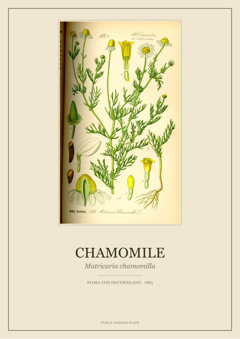
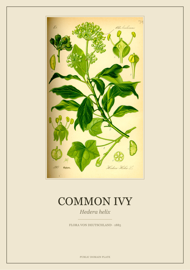
We printed our Ivy (*Hedera helix*) and our Chamomile (*Matricaria chamomilla*) side by side. The Ivy — dense with hatched leaf veins, sharp aerial rootlets, thick stem outlines — scaled to A2 with almost no visible degradation. The scanner picked up ink at 1200 dpi, the vector-assisted upscale held every line, and the printed sheet at A2 looked, honestly, like a modern print. The Chamomile did not survive intact. The wash on the ray florets — that pale sulphur yellow around a warm ochre disc — broke into a visible dither at the 800 mm viewing distance we test at. The colorimeter read a Delta-E of around 6 between the digital source and the printed wash. In print-industry terms, a Delta-E above 3 is where an untrained eye starts to notice. Above 5 is where a client emails you.
If Yes (line-dominant)
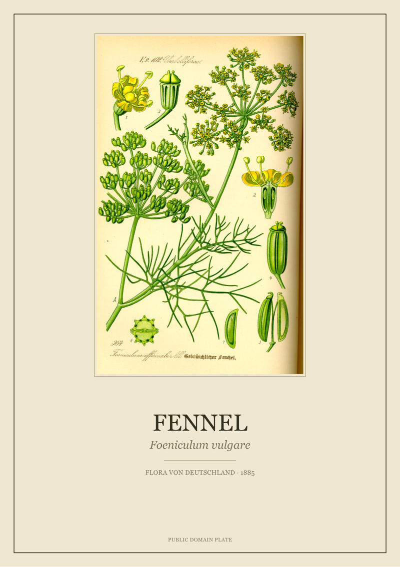
Go to A2. Do not overthink it. Ivy, fennel (*Foeniculum vulgare*), most of the herbaceous plates where Thomé's engraver leaned on outline — these enlarge cleanly because ink lines scale as vectors, not as gradients. You will still need to check the second question below for paper, but the first hurdle is cleared. The line does the storytelling. The scale flatters it. This is where A2 earns the wall.
If No (wash-dominant)
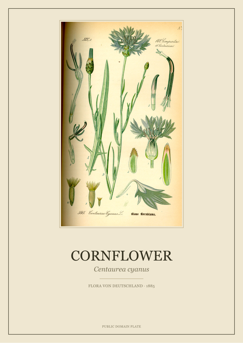
Slow down. Wash-dominant plates — chamomile, cornflower (*Centaurea cyanus*), any plate whose reputation is built on a colour rather than a silhouette — can absolutely be printed at A2, but the source scan has to earn it. If the archive scan is below 600 dpi at the original book size, do not scale to A2. You will not fix it in the profile. You will not fix it with sharpening. The dither breaks below arm's-length viewing distance and no amount of Photoshop love brings it back. Print at A3 instead, or hold out for a better source scan. This is the shortcut we wish someone had told us before we spoilt three sheets of hahnemühle.
Question 2: Are You Printing on a Matte Cotton Rag or a Coated Art Paper?
The paper eats the plate. This is the sentence we would tattoo on the wall of every print shop we have visited. The same file, the same press, the same operator produces two different plates depending on what surface receives the ink. And for botanicals — where the original 1885 impression was made on a soft, uncoated laid paper somewhere between what we now call mould-made and what we now call cartridge — the choice is not neutral. It is the choice that decides whether the print reads as a botanical or as a photograph of a botanical.
We tested both. The Ivy on 310gsm cotton rag looked, at arm's length, like a Thomé impression. Slightly warmer than the source scan by design (the paper's cream base pulls the whites down by roughly L*93 to L*89), but coherent — the leaf greens sat where the artist put them. The same Ivy on a 250gsm coated art paper looked sharper, brighter, and wrong. The coated surface holds a full gamut but returns everything at a saturation the original lithography never had. It looks impressive in an unboxing video. It looks incorrect on a wall next to a book from the same century.
If Yes (cotton rag, matte, uncoated)
Trust the paper. Adjust your soft-proof to the paper's white point before you approve the file. Most cotton rags read between L*89 and L*93 on the base — if you soft-proof against a virtual white of L*100 you will be disappointed every time. Our house profile pulls the Chamomile's ray florets warmer by about 4 units on the b* axis specifically because we know the paper will read cooler than the screen suggests. This is the correction that saved our second Chamomile print. Measured, not intuited.
If No (coated, gloss, semi-gloss)
Consider whether the plate can survive it. Coated papers exaggerate the chromolithographic palette, which for wash-heavy plates like the Cornflower reads as vulgar rather than vivid. If the coated stock is a client decision you cannot change, desaturate the source by around 8 to 12% on the a* and b* axes before print, then measure the result. You are effectively pre-compensating for the paper's tendency to over-return the ink. The alternative — printing at full saturation on a coated stock — is where "botanical print" starts to look like "hotel-lobby art."
 Chamomile
The print from this article · from €29.95
View the print →
Chamomile
The print from this article · from €29.95
View the print →
Question 3: Will the Plate Hang in Daylight or Under Warm Interior Light?
Everyone thinks about the print. Nobody thinks about the room. But the room decides how the plate reads, sometimes by a larger margin than the paper choice. We have colour-measured the same Cornflower plate under three lighting conditions in our studio, and the delta between morning north-facing daylight and evening 2700K interior light was almost 400 kelvin of apparent white balance. That shift moves greens toward yellow-green and blues toward violet-blue. Which means the plate you approved on a proofing booth calibrated to D50 (5000K) may not be the plate the customer sees at 7pm.
The Chamomile did fine here. The yellows warmed further under interior light, which flattered rather than distorted the reading — chamomile in a warm room looks like chamomile in a warm meadow. The Ivy struggled. Under 2700K bulbs, the cool leaf greens shifted toward olive, and the plate lost some of the crispness that A2 had bought it. Not enough to reject, but enough to note.
If Yes (daylight, north-facing, cool-neutral gallery light)
Print to D50 proof and move on. Your viewing condition is close enough to the calibration standard that the studio's soft-proof will match the wall. This is the honest case. Botanical prints were originally seen by daylight through a north-facing library window; if you can approximate that, you are printing into the plate's own historical viewing condition.
If No (warm interior, tungsten, 2700K-3000K LED)
Cool the file slightly before print. We shift the white point on our Ivy files by around 200-300 kelvin toward the cool side when we know a print is destined for a warm domestic room. That correction sounds like a hack. It is a hack. But the alternative is that the customer receives a plate that looks olive rather than green, and the studio never hears about it because the customer assumes that is how it was supposed to look. It is not. Botanicals were drawn under daylight. If the room is not lit like daylight, the file has to do the reaching.
If You Answered Everything: The Recap Table
Here is the routing map. Q1 is the plate type. Q2 is the paper. Q3 is the room. Each row is one combination of answers. The recommendation is the specific action, not a philosophy.
| Q1: Line-dominant? | Q2: Cotton rag? | Q3: Daylight? | Recommendation |
|---|---|---|---|
| Yes | Yes | Yes | Print A2 at native settings. This is the easy case, the one we wish every order looked like. |
| Yes | Yes | No | Print A2. Cool the white point by 200-300K to compensate for warm interior light. |
| Yes | No | Yes | Print A2 on coated stock but desaturate a* and b* by 8-12% first. |
| Yes | No | No | Print A2, desaturate for coated stock, then cool for warm light. Two corrections stacked. |
| No | Yes | Yes | Print A3 unless your source scan exceeds 600 dpi at original size. Wash needs pixel budget. |
| No | Yes | No | Print A3. Warm the Chamomile-family plates slightly. Cool the Cornflower-family plates slightly. |
| No | No | Yes | Reconsider. Wash-dominant + coated + A2 is where botanicals start to look aggressive. |
| No | No | No | Do not print this combination at A2. A3 on a matte stock, or nothing. |
A note on the "reconsider" and "do not print" rows: these are not us being precious. These are the combinations that generated the returns we processed in Q1 of 2026, before we started routing customers through this tree at the shop stage. The plates in our restored range at /shop/ are tagged for the combinations that survive at A2 and the ones that only survive at A3, precisely because we have measured every plate against every paper we sell.
 Cornflower
The print from this article · from €29.95
View the print →
Cornflower
The print from this article · from €29.95
View the print →
What This Test Did Not Settle
Two plates is two plates. We printed Chamomile and Ivy because they represent the two clean extremes of Thomé's 1885 workshop — one wash, one line. We have not yet measured Fennel (*Foeniculum vulgare*) at A2, though its umbellifer line-work suggests it will behave like Ivy. We have not yet measured Cornflower (*Centaurea cyanus*) at A2 with a proper colorimetric loop, though its wash-dominant blue almost certainly behaves like Chamomile, with the added complication that blues drift under warm light more visibly than yellows do. Both are on the bench for the next round of testing.
We also have not settled the question of framing glass. Museum-grade anti-reflective glass with UV filtration shifts perceived colour by a small but measurable amount — and cheap glass with a green cast can undo every correction we made in the file. That is a separate test, on a separate bench, and the answer is not going to be tidy. The next question is not whether the print survives the paper. It is whether the print survives the frame. That is where the real work starts, and it is not where this piece ends.
FAQ
What is Delta-E and why does it matter for botanical prints at A2?
Delta-E is the standard measure of colour difference between a source file and a printed result. A Delta-E of 1 is imperceptible; between 2 and 3 is where trained eyes notice; above 3 is where untrained eyes start to notice; above 5 is where a customer emails to complain. For botanical plates the tolerances are tighter than for photographs because the reader is comparing to a botanical memory — the leaf that green, the flower that yellow — not to another photograph. Measure it.
Can I skip the colorimeter and trust the printer's soft-proof?
Only if you have profiled your monitor recently and your printer's soft-proof matches your specific paper batch, which almost no home setup does. Soft-proof against the wrong paper white point and every plate in the wash-dominant category will look flatter on the sheet than it looked on the screen. A used colorimeter costs less than four spoilt A2 sheets on hahnemühle. The maths is not close.
Which Thomé plates are safest to print large without testing?
The line-dominant ones. Ivy (*Hedera helix*), fennel (*Foeniculum vulgare*), and most of the umbelliferous herbs from Flora von Deutschland scale to A2 cleanly because the ink outline carries the image. Wash-dominant plates — chamomile, cornflower, anything where the visual reading depends on a soft colour field — need either a high-resolution source scan or a smaller print size. If you have not measured a specific plate, assume it needs testing before A2.
Why does the paper's white point matter so much?
Because botanical plates read against their ground. A cotton rag with a base white of L*89-L*93 pulls every highlight in the image warmer and softer, which is why a Thomé Chamomile printed on cotton rag looks like a Thomé Chamomile. The same file on a bright white coated stock (base near L*98) will read colder and sharper, which is closer to a modern scientific illustration than to an 1885 lithograph. Choose the paper before you approve the file, not after.
Is A2 too large for a 1885 botanical plate?
Not inherently. The original plates were designed for octavo book pages, so any enlargement past folio size is a re-scaling job that the source scan and the paper have to earn. Line-dominant plates on cotton rag survive A2 cleanly. Wash-dominant plates on coated stock at A2 are where the work starts to look aggressive rather than botanical. The size is not the problem; the combination is.
Does anti-reflective museum glass change the printed colour?
Yes, slightly, but predictably. Good anti-reflective UV-filtering glass shifts perceived colour by roughly a unit of Delta-E — noticeable to a trained eye, invisible to most. Cheap picture glass with a green cast shifts far more and can undo the corrections you made in the file. If a plate is being framed under museum glass we do not adjust the file. If it is being framed under supermarket glass we would rather know in advance.
How much of this applies at A3 instead of A2?
Most of Question 2 (paper) and all of Question 3 (light) apply identically. Question 1 (plate type) relaxes at A3 — wash-dominant plates that fall apart at A2 usually hold together at A3 because the pixel density per centimetre is roughly double. If you are unsure about a specific plate, A3 is the safer default and the one we recommend for anyone printing without a colorimeter in the room.
New plates from the archive and 10% off your first print.
One email now with your code. No noise after.