There is a pattern that shows up every time we test a botanical plate at A2, and it is not the one the internet promises. The colour on a restored 1885 plate — an O.W. Thomé cornflower, say, pulled from the Flora von Deutschland, Österreich und der Schweiz — never lands where the screen said it would. We ran a recent batch of six through A2 test prints and measured the ink against the target sheet by sheet. What came back was not a story about pigment. It was a story about paper, and about which parts of a 140-year-old lithograph a modern press is still willing to honour.
The Paper Decides Before the Ink Does
The pattern we keep documenting: before a single drop of ink lands, the paper has already decided how far off the target the print will be. We watch this happen every time a batch moves from screen approval to press. The colour proofs on our calibrated displays are, by that stage, essentially fiction. The paper is the real specification.
The 1885 plates by O.W. Thomé were originally printed by chromolithography onto a lightly sized, semi-opaque stock — a paper that absorbed a specific amount of pigment before saturating and that reflected a warm neutral back through the ink film. When we restore those plates for A2 output, we are not printing onto anything remotely equivalent. We are printing onto contemporary museum-grade cotton rag, or a matte archival alpha-cellulose, or in a couple of test cases a hot-press watercolour sheet. Each of those has its own dot gain, its own optical brightening agent load, its own base whiteness reading on the L\* axis. And each one, before ink touches it, has already rewritten the tone map.
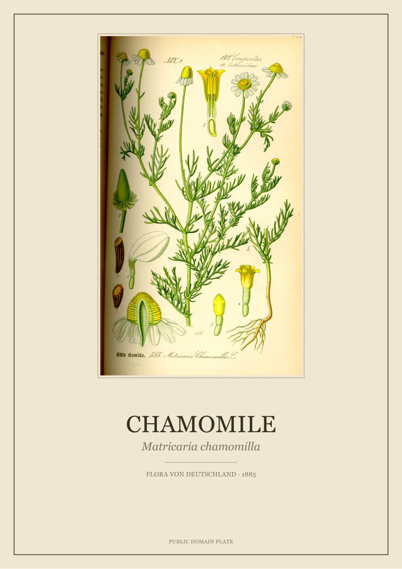
The Chamomile plate is the cleanest illustration of this. On our master file, the yellow disc florets of *Matricaria chamomilla* read at a specific chroma. On the museum cotton, they came in warmer and slightly duller than target — the paper's cream base was subtracting brightness from the yellow before the eye ever got to the ink. On the alpha-cellulose, the same yellow read cleaner but colder, because the optical brighteners were pushing blue up under the pigment layer. Same file. Same press. Same batch of inks. Two different paintings.
We had assumed, when we started measuring, that the interesting variance would be in the pigment behaviour — the specific way modern CMYK archival inks approximate a lithographic hue-set from 1885. It is not. The interesting variance is entirely in the substrate. The ink is the honest partner in the transaction. The paper is the one with an agenda.
Green Is Never One Green, Especially at A2
The second pattern is one every restoration studio learns eventually and few discuss publicly: on an A2 print, the greens do not survive as a single family. They split. And they split in a way that is visible from across the room, not just under a spectrophotometer.
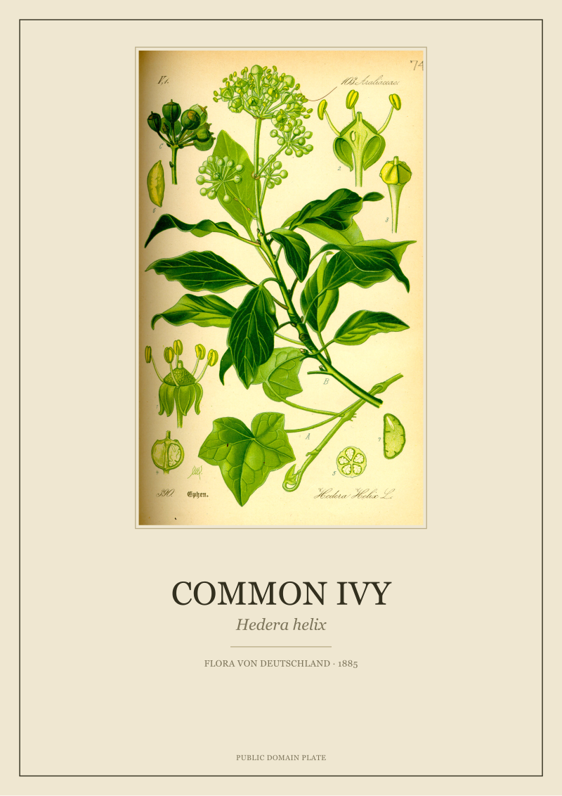
The Common Ivy plate — *Hedera helix* as Thomé drew it in 1885 — is our standing test for this. The plate carries at least four botanically distinct greens: the deep waxy green of the mature leaf face, the paler green of the underside, a yellow-shifted green in the emerging leaves, and the almost olive green Thomé used in the shading strokes along the veins. On a small print, all four can be nudged into a coherent green family with a single global correction. At A2, they refuse. The mature-leaf green wants to go cooler under press conditions. The underside wants to warm. The shading olive wants to lift and lose contrast. If you correct globally, one of the four will always be wrong enough to notice.
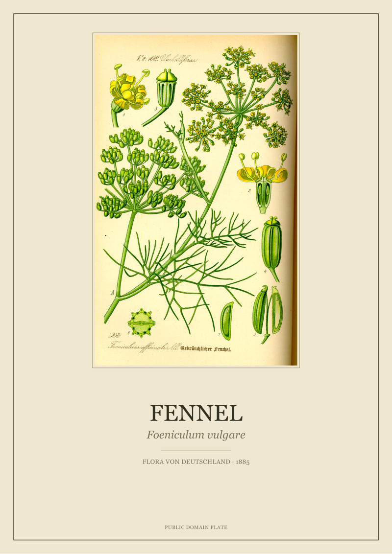
The Fennel plate — *Foeniculum vulgare* — repeats the pattern but in a narrower band. Fennel is a green-on-green subject: the finely divided foliage sits against a lighter stem and against umbels that are themselves green-yellow. On the measured A2 sheet, the foliage green came in almost exactly on target, but the umbel green drifted noticeably warm, breaking the tonal step the original lithographer had built between the two masses. On the A3 test print of the same file, the drift was there in the measurement but the eye did not read it. At A2, the eye read it immediately.
This is the part of the restoration work that resists automation. You cannot batch-correct a green family into behaving. You have to isolate each green as a separate patch, measure it after the print, and decide which of the four you are protecting and which two you are letting drift. On the Ivy, we protect the mature-leaf face and the veining olive, because those carry the drawing. We let the underside and the emerging leaf move by up to two Delta-E units. On the Fennel, we protect the foliage and let the umbel warm. Every plate has its own decision tree, and the decision only gets made after the A2 sheet is on the light table.
The colour meter tells you what the ink did, but the plate itself tells you which of its greens you were never allowed to sacrifice in the first place.
 Cornflower
The print from this article · from €29.95
View the print →
Cornflower
The print from this article · from €29.95
View the print →
The Fine Marks Break First, and They Break Predictably
The third pattern is the one that made us stop treating A2 as a scaled-up version of A3. It is a different animal. And the difference shows up first, and most brutally, in the fine marks.
Every Thomé plate carries three orders of line work: the primary contour that defines the plant, the secondary hatching that models the volume, and a tertiary set of very fine marks — the hairs on a stem, the venation of a small leaf, the anther detail on a stamen. On the original 1885 lithograph, all three orders are printed by the same process and share the same physical robustness. On a modern inkjet or giclée A2 print, they do not. The primary contour survives everything. The secondary hatching survives most things. The tertiary marks are on their own.
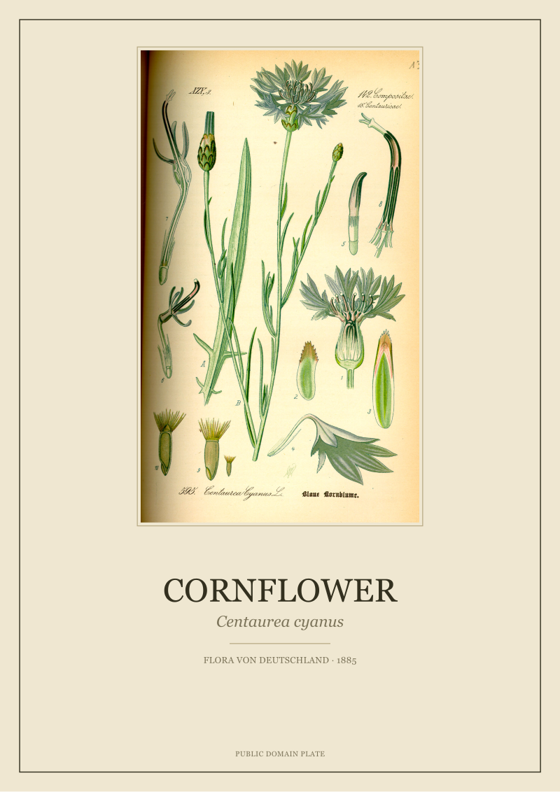
The Cornflower plate — *Centaurea cyanus* — is a good stress test because the flower head carries a dense fringe of very fine radiating florets, and the stem carries the wiry hairs that field botanists use to identify the species. On our A2 measurement passes, the fringe florets held reliably on museum cotton but softened on the alpha-cellulose, where the higher dot gain thickened each stroke by enough to close the negative space between strokes. The stem hairs did worse: on both papers, a subset of the finest hairs disappeared entirely into the paper texture, not because the ink failed to lay down but because the paper's own surface noise was loud enough to swallow the mark.
The Chamomile plate does the same thing along the ray florets. The finest tapering line at the tip of each ray — the last two millimetres of the drawing — is the first thing to disappear at A2. The Fennel plate does it in the umbel structure, where the individual florets in the outer ring are drawn with a single hair-thin stroke each. The Ivy is the one plate that shrugs this off, because its line work is mostly primary and secondary; there is very little tertiary line for A2 to eat.
The predictability is what makes this useful. Once you have measured half a dozen plates at A2, you know before you print which subjects will suffer at that size and which will hold. It becomes a scoping decision, not a hope.
A2 Is the Size Where the Plate Stops Lying
The final pattern, and the one that reframes the whole exercise: A2 is the print size at which a botanical plate stops being decorative and starts being diagnostic. Below A2, a lot of restoration sins are simply invisible. At A2, they are all visible, all at once, from three metres away.
We noticed this first with the Ivy. On A3, the Ivy plate looks like an Ivy plate: the leaves are recognisable, the drawing carries, the colours read as a coherent green mass. On A2, the same file — no changes, just a larger output — becomes a document. You can see which leaves Thomé drew from life and which he composed from a herbarium reference. You can see where his shading strokes were laid down quickly and where he doubled back. You can see the specific point on the primary stem where his line weight shifts, which is the point at which he probably lifted his pen. None of that is visible at A3. All of it is visible at A2.
The Cornflower does the same thing in a different register. At A2, the plate reveals that Thomé's cornflower is not one cornflower but a composite: a dissection study, a habit sketch, and a full-plant portrait, all sharing a single sheet and connected by a shared colour discipline. That composite structure is unreadable at A3. It is the first thing the eye finds at A2. The plate stops being an image and becomes an argument.
This has consequences for what we can honestly claim about a print. At A3, we can print almost any plate in the archive and be confident it will look like the plate. At A2, the plate has to be able to withstand the scrutiny that A2 invites. If the source scan is soft, A2 will show it. If a restoration pass overreached on a hue, A2 will show it. If a fine line was reconstructed rather than recovered, A2 will show it. The size is a truth-teller, and it does not care about the studio's convenience.
The six plates in this recent batch — the four we have named and two more we are not identifying yet, because their restorations are still in the internal review queue — all sat for that scrutiny. Four passed and are moving into production at A2. Two did not, and will be reworked and remeasured before we let them out at that size. The colour meter contributed a page and a half of numbers to that decision. The eye at three metres contributed the rest.
 Fennel
The print from this article · from €29.95
View the print →
Fennel
The print from this article · from €29.95
View the print →
So What Do You Actually Do
If you are choosing a botanical print for a wall and A2 is on your shortlist, the useful thing to understand is that the format is doing more work than it looks like it is doing. A plate that reads beautifully at A3 is not automatically a plate that reads beautifully at A2. Ask, or check, whether the specific plate you are looking at was actually tested at that size — not scaled up from a smaller proof, but printed at A2, measured, and reviewed. That single fact separates a serious restoration from a lazy one.
If you are the studio doing the work, the operational answer is narrower and less romantic. Stop trusting screen proofs past A3. Build a per-plate colour-and-line profile from an actual A2 print on the actual paper stock. Isolate the green families before global correction, decide which greens carry the drawing, and protect those. Accept that a subset of the tertiary line work will not survive on some papers and either change the paper or change the size. Do not let a plate leave the studio at A2 unless the A2 sheet has been on the light table under daylight-balanced illumination and has answered the question the plate itself is asking.
The larger point, and the handoff to the next question worth asking: colour accuracy is not the ceiling of restoration quality. It is the floor. Once the ink is landing where the meter says it should, the real work begins — the work of deciding which of a 140-year-old plate's arguments a modern wall is going to be allowed to hear. That question is not answered by measurement. It is answered plate by plate, and it is the part of the craft that no spectrophotometer has ever helped with.
New plates from the archive and 10% off your first print.
One email now with your code. No noise after.