You should not paint a red rose from a photograph. Hear me out. In our studio we restore botanical plates from O.W. Thomé's 1885 Flora von Deutschland — chamomile, ivy, cornflower, fennel — and we have watched enough first attempts at red roses to recognize the shape of the wreck before it happens. The photograph lies about red. The pigment lies back. The paper decides who wins. What follows is a flowchart in prose: three questions, answered in order, with a routing table at the end that tells you whether to keep going, change tool, or stop before you ruin the sheet.
Question 1: Are You Painting From a Photograph or From the Flower?
This is the first fork because every mistake after it compounds. The nineteenth-century plates we restore — the chamomile with its hollow receptacle, the fennel's umbels drawn like a thrown net — were made from specimens on a table, dissected, measured, redrawn. The artist knew where the leaf attached because they had turned the leaf over. A photograph strips exactly that information out. It flattens the depth cue, blows the highlight, and tells you a red rose is "red" when it is in fact seven neighboring reds negotiating under a specific light.
The practical consequence: if you paint from a photograph you will reach for a tube labeled red and lay it flat. The painting will look like a sticker. The flower in the file will have been doing the work the pigment has not been asked to do.
If Yes — you're painting from a photograph
Treat the photograph as a document, not as a model. Spend ten minutes before you touch a brush pulling the file into something diagnostic. Zoom to 300% on the darkest part of the shadow and name the hue — is it a cold crimson leaning blue, or a warm maroon leaning brown? Zoom to the brightest petal edge where the sun strikes it and name that hue too. These are two different pigments, not one pigment plus white. If you cannot name them separately, you are not ready to mix.
The red flag at this fork: you catch yourself trying to match the screen's red exactly. You can't. Screens emit, paint reflects, and the gamut gap is wider than almost any other color. Decide early you are translating the rose into a watercolor language, not copying the file. Exit criterion: if after twenty minutes you are still searching for "the right red," stop and go find a real rose. The file has already told you everything it is going to tell you.
If No — you're painting from the flower itself
You are in the position Walther Otto Müller and the other illustrators behind Thomé's Flora were in when they drew ivy for the 1885 plates — looking at the thing. Good. Two warnings. First: a cut rose shifts color across the first two hours in a vase. The hue at hour three is not the hue at hour zero. Decide which moment you are painting and commit to it in the first wash. Second: north light is not neutral; it is slightly cool and favors the blue end of your red. If you want the warm oranges that live in a red rose's throat, you need to decide whether you are painting the flower you see or the flower you remember, because the north window will not give you both.
Working from life also unlocks something a photograph cannot: the back of the petal. The underside is almost always a different red than the face — paler, dustier, often with a cooler cast. Painting it correctly is the difference between a rose and a drawing of a rose.
Question 2: Is Your Red a Single Pigment or a Mixed Red?
This question matters because red is the pigment family most likely to let you down. Many single-pigment reds are either staining and uncorrectable, or fugitive and bound to fade. The nineteenth-century plates in Thomé's Flora survived because the pigments and lithographic inks that printed them were chosen for permanence first and brilliance second. If you want the painting to still be red in forty years, your decision here is not aesthetic. It is actuarial.
A single-pigment red lays down with one chemistry: one particle, one behavior on the paper. A mixed red — a red plus a touch of another color to shift it warm or cool — behaves like a committee, and committees separate when wet.
If Yes — you're using a single pigment
Know what it does before you paint anything that matters. Lay out a small test sheet. Paint a stripe at full strength, then dilute in three steps to the palest wash you can achieve. Let it dry. Then come back the next morning and look at it in daylight. You are checking three things: whether the pigment stains the paper (meaning you cannot lift it later), whether it granulates (meaning the particles separate on textured paper), and whether the dilute wash shifts hue (many reds go pink or peach once thinned, and you need to know that before you commit it to a petal).
The red flag: the test stripe looks nothing like the swatch on the tube. This is not a defect in the pigment. The swatches on tubes are printed under studio lighting at a saturation the pigment never actually hits on paper. Trust your test sheet. Exit criterion: if the dilute wash of your red does not sit in the same family as the mid-strength wash, stop and buy a different red. Mixing your way out of a bad base is harder than starting over with the right one.
If No — you're mixing a red
You have more control and more ways to lose. The classic mixed red for botanical work is a cool crimson shifted warm with a small addition of an orange-leaning pigment, or a warm scarlet pulled cold by a trace of a blue-leaning magenta. The trap is the trace. "A touch" of a blue into a red is a terrifying amount of blue on a palette; the mix will swing lilac before you see it coming. Work with two brushes — one for the red, one with clean water — and build the shift in micro-additions, testing each on a scrap of the actual paper you will use for the painting.
Mixed reds also behave differently in the first wash than in the last layer. The two pigments can separate on wet paper, with the heavier particles sinking into the paper's valleys and the lighter ones riding on the hills. Sometimes this is beautiful. More often it looks like dirt. If you want the rose to read as a single coherent red, mix your pot thoroughly, test for separation on your paper, and if the pigments drift apart, pick one of them to lead and relegate the other to a glaze on top.
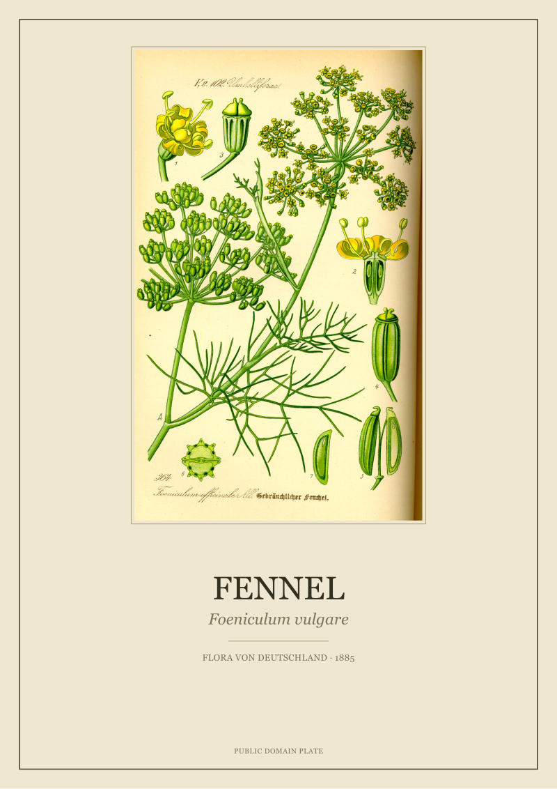 Fennel
The print from this article · from €29.95
View the print →
Fennel
The print from this article · from €29.95
View the print →
Question 3: Is the Paper Hot-Pressed, Cold-Pressed, or Something You Found?
Paper is the quietest decision in the chain and the one that most often decides the painting. The plates we restore were printed on heavy, sized, archival stock chosen so that line and wash would hold without buckling and so the ink would not sink out of registration. A rose painted on the wrong paper is already losing before the first wash dries.
If Hot-Pressed
Smooth paper rewards precision and punishes hesitation. The pigment sits on the surface, which means color stays bright and edges stay crisp — but every stroke is visible and every correction is a wound. Hot-pressed suits a drier, more drawn approach to a rose: the botanical plate approach, closer to how fennel's umbels were rendered line by line. You will see your red at its most saturated here. You will also see every tremor in your hand. If you are early in your watercolor practice, hot-pressed is not a kinder paper, it is a stricter one.
Exit criterion: your first wash beads up on the surface instead of laying down evenly. The paper is working against you, likely because the sizing is heavier than your wash can soak. Dampen the paper lightly with a wide brush of clean water and wait sixty seconds before laying the red. If the second attempt still beads, you are on a sized paper not meant for watercolor at all — stop before you fight it further.
If Cold-Pressed
Textured paper is the forgiving middle. It accepts a wet wash, grants gradients, lets granulating reds show their character. For a red rose with soft petal transitions, this is the paper that most studios would reach for first. The trade is loss of edge: a hard line on cold-pressed paper is not quite hard, because the fibers break the stroke. If your rose depends on crisp petal boundaries, you will need to work drier at the edges than you planned.
Red flag: your wash dries noticeably paler than it looked wet. All watercolors lighten in drying, but cold-pressed exaggerates the effect because pigment sinks into the texture. The fix is not to paint stronger. The fix is to layer — a second, dry glaze over the first wash, matched carefully — because overloading a single wash is how you get the stiff, plastic look that gives amateur red roses away.
If Something You Found
Printer paper, a sketchbook sheet of unknown provenance, the back of a drawing you abandoned. Stop. You cannot survey your way out of unknown paper. The red you have carefully chosen will behave in a way you cannot predict: it may bleed, cockle, lift, or dry grey. Exit criterion is this fork itself — if you cannot name the paper's weight, surface, and sizing, do not paint the real rose on it. Paint a throwaway rose on it first, learn what the paper does, and then make the decision on a sheet you can defend.
If You Answered Everything: The Routing Table
Three questions, three answers each, eight realistic combinations (we fold "found paper" into every row as a universal stop). Read the row that matches your answers and treat the recommendation as the exit criterion, not a suggestion.
| Q1: Source | Q2: Pigment | Q3: Paper | Recommendation |
|---|---|---|---|
| Photograph | Single | Hot-pressed | Build the painting from a controlled line drawing first; let the single pigment do the color work in one or two passes. |
| Photograph | Single | Cold-pressed | Safest beginner path; use diluted glazes, accept softer edges, and resist the urge to intensify the red. |
| Photograph | Mixed | Hot-pressed | High risk; the mix will separate on the smooth surface. Switch to a single pigment or switch paper before starting. |
| Photograph | Mixed | Cold-pressed | Workable if you test the mix on the actual paper first; otherwise fall back to a single pigment. |
| From life | Single | Hot-pressed | Studio-plate approach; strong candidate for a drawn, precise rose closer to the Thomé tradition. |
| From life | Single | Cold-pressed | The default recommendation for a studio-style red rose with soft transitions and reliable permanence. |
| From life | Mixed | Hot-pressed | Only if you are experienced; the separation risk is real and the smooth paper will show every flaw. |
| From life | Mixed | Cold-pressed | Advanced path; rewarding when the mix holds, but test the pigment behavior before committing the final sheet. |
The table is not a verdict, it is a routing. The honest reading is that two combinations are strongly recommended, three are workable with caveats, and three should be reconsidered before you touch the paper. If your row says reconsider, the correct response is not to proceed carefully. It is to change one variable — paper, pigment, or source — and re-enter the flowchart from the top.
One closing note from the restoration bench. The 1885 plates we work with every day do not look alive because the pigment was spectacular. They look alive because the person at the table decided, before the first mark, what kind of thing they were drawing and how long they wanted it to last. A red rose on paper is the same decision. The flowchart above is a way of making it visible. The plates we restore are gathered at /shop/ if you want to see what a hundred and forty years of a well-made decision looks like.
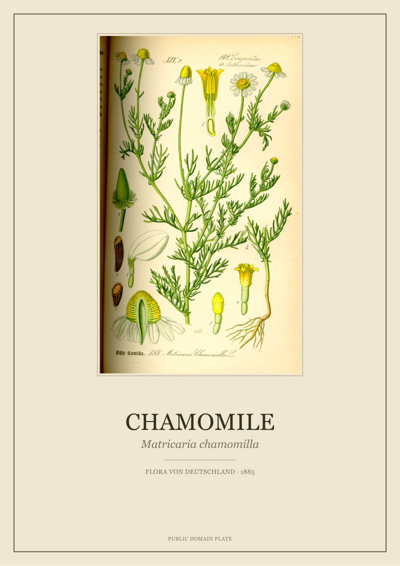 Chamomile
The print from this article · from €29.95
View the print →
Chamomile
The print from this article · from €29.95
View the print →
FAQ
Why is painting from a photograph considered the harder route if photographs seem like better references?
Photographs are flatter than they look. They compress a rose's seven neighboring reds into a single average red, blow the highlight into pure white, and tell you nothing about the underside of the petal. The illustrators behind the 1885 plates we restore worked from the flower itself precisely because they needed information a photograph removes. A photograph is useful as a document — zoom in to name the hues — but it is a poor model for mixing color.
What single pigment do most botanical studios recommend for a red rose?
Studios differ, and we deliberately do not endorse a specific tube. The honest guidance is that you want a lightfast, non-fugitive red that does not stain the paper irreversibly and that holds its hue when diluted. Test any candidate pigment on a scrap of the actual paper you intend to use, in three dilutions, and look at the dry result the next morning in daylight. The pigment that passes that test is the one that belongs on your rose.
How much does hot-pressed versus cold-pressed paper actually change the outcome?
More than most beginners expect. Hot-pressed paper keeps the pigment on the surface, which preserves saturation but exposes every brush tremor. Cold-pressed paper absorbs the wash into its texture, which forgives technique but mutes the first-pass color. A red that looks right on cold-pressed will look brighter and harsher on hot-pressed; a red that looks right on hot-pressed will look dull and chalky on cold-pressed. The paper is not a neutral surface — it is a second pigment.
Can I use acrylic or gouache instead of watercolor for a red rose?
This flowchart is written for watercolor because that is the medium of the botanical plate tradition the studio sits within. Acrylic and gouache behave differently: they are more forgiving of layered correction, less dependent on the paper's absorbency, and do not thin into transparent washes without losing body. The three questions still apply — source, pigment, paper — but the exit criteria shift. Start a separate flowchart for those media rather than importing watercolor rules into them.
What is the connection between painting a red rose and the botanical plates the studio restores?
The plates in Thomé's Flora von Deutschland (1885) — chamomile, common ivy, cornflower, fennel — were made under the same three decisions this article routes through: source (the specimen on the table), pigment (chosen for permanence), paper (chosen for registration and age). The connection is not stylistic. It is methodological. The 140-year survival of those plates is evidence that the flowchart works when followed seriously.
Is it ever acceptable to skip the paper test and paint directly on the final sheet?
Only if you have painted on that specific paper, from that specific batch, with that specific pigment, enough times to know what will happen. For a first attempt at a red rose, skipping the test is where most paintings are lost before they start. A test sheet costs ten minutes. A ruined final sheet costs the painting. The ratio does not favor skipping.
Does the historical use of rose in apothecary tradition inform how to paint one?
Historically yes, practically no. Rose appears in old herbals and apothecary records as a cultural artifact, and that is a lineage worth knowing as history. It does not change what pigment belongs on the petal or what paper holds the wash. Our editorial position is firm here: lore is told as lore, and the painting decisions are made on their own terms. The red rose on your paper is a studio problem, not an apothecary one.
From the collection
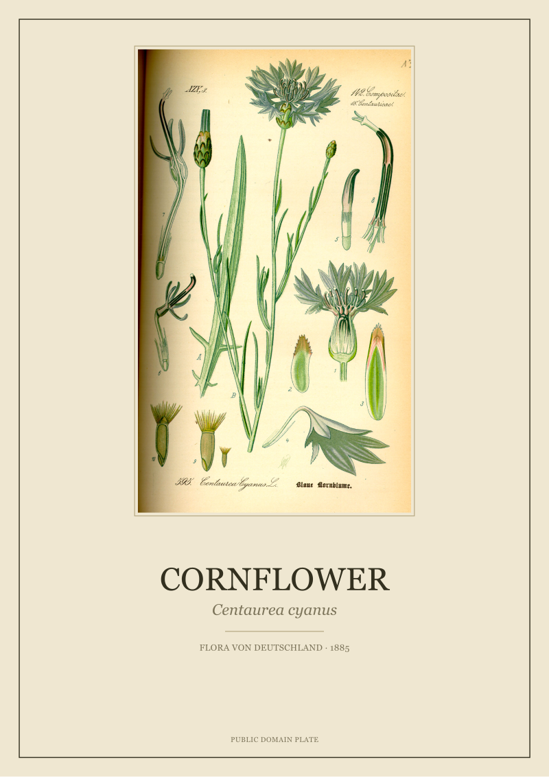
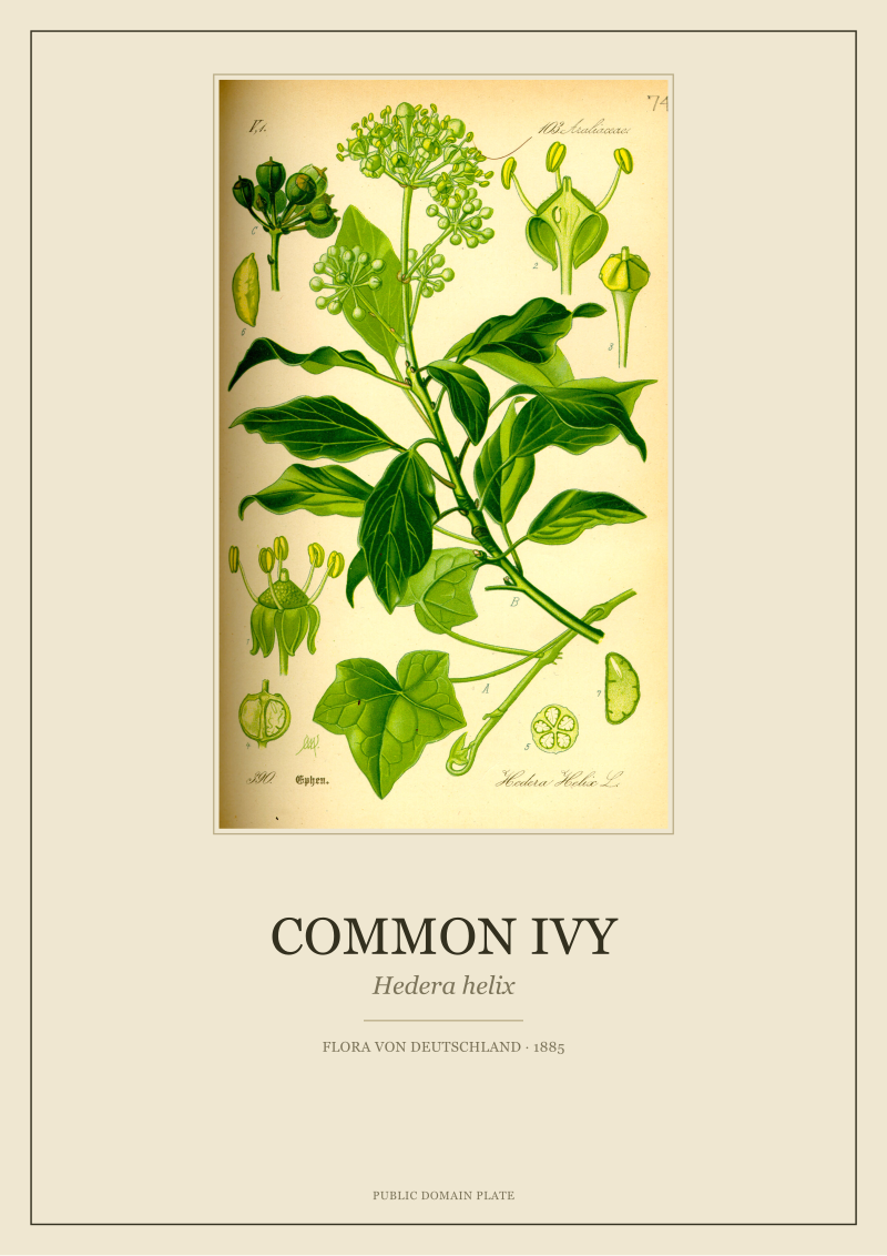
New plates from the archive and 10% off your first print.
One email now with your code. No noise after.