There is a pattern across the chromolithograph plates we restore at Botanic Walls: red is never one color. On O.W. Thomé's 1885 plates for Flora von Deutschland, Österreich und der Schweiz — the plates that carry the Cornflower, the Chamomile, the Fennel, the Common Ivy — a hue the eye reads as flat is in fact two to five lithographic stones layered in registration, each stone carrying a fraction of the final tone. The query "painting a red rose" assumes a single pigment decision. The 1885 bench says otherwise. This piece walks the arithmetic.
The One-Stone Illusion
Modern readers inherit the four-color process from twentieth-century offset: cyan, magenta, yellow, black, and the mind quietly assumes that a red object was a magenta plate with a yellow plate under it. The 1885 chromolithograph bench did not run four plates. It ran as many stones as the printer judged the subject required, and the judgment ran upward from the midtone, not down from a fixed inventory.
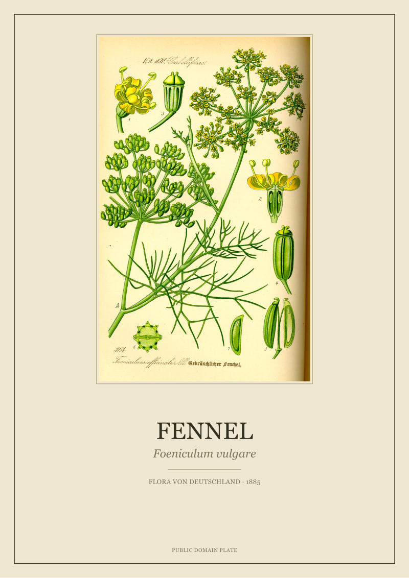
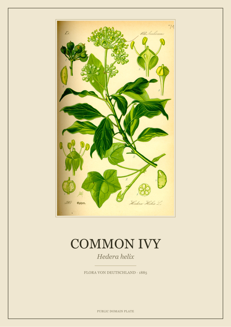
Count the hues on a single Thomé plate and the pattern surfaces. The Cornflower plate (Centaurea cyanus) carries at least a cool mid-blue, a deeper blue shadow note, a warm neutral for the stem, a yellow-green for the leaf, a cool green shadow, and a key line. Six stones for a flower the eye calls "blue". The Common Ivy (Hedera helix) separates leaf green into a yellow-leaning young-leaf tone and a blue-leaning old-leaf tone — two greens, not one. The Chamomile (Matricaria chamomilla) runs a warm white that is not paper white but a stone-printed cream, plus a yellow for the disc florets, plus the leaf greens. The Fennel (Foeniculum vulgare) spends two of its stones on a yellow that pretends to be one color and is in fact a saturated base plus a cooler overprint for the shaded umbels.
The arithmetic that follows for a red rose, had Thomé's workshop drawn one for this volume, is not a question of which red pigment. It is a question of how many stones the red is built from, in what order they print, and what each stone contributes to the final tone. One stone would be a sign-painter's rose. The bench did not sign-paint.
The Madder-vs-Carmine Trade-off
The 1885 chromolithographer selecting a red was choosing between two broad lake families, and the choice was arithmetic before it was aesthetic.
Madder lake, derived from Rubia tinctorum root, carried a known reputation for lightfastness. Period conservation surveys of nineteenth-century botanical prints repeatedly place madder-based reds among the better survivors on the shelf — the fugitive losses cluster elsewhere, in the geranium lakes and the eosin-based synthetics that entered the market from the 1870s onward. Carmine, extracted from cochineal, printed a cleaner, bluer, more saturated red than madder's warmer rose, but logged weaker lightfastness in long-cycle exposure tests. The trade-off: cleaner hue now, or hue that survives the window.
The cost column ran in the opposite direction. Cochineal was a long-haul import from the Americas, priced by the pound. Madder was European, agricultural, and cheaper. A workshop producing a volume at Thomé's scale — hundreds of plates in a reference flora — was running a lightfastness-per-mark budget as much as a pigment budget. The math a workshop foreman actually did looks something like this: cost per gram of pigment, multiplied by grams per stone pass, multiplied by stones in the stack, divided by expected archival years of the finished plate. The dividend is cost-per-year-of-visible-color. On that ratio, madder wins against carmine often enough that the warmer rose is the structural default of the period, not the artistic one.
A red rose on this bench, costed honestly, is three stones minimum. A pale madder underprint carrying the body of the hue. A carmine or deeper madder overprint carrying the saturation at the petal center and the folded shadow. A key line, often in a brown-black rather than pure black, carrying the drawing. The eye reads this stack as one color because the stones are tuned to the eye, not to the invoice.
A red rose on this bench is not a pigment decision. It is a budget decision wearing a pigment's clothes.
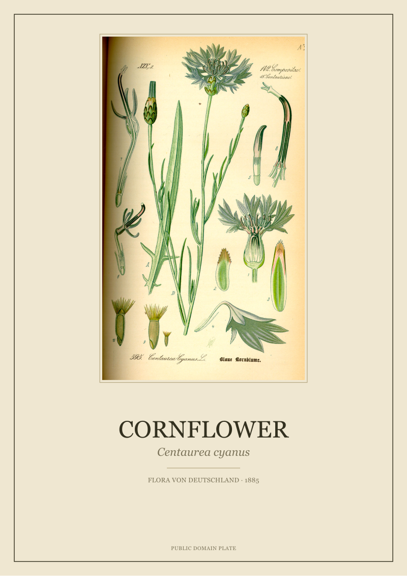 Cornflower
The print from this article · from €29.95
View the print →
Cornflower
The print from this article · from €29.95
View the print →
The Line-Count Problem Behind a "Flat" Petal
Before the halftone screen entered commercial printing — the Meisenbach patent is 1882, but adoption in botanical reference work lagged by a decade or more — chromolithography built its tones out of the chalk manner, the stipple, and the crayon mark. A "flat" red petal was not flat on the stone. It was a controlled density of marks.
The arithmetic of a petal reads like this. Call the printed area of a mid-sized rose petal on a quarto plate four square centimeters. On a chalk-manner stone, a mid-tone pass carries somewhere between forty and seventy marks per linear centimeter at the drawing scale, depending on the lithographer's hand and the grain of the stone. Square that density and the petal is carrying 1,600 to 4,900 marks per square centimeter from a single stone. Across three stones — the madder base, the carmine or deeper lake overprint, the key — the mark count on that four-square-centimeter petal lands between 19,200 and 58,800 individual lithographic events, each one deposited in registration against the others.
The thing to understand about this number is not the number. It is the registration tolerance it demands. If three stones each carry 15,000 marks on a petal and the registration drift between stones is 0.3 millimeters, roughly a third of the overprint marks fall off their intended underprint and the hue breaks. Workshop registration in good 1885 practice held closer to 0.1 millimeter across the sheet, and a plate like Thomé's held that tolerance across the full page, not just one flower. The flatness of the red is the output of a tolerance stack, not a pigment choice.
This is why a red that looks "wrong" on a cheap chromolithograph does not look wrong because the printer picked a bad red. It looks wrong because the registration drifted and the stack came apart. The pigment is fine. The arithmetic failed.
The Reproduction Tax Nobody Prices In
Every stone a workshop added to a plate was a tax. The tax was paid in paper, in time, and in registration risk, and it compounded.
Price the paper handling. A single sheet in the Thomé workflow is picked up, aligned, printed, lifted, racked, dried, and returned to the stack once per stone. A three-stone plate handles the sheet three times for that image; a six-stone plate — the Cornflower lives here — handles it six. Call it ninety seconds of skilled hand labor per pass at period rates, and a one-stone image carries a minute-and-a-half of handling cost against a six-stone image carrying nine. The ratio is linear; the budget line is not. A reference volume runs the full stack across every impression of the print run, so a workshop producing two thousand copies of a six-stone plate is logging thirty thousand sheet-handling events against the same volume of a one-stone plate's five thousand.
Price the drying. Each stone's ink must set before the next prints, or the second stone lifts the first. Period drying intervals ran from a few hours in a warm, dry shop to a full day in a Rhineland winter. A six-stone plate occupies the drying rack for six intervals; a three-stone plate for three. The rack is a fixed asset, and rack-days are the quiet cost center of a nineteenth-century color shop.
Price the risk. Registration failure on stone three of six does not scrap one stone's work. It scraps the full stack behind it. The expected-value cost of a six-stone print is not six times a one-stone print — it is six times, plus the compounding probability of a registration event on any one of the six passes, times the sunk cost of the stones below. A workshop foreman costed this. The reason Thomé's plates print at the stone count they print at, and not higher, is that at some point in the stack the marginal stone's hue improvement stopped exceeding its marginal risk cost. The red rose that would have taken eight stones to render with perfect saturation was in fact printed in three or four, because stone five crossed the line.
The modern eye looking at an original 1885 impression sees the result of this arithmetic and reads it as craftsmanship. It was craftsmanship. It was also accounting.
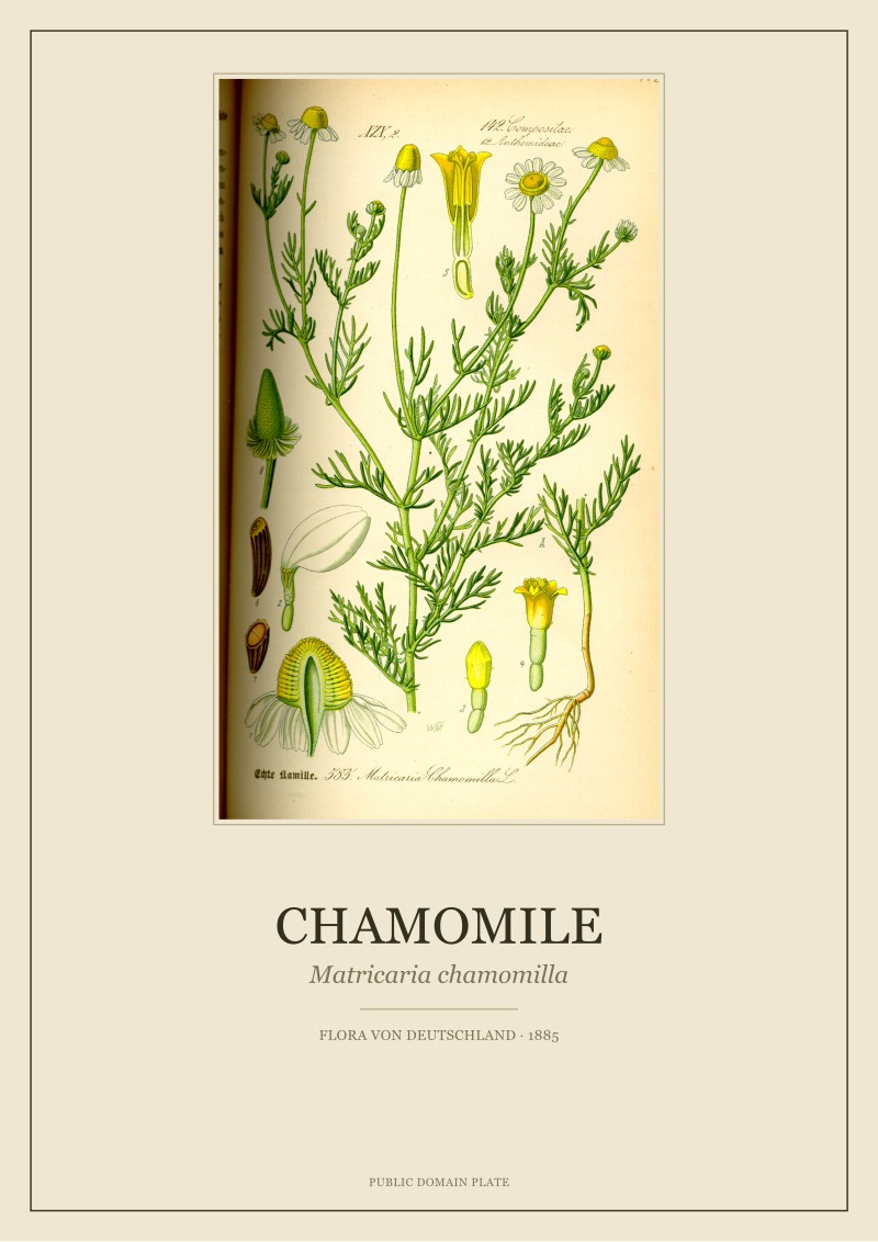 Chamomile
The print from this article · from €29.95
View the print →
Chamomile
The print from this article · from €29.95
View the print →
So What Do You Actually Do
If you came to the query "painting a red rose" looking for a brush-and-palette answer, the honest finding is that the brush-and-palette answer is a twentieth-century convenience. The 1885 answer was a pigment stack, a stone count, a registration tolerance, and a reproduction-tax calculation that the finished object quietly hides. When you look at a chromolithographic red on an original Thomé plate, or on a faithful restoration of one, you are looking at a decision tree that resolved in favor of three or four stones, a madder-leaning base, and a drying-rack schedule.
The practical implication for anyone handling, buying, or restoring one of these plates: do not treat the color as a surface. The red is a volume. Clean it the way you would clean a stack of transparent films, because that is what the printer built. A varnish layer, an ink layer, another ink layer, another, and the paper beneath. Over-cleaning a chromolithograph strips the top stone first, and the top stone is usually the carmine saturation note. Lose it and the plate retreats to its madder underprint — warmer, softer, "aged" in a way that is not actually age. It is subtraction. In our restoration workflow at Botanic Walls, this is why the Thomé plates on our shop are scanned at the stone-density resolution the original marks were drawn at, not the resolution the final hue appears to need.
This piece does not address the specific chemistry of synthetic alizarin, which entered the market in 1869 and partially displaced natural madder across the following two decades — the pigment-substitution story deserves its own article. It does not address the parallel question of green, where the chromium-based pigments of the period logged their own lightfastness oddities that the Thomé greens largely sidestep by stacking rather than mixing. And it does not address the economics of twentieth-century photolithographic reproduction, which inverted every assumption in the paragraphs above by replacing stones with films and making the stone count irrelevant. Each of those is a separate argument, and we will come to them in their turn.
New plates from the archive and 10% off your first print.
One email now with your code. No noise after.