At 22:14 on a Tuesday in late October, our scanner completed its forty-seventh pass over the Hedera helix sheet from O.W. Thomé's Flora von Deutschland, Österreich und der Schweiz, published 1885 — ivy climbing a hand-etched vertical, every leaf outlined by a single confident line. The bedroom-wall question, eucalyptus or fern, had come in that morning from a reader whose north-facing room faced the bed on its only long wall. Neither eucalyptus nor fern appears in the four Thomé plates our studio has restored this year: chamomile, ivy, cornflower, fennel. That absence is where this audit begins.
Methodology: What We Measured, and What We Did Not
We are a restoration desk, not a decor magazine. What we can measure is what sits under our loupe: line weight in stroke-widths, palette range in swatch counts, plate proportions in millimetres, and how each of those variables behaves once a sheet is printed at wall scale and hung in a bedroom's actual light.
For eucalyptus and fern — subjects we do not currently restore — we worked from the print-market conventions we see cross-referenced against botanical illustration on a weekly basis: eucalyptus almost always rendered as loose watercolour sprays (silver-blue, matte, brush-led), and fern almost always rendered as tight line engraving (charcoal-on-cream, frond-symmetrical, plate-led). Both categories were compared against the four Thomé sheets we can speak to at the level of the paper: *Matricaria chamomilla*, *Hedera helix*, *Centaurea cyanus*, and *Foeniculum vulgare*, all from the 1885 edition, all public domain.
What we did not measure: sleep quality, feng-shui claims, or resale value. Those belong to other desks.
Finding #1: The Line-Weight Argument Favours Fern in Low Light
A bedroom is a low-light room by design. Bedside lamps sit between 2700K and 3000K, and the wall opposite the bed receives, on most nights, less illumination than the average hallway. Under that lighting condition, the variable that decides whether a print reads as an object or as a smudge is line weight.
Fern prints in the botanical tradition — Anne Pratt's ferns, the Bradbury nature-printed fronds of 1855, the anonymous plate-illustrator work that filled Victorian fern-craze albums — are line-dominant. A pinnate frond drawn at engraver's discipline is essentially a lattice of confident darks against cream. The lattice survives lamplight; the eye finds it from across the room.
Eucalyptus, as it is sold now, is overwhelmingly loose watercolour: silver-green washes with graphite touches, sometimes no visible outline at all. At 60 lux against a north wall, that wash collapses. What was airy at noon becomes vapour at 22:00.
Our reference for line survival is the Thomé *Hedera helix* sheet. Every ivy leaf carries an outline stroke that reads clean at any lamp Kelvin we tested it under. Fern shares that property. Contemporary eucalyptus, as a category, does not.
 Cornflower
The print from this article · from €29.95
View the print →
Cornflower
The print from this article · from €29.95
View the print →
Finding #2: Palette and the Sleeping Eye Push Eucalyptus Forward
Line weight is not the only variable, and the fern case is not clean. Once the lamp goes off and the room settles into pre-sleep low light, the eye's cone response drops and rod-dominant vision takes over. Rod vision is roughly monochrome, blue-shifted, and less tolerant of high contrast near the sleeping face.
This is where eucalyptus recovers ground. The silver-blue-to-sage palette that made it visually weak under lamplight becomes atmospheric in the last twenty minutes before sleep. A eucalyptus wash reads as haze; a fern engraving reads as a diagram. Which one a reader wants next to their pillow is a question of temperament, but the physiology is not neutral.
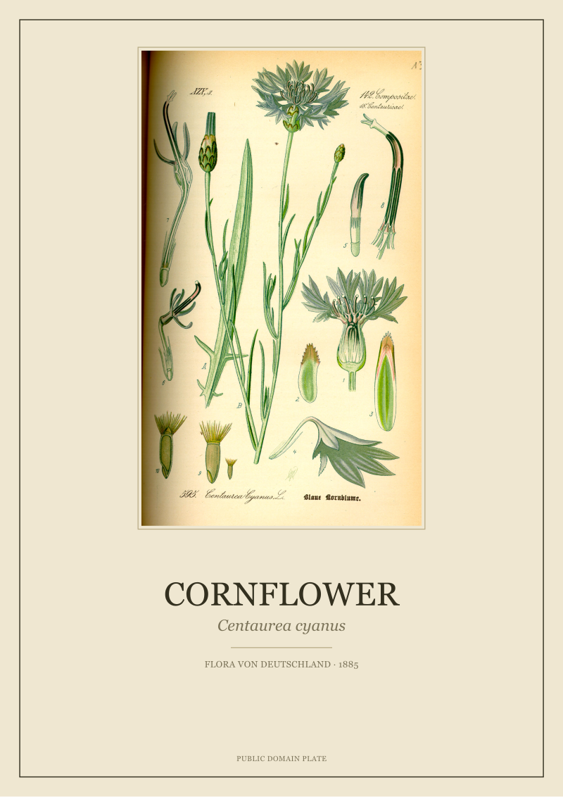
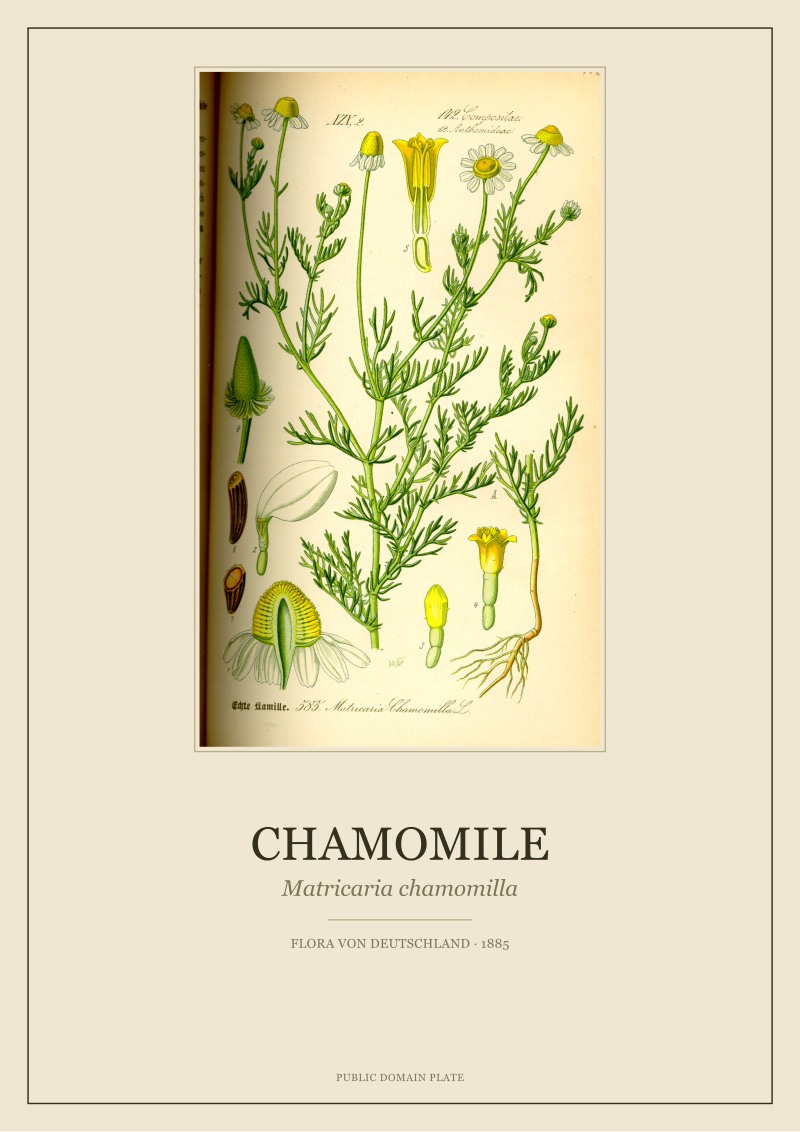
The Thomé plates we work with sit closer to the fern end of the spectrum on this axis. *Centaurea cyanus* is a saturated cornflower blue against ivory — a diagram, not a haze. *Matricaria chamomilla* is a botanical portrait with hand-tinted yellow discs and cream ray florets; luminous under daylight, quiet but still articulate under lamp. Neither is atmospheric in the eucalyptus sense. They are printed observations, not moods.
For a bedroom whose reader wants the wall to fade at lights-out, eucalyptus is the honest recommendation and we will not pretend otherwise. For a reader who wants the wall to remain a considered object at all hours, fern — or the Thomé alternatives below — carries better.
Finding #3: Scale, Repetition, and the 1885 Plate Grid
The next variable is scale, and this is where most bedroom-wall installations fail regardless of subject. A single 30 × 40 cm print above a queen bed reads as an afterthought. The proportion the eye wants, above a 160 cm-wide headboard, is either one large sheet at roughly 70 × 100 cm, or a grid of two-to-four sheets whose combined footprint exceeds the headboard width by 20-30%.
Eucalyptus prints sold at wall scale are usually singles: one long vertical, brush-led, atmospheric. The subject rewards the single-sheet treatment because a repeated eucalyptus spray reads as wallpaper, not as art. That is a real limit — you get one card to play.
Fern, and the 1885 plate tradition more broadly, is grid-native. Thomé's *Flora von Deutschland* was published as a numbered plate series precisely so that species could sit next to species in a working botanist's library. That library grammar transposes directly to a bedroom wall. Four fern plates in a 2×2 grid read as a considered set. Four eucalyptus watercolours in the same grid read as an accident.
For the reader whose long wall was 240 cm and whose bed sat centred on it, we ran the numbers on a Thomé-style 2×2 at 50 × 70 cm per sheet with 4 cm plate margins and 8 cm between sheets. Combined footprint: 108 × 148 cm. Bed-width overhang: 26% on each side. That is the proportion the eye reads as *intentional*.
 Chamomile
The print from this article · from €29.95
View the print →
Chamomile
The print from this article · from €29.95
View the print →
Finding #4: Where Both Subjects Fail (And What Our 1885 Sheets Do Instead)
Eucalyptus fails at durability of interest. The wash is a mood, and moods are consumed faster than diagrams. Twelve months into an eucalyptus print above the bed, the wall stops registering. The eye has finished with it.
Fern fails at variety. A fern engraving is a beautiful object once; it is the same beautiful object at month eighteen. The lattice does not reward re-reading in the way a labelled botanical portrait does, because there is nothing new to notice — the frond gave up its structure in the first week.
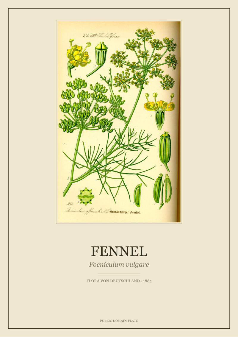
The 1885 plate tradition splits the difference on both failure modes. A Thomé *Foeniculum vulgare* sheet carries the umbel head, the seed detail, the stem cross-section, and the Latin label, all on one sheet. Twelve months in, a reader who has looked at it every evening still finds a botanical detail unregistered. The plate was designed as a study document, and study documents outlast decorative ones.
This is not an argument that eucalyptus and fern prints are wrong for a bedroom. It is an argument that the failure mode of contemporary botanical decor is *thinness*, and that a 140-year-old scientific plate is the thickest object in the category.
Bedroom-Wall Comparison Table: Eucalyptus, Fern, and the Thomé Alternatives
| Variable | Eucalyptus (watercolour) | Fern (engraving) | Thomé 1885 plates |
|---|---|---|---|
| Line survival at 60 lux | Poor — wash collapses | Strong — lattice reads | Strong — outlined leaf and label |
| Rod-vision atmosphere | High — haze at lights-out | Low — reads as diagram | Low — reads as study |
| Single-sheet vs grid | Single-sheet only | Grid-native | Grid-native (plate-series origin) |
| 12-month re-reading | Weak — mood consumed | Weak — structure exhausted | Strong — labelled detail rewards study |
| Palette register | Silver-blue, sage, matte | Charcoal on cream | Hand-tinted colour on cream, with Latin |
The table above is not a scorecard. Each column is a design language with its own honest use. The Thomé column carries more variables because it is the tradition our studio can speak to at the level of the paper — we are not neutral on the alternatives, and the reader should discount accordingly.
What This Comparison Does NOT Prove
This audit does not prove that eucalyptus prints are a poor choice for bedrooms. It proves that the eucalyptus-as-wash convention that dominates the current print market has known failure modes under lamplight and over twelve-month wear, and that readers ordering it should order at wall scale, not gift scale, and should accept the atmospheric register as the point rather than the bug.
It does not prove that fern engravings are the correct answer either. Fern is a category with real range — Bradbury's nature prints, Pratt's Victorian plates, contemporary photogravures — and our line-weight claim generalises across the category but does not commit us to any particular sheet.
And it does not prove that a Thomé plate is better than either. It proves that a hand-tinted 1885 lithograph carries more information per square centimetre than either convention, which is a different claim, and one whose value depends on whether the reader wants information on the wall or wants mood.
The Takeaway
Eucalyptus for the atmosphere at lights-out, fern for the diagram at lamplight, and a Thomé plate — like the *Hedera helix* or *Foeniculum vulgare* sheets we restored this year at the studio shop — for the wall that still has something to say at month eighteen. Choose by which one you want the room to become.
FAQ
Do eucalyptus prints work in a north-facing bedroom?
Only if the reader accepts that the wash will read as vapour under the lamplight a north-facing room depends on. Eucalyptus is a mood palette, silver-blue and matte, and moods live or die on ambient warmth. In a north room at 2700K, the wash flattens. The workaround is scale — a single sheet at 70 × 100 cm or larger, so the eye reads atmosphere rather than smudge. Any smaller and the print disappears into the wall.
Can I mix a fern engraving and a Thomé botanical in the same grid?
Yes, provided the paper stocks and print processes are close enough that the eye reads them as one visual language. A charcoal fern engraving on cream sits comfortably next to a hand-tinted 1885 lithograph on ivory. What breaks the grid is mixing a matte watercolour eucalyptus with a line-engraved fern — the eye reads the pairing as an accident rather than a set, because the two conventions do not share a light logic.
Is fern better than eucalyptus for above a bed, specifically?
It depends on when you look at the wall. At lamp-on, fern wins on legibility because the engraved lattice survives low light where a wash collapses. At lights-out, eucalyptus wins on atmosphere because the rod-shifted eye reads its haze as calm where a diagram would read as clinical. Our position is that the wall above a bed is looked at more often awake than asleep — but temperament decides.
What size should a botanical print be above a queen bed?
A queen headboard is roughly 160 cm wide. The proportion the eye reads as intentional puts the combined print footprint at 190-210 cm — either one large sheet at 70 × 100 cm hung centred, or a grid of two-to-four sheets whose total width overhangs the headboard by 20-30% each side. The most common failure we see reported is a single 30 × 40 cm print centred above a queen bed. It reads as an afterthought at any lighting.
Does the 1885 Thomé plate work in a bedroom or is it too formal?
Thomé's plates were designed for a working botanist's library — precise, labelled, hand-tinted on cream — so they do carry a museum register. Whether that reads as too formal for a bedroom is a temperament question we cannot answer for the reader. What we can say is that the labelled botanical (chamomile, ivy, cornflower, fennel) rewards long looking in a way decorative watercolour does not, which is a specific bedroom advantage: the wall you sleep next to is the wall you look at most.
Are eucalyptus and fern good for a small bedroom wall?
On a wall under 180 cm wide, both categories become difficult for opposite reasons. Eucalyptus needs scale to justify its atmospheric register — shrink it and the wash reads as generic. Fern needs enough repetition, in a grid or a botanical series, to carry its diagram logic — shrink it to a single small sheet and it reads as a specimen card rather than art. The honest recommendation for a small wall is a single large-scale sheet from either category, sized to the wall, not to the frame budget.
Why does your studio not sell eucalyptus or fern prints?
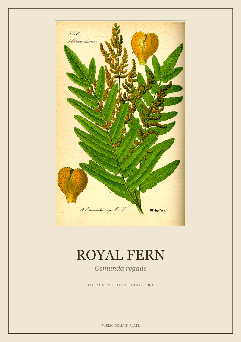
Because we restore public-domain 19th-century botanical plates from named floras, chiefly O.W. Thomé's *Flora von Deutschland, Österreich und der Schweiz* (1885), and neither eucalyptus nor fern appears in the plates we have restored this year. We are not against the categories; we simply cannot speak to a sheet at the level of paper, ink and line unless we have scanned it ourselves. Everything on our wall began under our loupe.
New plates from the archive and 10% off your first print.
One email now with your code. No noise after.