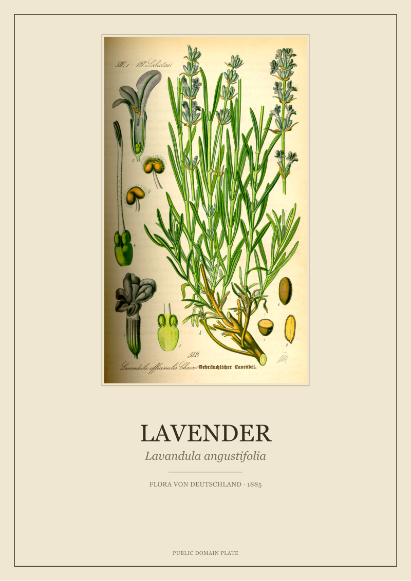
Most people looking at a 19th-century botanical plate think they are looking at a picture of a plant. They are not. Hear us out. What Otto Wilhelm Thome drew in 1885, when he laid Lavandula angustifolia across a single page of his Flora von Deutschland, Osterreich und der Schweiz, was closer to a technical dossier than to a portrait. Every dissected floret, every cross-sectioned calyx, every isolated stamen floating beside the whole stem was doing legal-brief work: identifying the species so precisely that another botanist, in another country, could not confuse it with a neighbour on the same hillside.
The Dissection Habit: Why the Plate Is Not a Portrait
There is a pattern we notice every time a viewer meets one of these plates for the first time. They lean in toward the whole plant — the tall spike, the narrow leaves, the familiar silhouette — and they let their eye slide past the small satellite drawings scattered around it. Those satellites are the point. The whole plant is the courtesy the illustrator paid to the reader; the dissections are the reason the page exists.
Thome was working inside a tradition older than his own century. A 19th-century flora — and Flora von Deutschland, Osterreich und der Schweiz was one of the great ones for its region — is not a coffee-table book. It is a determination key made visual. Its readers were teachers, pharmacists in training, foresters, gymnasium students, provincial doctors, gentleman botanists. They opened the book because they had a plant in front of them and a question: what exactly is this. The plate answered by showing them the plant in the way a stranger's face is shown on an identity document. Full view, then the features that distinguish this face from every other face on the same street.
For a lavender that means the drawing does several things at once. It shows the habit of the plant — the branching, the density of the spike, the leaf carriage — at a scale that lets the eye compare it against neighbouring species in the mint family. It then breaks the diagnostic parts out into their own small studies. A floret separated from the whorl, so its shape and proportions can be read without the crowd around it. A calyx opened lengthwise, so the tube's ribbing and the teeth at its rim can be counted. A stamen isolated, so the anther's attachment can be seen the way a jeweller sees a setting.
This is why a botanical plate rewards slow looking in a way a photograph does not. A photograph flattens the plant into one moment of light. A plate like Thome's is edited — the illustrator has already decided what matters, and has drawn the matters larger, cleaner, and further apart.
The Line That Doesn't Lie: Contour Before Colour
The second pattern we see, once viewers accept that the plate is a document, is that they still look for the wrong thing inside it. They look for colour. They ask us about the exact shade of the flower, whether the green of the leaf is faithful, whether the 1885 palette can be trusted. Colour, in these plates, is the last honest layer. The line came first, and the line is where the truth lives.
A botanical plate of Thome's period was built by hand in a specific order. The illustrator drew the plant in graphite, working from pressed herbarium specimens and, wherever possible, from living material. That drawing was refined into a clean contour — every leaf edge, every vein, every calyx tooth resolved as a line a lithographer could copy onto stone. The contour did the identification work. Colour, when it was added, sat on top of a decision already made.
Look at a Thome lavender with this order in mind and the drawing changes. The narrow leaves are not just described by their outline; they are described by the pattern of hatching along the midrib, by the slight silvered fuzz suggested with short parallel strokes on the underside. The stem is drawn as a square in cross-section — a quiet, essential clue, because a square stem is one of the signatures of the mint family, the Lamiaceae, to which lavender belongs. If the stem in the plate were round, the plant would be misfiled at first glance.
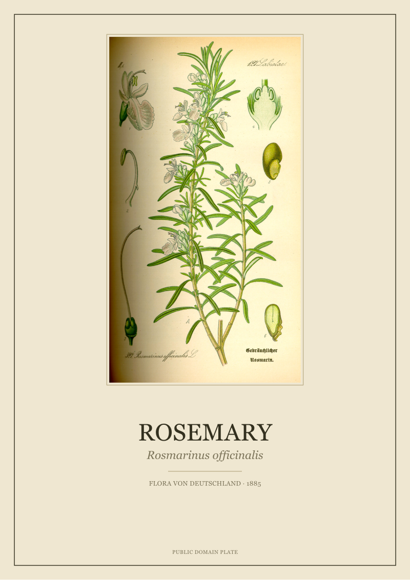
The florets, arranged in tight whorls up the spike, are drawn with a specific attention to the two-lipped shape that mint-family flowers wear. Upper lip, lower lip, tube. The way the lips are drawn tells a reader whether this is a lavender rather than a sage, a hyssop, a rosemary, a thyme — all cousins on the same family tree, all capable of confusing an untrained eye at ten paces. The line is what does the disambiguation.
This is also why a good restoration of a Thome plate begins by protecting the line and treating the colour as a second-order question. Where the line survives clean, the plate is still doing its 1885 job. Where the line has been softened by scanning noise or by an over-eager filter, the plate becomes decorative and stops being a document.
Colour is what makes a botanical plate hang on a wall; line is what makes it worth hanging.
 Lavender
The print from this article · from €29.95
View the print →
Lavender
The print from this article · from €29.95
View the print →
The Latin Under the Picture: Reading the Label as a Legal Caption
The third pattern is that almost nobody reads the label. The Latin sitting under the drawing looks like a formal courtesy — a two-word tag naming the plant. It is not. It is the caption a lawyer would write, and it does more work than any of the pictorial elements above it.
Lavandula angustifolia. Genus, then species. Genus capitalised, species lowercase, both italicised in a modern reprint. The binomial itself is a small argument. Lavandula places the plant inside a defined group of aromatic sub-shrubs in the mint family. Angustifolia — "narrow-leaved" — separates it from its close relatives with broader or more divided leaves, and specifically from Lavandula latifolia, the broad-leaved species with which it hybridises in cultivated fields.
A plate reader in 1885 would have understood the binomial as a claim: this is the true, narrow-leaved lavender, the one with the tidy botanical citizenship. Not the hybrid. Not the wide cousin. The very species. Everything drawn above the label — the leaf width, the spike density, the shape of the calyx teeth — is offered as evidence for the claim.
The plate work itself, Flora von Deutschland, Osterreich und der Schweiz, is the second half of the caption's authority. A flora is a bounded document; it names its territory. Thome's flora covered the German-speaking countries of Central Europe. To include lavender in that flora at all was already a statement about where the plant grew, how far north its cultivation had settled, and which of its populations counted as part of the regional botany. Modern readers, meeting the plate on a wall two continents away, tend to lose this context. The label restores it. It says: this plant, drawn this way, was documented here, by this author, in this year, for this readership.
We treat the label, in restoration, with the same care we give the line. We resist the temptation to move it, restyle it, or translate it. It is part of the object, and it is where the object signs its own name.
The Colour That Isn't There: What Chromolithography Chose to Leave Out
The fourth pattern is the one that costs us the most conversations. Viewers ask why the lavender in the plate looks the way it does — sometimes paler than the modern crop, sometimes more grey-green than they expect. The answer sits in the printing process, not in the plant.
Late-19th-century flora illustrations reached their readers through chromolithography, a printing method in which each colour was drawn onto its own limestone slab and pressed onto the paper in registered layers. A plate might be built from four, six, ten separate stones — one for the outline in a dark warm ink, another for a leaf green, another for a flower purple, another for the soft brown of the stems, another for shadow. The palette was not infinite. It was chosen at the workshop, before any specific plate was drawn, and every species in the volume had to work inside it.
This is why the plates from Flora von Deutschland, Osterreich und der Schweiz feel like they belong to one another across hundreds of species. They share a colour vocabulary. The greens are cool because the workshop's greens were cool. The purples in the lavender's florets are the same purples used, with different weight, in the plate for a wild orchid or a mint or a self-heal. The illustrator and the printer had already decided, together, what the whole book would look like.
What chromolithography chose to leave out is as important as what it put in. Fine gradations of hue — the shift from silvered underside to grey-green upper surface on a lavender leaf, or the warm brown at the base of a spike that has begun to dry — were often replaced by flat washes or by parallel-line shading in a single ink. The eye reads these simplifications as style. They are also a technical honesty: the workshop was not pretending to have painted the plant. It was printing a reproducible reference that a thousand copies of the same book could share, page for page.
When we restore a Thome plate today, this is where the ethical questions gather. We can, with modern tools, invent gradations the original stones never carried. We can smooth, saturate, "correct" the greens toward the greens of a photograph. We refuse to. The plate is a 1885 object made by a workshop that told the truth about its own limits, and adding colour it never had would be lying about the object and about the plant at once.
 Rosemary
The print from this article · from €29.95
View the print →
Rosemary
The print from this article · from €29.95
View the print →
So What Do You Actually Do With a Plate Like This
The direct advice, once the plate is understood, is short. Hang it where it will be read, not only glanced at. That means a wall a person passes slowly — beside a reading chair, along a hallway that ends somewhere, above a desk — rather than a wall that only receives the sweep of a room's first look. A botanical plate rewards the second minute of attention. It should be placed to earn it.
Read the label first, then the whole plant, then the satellite dissections in order of size. The label tells you what you are looking at, the whole plant tells you how it stands, and the dissections tell you why the illustrator was willing to defend the label against a rival species. Doing this once, deliberately, with a lavender plate will change the way you read every plate afterwards — the reflex of looking for the small drawings, and asking what they are proving, becomes permanent.
Do not reduce the plate to scent. Lavender's contemporary reputation is aromatic — soap, oil, sachet — and it is easy to hang the plate as a decorative citation of a smell. The plate is older than that reputation and quieter. It shows a plant being identified, not marketed. If the wall lets the identification survive, the object keeps doing the work Thome drew it to do.
And once one plate is on the wall, the harder question begins: whether one is enough, or whether the plate is asking for company from its family, its region, or its season. That is where the studio's conversation with a room actually starts, and it is not where this piece ends. Our restored 1885 Lavandula angustifolia lives in the /shop/ if you would like to read it more closely.
New plates from the archive and 10% off your first print.
One email now with your code. No noise after.