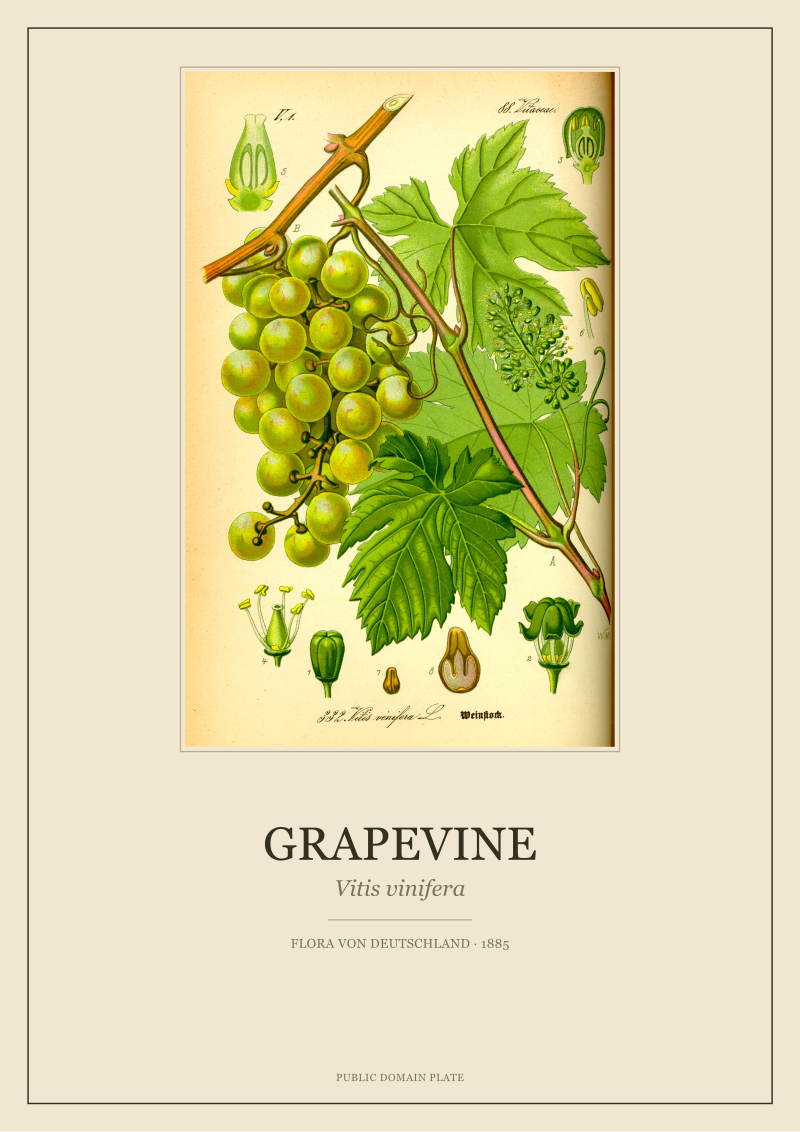
The grapevine has been drawn more often than almost any other plant in the European record, and drawn badly for most of that history. We restore one version of it: *Vitis vinifera* as it appears in Otto Wilhelm Thomé's *Flora von Deutschland, Österreich und der Schweiz*, 1885, now in the public domain. That single plate sits at the end of a four-hundred-year argument about how to put a plant on paper — an argument that ran through monastery herbals, Linnaean reform, and the chromolithographic press before it produced the sheet on our studio table.
Why the Grapevine Was Never Just a Plant to Draw
Most plants entered the illustrated record because a physician wanted to identify them. The grapevine entered because a monastery wanted to account for it. *Vitis vinifera* is a plant with ledgers behind it: cadastral surveys, tithe records, tax rolls. It was drawn under the pressure of an economy long before it was drawn under the pressure of a taxonomy. That pressure produced a specific pathology on paper. The grapevine kept getting stylised. A cluster of grapes became a diagram of abundance rather than a description of a fruit. A leaf became a heraldic silhouette rather than a lobed, palmate blade with a specific vein pattern.
Read any European ceiling from the 15th to the 18th century and the grapevine is there — twisted, symmetrical, decorative, botanically wrong. It sits in choir stalls, wine-cellar signage, the margins of psalters, the corners of family crests. By the time a serious botanist tried to look at *Vitis vinifera* as a plant, the audience had four centuries of ornamental grapevine in their eye. The illustrator had to draw against that memory.
This is the first fact any history of grapevine illustration has to reckon with: the plate is not competing with other plates. It is competing with the wallpaper.
Before Thomé: The Herbal Woodcut and Its Limits
The earliest printed European herbals — Brunfels in 1530, Fuchs in 1542 — are conventionally where botanical illustration begins as a technical discipline. Brunfels commissioned Hans Weiditz to draw from living specimens. Fuchs went further and printed dissected views, roots included, at unusually large scale. Both books contain grapevines. Both grapevines are recognisable. Neither is analytically useful.
The reason is the medium. A 16th-century woodcut resolves to the width of a knife blade. The line is committed once and does not soften. It can render a lobe, a tendril, an inflorescence in silhouette. It cannot render the difference between a young leaf and a mature one on the same plant, or the fine reticulation of tertiary veins that separates *Vitis vinifera* from its American cousins. The grapevine is a plant whose identity lives in exactly those places. A woodcut of a grapevine is closer to a family crest than to a specimen.
There is a second limit, less technical. The herbal tradition drew plants as monographic portraits — the whole habit at once, roots down, fruit up, everything present. This produces a plate that reads well from three metres but confuses under a hand lens. Every organ competes for the same square centimetre of paper. The economy of the plate was wrong for a plant as structurally busy as *Vitis*.
We restore woodcut-era plates when the studio commissions them, and we can say this cleanly: pre-1700 grapevines are art history. They are not botany. The interesting portrait of *Vitis vinifera* does not exist until the illustrator inherits a different convention.
 Grapevine
The print from this article · from €29.95
View the print →
Grapevine
The print from this article · from €29.95
View the print →
What Changed in the 18th Century: Line, Dissection, Latin
That convention arrived through three simultaneous shifts: engraving replaced woodcut, dissection replaced habit, and Linnaean Latin replaced description.
Copperplate engraving, standard by the mid-18th century, resolves an order of magnitude finer than woodcut. Georg Dionysius Ehret, working with Linnaeus and later independently, pushed the medium hard. His plates carry venation, pubescence, the difference between a pistil and a stamen at scale. Ehret drew *Vitis* only occasionally, but the convention he settled — habit at half-page, floral and fruit dissections in the corners, everything captioned — is the convention Thomé inherits 130 years later.
Dissection is the more important shift. Once the plate included a separate, magnified diagram of the flower and the fruit, the illustrator was no longer forced to compress the plant into a single portrait. The main figure could show habit; the insets could show structure. *Vitis vinifera* has a small, unshowy inflorescence and a fruit with a specific pip arrangement. Neither shows up in a habit-only drawing. Both become the identifying features once the dissection convention exists.
Linnaeus, in *Species Plantarum*, 1753, gave the plant its binomial and located it in a system. The plate now had to carry a name that pointed at a definition. It could no longer be captioned "Weinstock" or "Vigne" and left there. The 18th century turned the grapevine plate from an object of recognition into an object of reference — a piece of evidence for a claim about a species.
By 1800, the machinery for a genuinely analytical *Vitis* plate existed: a fine-line medium, an accepted layout, a fixed name. It took another eighty years, and one further technical shift, before Thomé's version arrived.
Reading the 1885 Plate: Thomé's Vitis vinifera, Detail by Detail
The 1885 plate is chromolithographic. That matters. Chromolithography — a multi-stone colour-printing process refined through the mid-19th century — was the first medium that could carry engraving-grade line together with layered, register-accurate colour. Thomé's *Flora von Deutschland* was designed for schools and educated households, which meant the plates had to be legible at reading distance and correct under closer inspection. The commercial pressure produced a specific composition.
Read the *Vitis vinifera* plate as a document and it resolves into five zones. The central habit shows a young shoot with three to four leaves, a tendril, and an inflorescence in situ. The leaves are drawn as they actually vary on a single vine — one nearly entire, one deeply five-lobed, sinus depth changing along the stem. Nothing is symmetrised. The tendril is opposite the leaf, which is correct for *Vitis* and wrong in almost every decorative grapevine ever drawn.
Below and to the side, the plate carries the analytical inserts. A single flower is magnified to show the calyptra — the fused petal cap that falls off at anthesis, which is the diagnostic feature of the genus. A cross-section of the ovary shows the two locules and the ovule arrangement. A mature berry is drawn whole and in section, seeds visible, with the specific pear-shape of the *Vitis vinifera* pip rendered at magnification. A separate small figure shows a single seed from two angles.
The colour is doing analytical work as well as decorative work. The green of the leaf is not one green. The upper surface is a cooler, slightly grey-tinged green; the underside, visible where a leaf folds, is paler and warmer, catching the fine tomentum that *Vitis vinifera* carries on young growth. The fruit is drawn at true colour — the muted, dust-bloomed purple of an unwiped grape, not the wet, saturated purple of a fruit stall.
The caption is minimal: Latin binomial, family, a line of German common name. Everything else is on the plate. The reader is expected to look, not to be told.
This is what a mature botanical plate looks like. Four hundred years of iteration are compressed into one sheet, and the sheet does not announce them.
After 1885: Photography, Loss, and Why the Plate Still Wins
Photography of plants was, by 1885, thirty years old. Anna Atkins had published cyanotype algae in 1843. Botanical photography, by the end of the century, was competing directly with drawn plates for the same institutional budgets. Within a generation, the drawn plate had lost that competition. Twentieth-century floras are largely photographic. The chromolithographic tradition effectively ends before the First World War.
What was lost is specific. A photograph of a grapevine captures a single instant of a single specimen. It carries information about that leaf, that light, that shutter speed. It cannot show the range of leaf-lobing on a single plant without a composite. It cannot show a flower and a mature fruit on the same page without cheating the season. It cannot section an ovary. Every diagnostic move that Thomé's plate makes — the compression of variation, the analytical insert, the true-colour rendering under studio light — is unavailable to the camera.
The plate wins on paper for the same reason it lost the market: it is an argument, not a record. It is what an illustrator, a botanist, a printer and a chromist agreed the grapevine was. That agreement, printed at scale in 1885, is what we work with now. When we restore the plate, we are not preserving a photograph of a plant. We are preserving a four-hundred-year negotiation about how to see one. The plate is in our current studio catalogue at see the Grapevine print, rescanned at archival resolution from a first-edition copy.
The Thomé grapevine hangs well on a wall because it was designed to hang well on a wall — not a domestic wall, a schoolroom wall, but the design constraint is the same. It has to read at three metres and reward at thirty centimetres. Very little printed matter from the 21st century meets that specification.
The next question, and the one we get asked immediately after this one, is why the same technical maturity produced so few great plates of the plants we now consider ornamental — the domestic ivies, the parlour ferns, the cut flowers of the late Victorian shop. The answer is not aesthetic. It is about which plants had ledgers behind them, and which did not.
FAQ
Who was Otto Wilhelm Thomé and why does his 1885 flora matter?
Thomé was a German schoolteacher and botanical illustrator who compiled *Flora von Deutschland, Österreich und der Schweiz* as an educational reference. The work matters for two reasons: it appeared at the technical peak of chromolithographic printing, and it was aimed at a schoolroom audience, which forced compositional discipline. The plates had to be legible, accurate and comprehensible without a lecturer standing next to them. That combination is rare in botanical publishing history.
Is Thomé's grapevine plate actually in the public domain?
Yes. *Flora von Deutschland, Österreich und der Schweiz* was published in 1885. Under standard copyright terms across the EU, UK and US, works of this age have long entered the public domain. The plate we restore is from a first-edition copy and can be reproduced, restored and printed without licensing. What is not free is a modern high-resolution scan or restoration of that plate, which is an original piece of work by whoever produced it.
Why did decorative art get the grapevine wrong for so long?
Because it was drawing a symbol, not a plant. The decorative grapevine that runs through European ornament from the medieval period onward is a symmetrised, stylised object with the tendril placed for balance rather than anatomy. Thomé's plate corrects the two commonest ornamental errors: tendrils are opposite leaves, not paired around a stem, and the leaves on a single vine vary substantially in lobing rather than repeating one silhouette.
What actually separates Vitis vinifera from other Vitis species on a plate?
Two features carry most of the diagnostic weight in the illustrated tradition. The first is the calyptra — the fused cap of petals that falls off as one piece when the flower opens, which is a genus-level feature. The second is the pip. *Vitis vinifera* seeds are pear-shaped with a specific beak length and a characteristic pair of shallow depressions on the ventral face. Thomé's inserts render both.
Why is chromolithography considered the peak medium for botanical plates?
It is the only historical process that combines the fine, resolved line of engraving with layered, register-accurate colour on the same sheet. Earlier hand-coloured engravings varied specimen to specimen. Later photolithography flattened tonal range. Chromolithography, roughly 1860 through 1910, sits in the narrow window where both variables are controlled. Nothing before or since holds line and colour at that standard on a single printed page.
How do you restore a nineteenth-century plate without altering it?
Working from a high-resolution scan of a physical first-edition sheet, restoration removes foxing, paper yellowing and print-defect noise that were not part of the original 1885 impression. Colour is calibrated back toward the reference range Thomé's chromists worked in, not toward modern taste. The line work is left untouched. The test we apply is whether a botanist from 1885 would recognise the plate as their own.
Does a botanical plate work as art independent of its botanical accuracy?
It can, but the reverse is more interesting: the plates that survive as art are almost always the ones that were most rigorous as botany. Rigour produces composition. Thomé's *Vitis vinifera* is compositionally strong because every element on the sheet is there for an analytical reason — habit at scale, dissection in the margin, colour tied to specimen truth. Decorative botanical work with no evidentiary discipline tends to age poorly on a wall.
New plates from the archive and 10% off your first print.
One email now with your code. No noise after.