The fig palette is not green. Hear me out. Thomé's 1885 plate of Ficus carica, rendered by chromolithography and now in the public domain, resolves under museum scanning to five dominant hues: a muted olive across roughly a quarter of the sheet, a warm sepia from the split fruit, a paper-cream that carries most of the background, a violet-tinged aubergine in the pulp, and a dry ochre along the branch. Any interior scheme that treats the plate as "a green botanical" will fight it. The plate is already a palette. This piece routes the reader through three questions to place it without losing any of those five tones.
Question 1: What Colour Are the Walls Behind the Fig Plate?
The wall is the mount. Before framing, before daylight, before the sofa fabric, the wall decides which of the five fig hues survives and which one collapses into the background. This is the first fork because getting it wrong here cannot be corrected by a better frame or a brighter bulb. A plate hung against a wall that echoes its dominant tone stops being a picture and starts being a texture patch. A plate hung against its opposite becomes a shout.
Read your wall in daylight, at around midday, without any lamp on. Squint until the detail drops out. What remains is the wall's actual value — the tone that will sit behind the print eight hours a day. Then compare it to the fig's five: olive, sepia, cream, aubergine, ochre.
If Yes — the wall is cream, off-white, unbleached linen, or any warm neutral in the same family as the plate's paper background
This is the friendliest case, and also the one most likely to be underestimated. A cream wall does not compete with the plate — it extends it. The paper of the print (which is roughly forty percent of the sheet's surface) reads as a continuation of the wall, and the eye is drawn cleanly to the leaves and fruit. The visual density of the plate goes up, not down. In this case, framing should stay quiet: an unstained oak, a limed ash, or a narrow black lacquer. Do not add a wide off-white mount — the mount and the wall will merge and swallow the frame. A three-centimetre mount in soft warm grey is enough to give the plate a boundary without staging it.
If No — the wall is a saturated colour (green, blue, terracotta, deep clay), a cool white, a grey, or wallpapered
This is where most fig placements fail, and where the palette work matters most. A green wall will absorb the plate's olive and force the sepia and aubergine to carry the whole image — which they can, but only if the frame steps in as a mediator. On saturated walls, use a wider mount (five to seven centimetres) in the plate's own cream, and a frame in the wall's darker neighbour: on sage green, a walnut frame; on terracotta, a black-stained ash; on inky blue, an aged brass or dark bronze. On cool grey walls, the aubergine tone flattens badly — introduce a small warm object nearby (a lamp base, a ceramic) to hold the plate in the room rather than letting it drift.
Question 2: How Much Daylight Does That Wall Actually Receive?
Chromolithography from the 1880s was printed to be read in the daylight of a bourgeois parlour, not under a downlight. Thomé's original edition of *Flora von Deutschland, Österreich und der Schweiz* assumed north-facing gaslight in winter and full window daylight the rest of the year — a wide, soft, tonally warm light. Modern interiors run the opposite: cooler lamp temperatures, more direct-beam LED, and often no daylight at all on interior walls. This changes which of the five fig hues you actually see.
Measure the wall's daylight honestly. Stand in the room at 10am on a clear day, phone camera in manual white-balance if possible, and photograph the wall. If the image comes back visibly amber, the wall gets warm daylight. If it comes back neutral or slightly blue, the wall is on cool or ambient light. If it comes back dark, the wall is in shadow all day and lives on artificial light. Route from there.
If Yes — the wall receives at least four hours of direct or reflected daylight per day
The plate will hold its full palette. The olive stays olive, the sepia stays warm, the cream stays paper-toned. This is the placement Thomé designed for, and the plate will feel three-dimensional — the aubergine of the pulp will glow slightly, and the ochre along the branch will pick up whatever late-afternoon light passes through the room. No supplementary lighting needed. Avoid picture lights entirely; they will overpower the daylight and turn the sepia orange after sunset. Framing under museum glass (anti-reflective, UV-filtering) is worth the cost here — direct daylight will fade even a well-restored public-domain scan over five to seven years if the glass is untreated.
If No — the wall lives on artificial light for most of the day
Now the light temperature decides the palette. Warm-white LEDs (2700K and below) will push the plate toward its sepia and ochre — the olive will read almost grey, and the aubergine will darken toward black. Cool-white LEDs (3500K and above) will do the opposite: the olive and cream come forward, the sepia goes flat, and the aubergine turns cold and purple. Neither is wrong, but each picks a different fig. If you want the fruit-forward reading of the plate (which is what most people respond to), stay at 2700K–3000K and add a small warm picture light or a nearby table lamp aimed at the wall. If you want the botanical-schematic reading (leaves and structure), go 3000K–3500K and light the room evenly. Below 2400K the sepia will look muddy; above 4000K the whole plate will look photocopied.
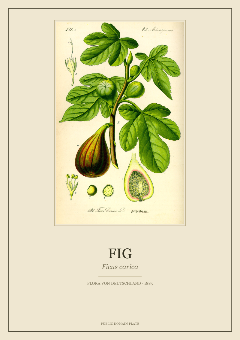 Fig
The print from this article · from €29.95
View the print →
Fig
The print from this article · from €29.95
View the print →
Question 3: Are the Room's Other Materials Warm-Toned or Cool-Toned?
The plate does not hang alone. It hangs with a sofa, a rug, a table, a shelf of books, curtains, cushions. The dominant material tone of that inventory is the third fork, because the plate's palette will either extend those materials or contradict them — and both are legitimate choices, but they require different framing decisions.
Do the inventory in one minute. Look at the four largest non-wall surfaces in the room — usually the floor, the largest piece of furniture, the largest textile, and any prominent wood or stone. Assign each to warm (oak, walnut, brass, terracotta, unbleached linen, wool, leather, jute) or cool (chrome, black steel, cool grey stone, blued oak, painted white cabinetry, cotton in cool tones). Count.
If Yes — three or four of the four surfaces are warm-toned
The room is already speaking the fig's dialect. The sepia, ochre, cream, and aubergine will all find echoes in the existing materials, and the olive will register as the only unexpected note — which is exactly the tension a botanical plate is supposed to introduce. Frame in an unstained oak or a warm-toned walnut to fold the plate into the existing wood tones. Skip the mount, or use the thinnest cream mount possible; a wide mount here breaks the visual conversation between plate and room. Consider hanging the plate at seated eye-level (roughly 140 centimetres to centre) rather than the standard 155 — warm rooms tend to be lived in from the sofa, and the plate wants to be read from where the room is actually used.
If No — three or four of the four surfaces are cool-toned, or the room mixes tones roughly evenly
The plate becomes a warm accent, and the framing has to work harder to justify its presence. Do not try to match the plate to the room; the aubergine and sepia will not find partners on cool oak or in a grey wool rug. Instead, isolate the plate. Use a black or dark-bronze frame (never a warm wood) and a wide cream mount to create a formal border between the plate's world and the room's. This is the museum treatment — it reads as a deliberate inclusion rather than a decorative mismatch. If the room mixes tones, place the plate on a wall that is closest to the warm materials, not the cool ones. A fig plate above a wool sofa in a room with a walnut floor will always land better than a fig plate on the cool wall opposite the sofa.
If You Answered Everything: The Placement Table
Each row below reads Q1 (wall colour) / Q2 (daylight) / Q3 (material tone) and returns one concrete recommendation. Use it as a lookup, not a rulebook — the plate has its own final word.
| Q1: Warm/cream wall? | Q2: 4h+ daylight? | Q3: Warm materials? | Recommendation |
|---|---|---|---|
| Yes | Yes | Yes | Unstained oak frame, narrow warm-grey mount, hang at 155cm — the plate carries the room. |
| Yes | Yes | No | Black-stained ash frame, five-centimetre cream mount, museum glass — treat as a formal insertion. |
| Yes | No | Yes | Warm walnut frame, no mount, 2700K side lamp aimed at the wall — evening reading of the palette. |
| Yes | No | No | Dark bronze frame, wide cream mount, single 3000K picture light — isolate the plate from the room. |
| No | Yes | Yes | Walnut frame on a green wall, cream mount at seven centimetres, no supplementary light needed. |
| No | Yes | No | Black frame, wide cream mount, museum glass, add one warm ceramic within a metre of the plate. |
| No | No | Yes | Aged brass frame, narrow mount, 2700K–3000K lighting — the sepia will do the heavy lifting. |
| No | No | No | Black lacquer frame, wide cream mount, 3000K even room light — accept the plate as a cool-cool contrast. |
Two notes on the table. First, "warm-toned materials" in row six saves an otherwise difficult placement — a single terracotta pot near a cool-walled fig plate does more than a wider mount. Second, the hardest combination (No / No / No) is the one that most modern flats fall into: cool walls, no daylight, cool materials. That row is honest — the plate will read as a deliberate contrast, not as decoration. Some of our clients hang the Ficus carica plate precisely for that reason. The restored plate is available through the studio's own catalogue at /shop/ if the palette exercise has decided the room for you.
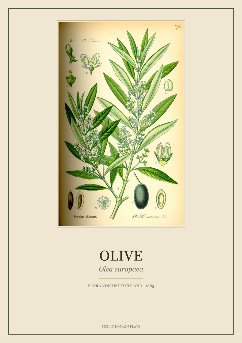 Olive
The print from this article · from €29.95
View the print →
Olive
The print from this article · from €29.95
View the print →
FAQ
Which of the five fig hues should I try to match in the rest of the room?
The cream, always. It is the largest surface on the plate (roughly forty percent of the sheet) and the most forgiving to echo in a room — through curtains, a rug border, or a lampshade. Matching the aubergine or sepia is harder and risks turning the room into a costume for the plate. The olive can be echoed in one plant or one ceramic. Never try to match all five; the plate will lose its role as a focal point and dissolve into the scheme.
Does the Thomé plate work in a bathroom or kitchen?
Yes, but with framing caveats. Both rooms have humidity swings that will warp any wooden mount within two seasons unless the frame is sealed. Use a metal frame (black steel, aged brass) and museum glass with a proper spacer, and keep the plate at least a metre from any direct steam source. Kitchens are actually the natural home for a botanical fig — the plate depicts a food plant, and it reads well above a dining table or opposite a stone counter.
Should I use a matte or a glossy frame glass?
Matte anti-reflective museum glass, without question, if the wall gets any daylight or lamp glare. Glossy glass will bounce so much light back that half the fig plate will be unreadable from most viewing angles. The chromolithographic surface of an 1885 plate is subtle — its tonal transitions live in the darkest quarter of the scan, and glare erases them completely. Museum glass costs roughly three times as much as standard glazing. It is the single highest-leverage upgrade for a botanical plate.
Can the fig plate go in a room with other Thomé plates from the same 1885 series?
Yes, and it is one of the strongest wall arrangements in the studio's catalogue. The 1885 series was printed to a consistent palette convention — the same cream paper, the same sepia and olive registers — so plates from within the series read as siblings rather than as a mixed group. A three- or five-plate arrangement featuring the fig alongside olive, vine, or lavender plates will look coherent without any additional design work. Space them at ten centimetres frame-to-frame and use identical framing across the set.
What is the correct hanging height for a botanical plate in a living room?
The gallery standard is 155 centimetres to the centre of the frame, which assumes a standing viewer. For a room that is primarily used seated (sofa, reading chair, dining table), drop to 140–145 centimetres. The fig plate rewards being read closely — the aubergine detail in the fruit pulp and the venation of the leaves are lost at standing distance from three metres away. Hang it where it will actually be looked at.
Will direct sunlight fade the restored plate?
Direct sunlight will fade any pigmented print, including a modern restoration. UV-filtering museum glass reduces fading by around ninety-nine percent, but heat and visible light still degrade dyes over time. If the wall receives more than two hours of direct sun per day, hang the plate on the shaded side of the room or rotate it seasonally. Public-domain scans can be reprinted, but a plate on the wall for a decade in full sun will noticeably shift toward the ochre end of the palette.
Is there a wall colour the fig plate simply cannot live with?
Bright saturated red is the one true refusal. The plate's aubergine and sepia both compete with red at the same tonal register, and the eye cannot resolve the plate as a distinct object — it reads as noise on the wall. Bright yellow is a similar problem for the ochre and cream. Every other colour, including strong greens and dark blues, can be made to work with the right frame and mount. If the room is red or yellow, hang the plate in the hallway instead.
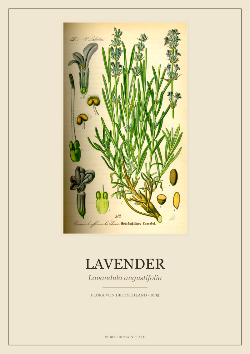
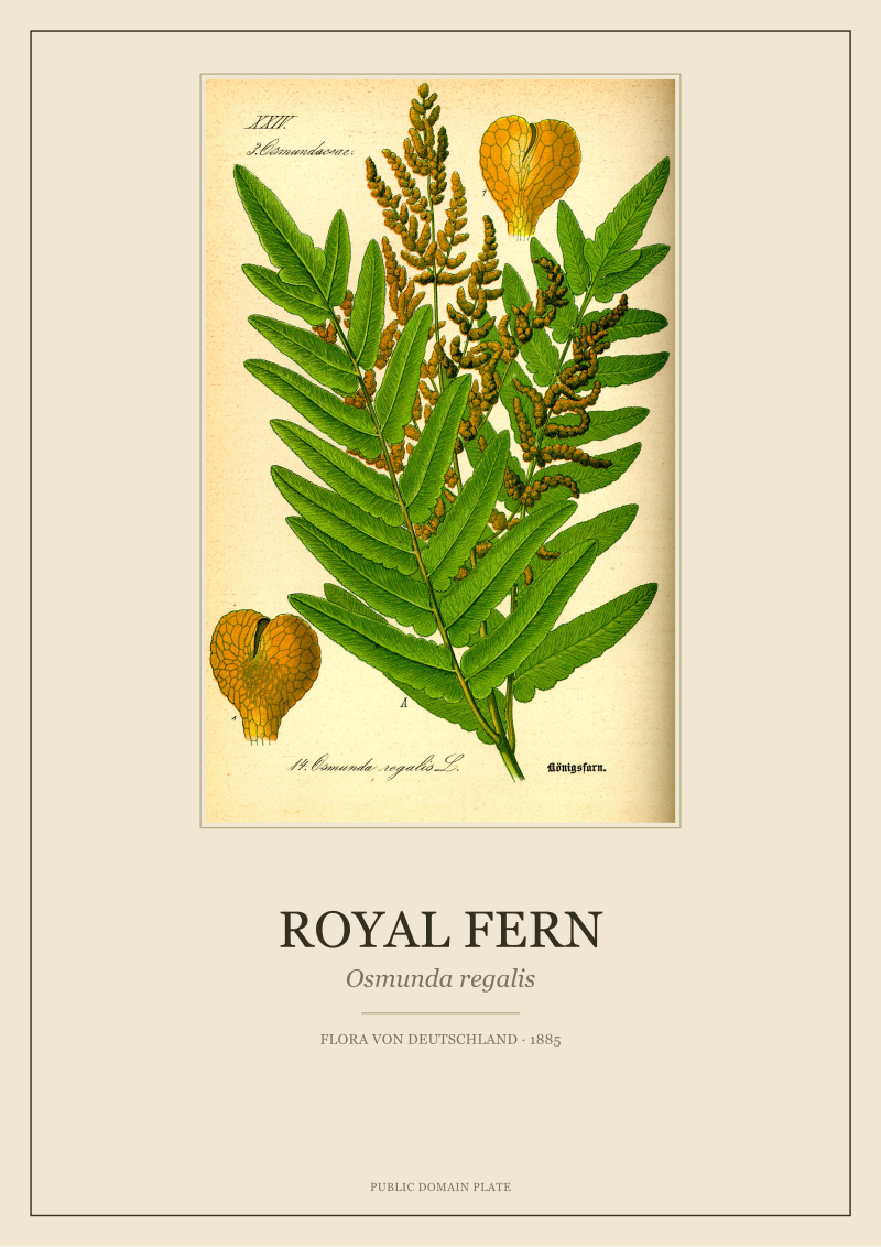
New plates from the archive and 10% off your first print.
One email now with your code. No noise after.