Otto Wilhelm Thomé's 1885 plates are not botanical art. Hear me out. Between 1885 and the turn of the century, his Flora von Deutschland, Österreich und der Schweiz appeared as a run of hand-coloured lithographs that has spent the last century decorating apartments from Copenhagen to Chicago. The Chamomile plate, the Cornflower, the Common Ivy, the Fennel — every one has a second life on Etsy and a third on Pinterest. The problem is that the plates were not drawn to be looked at. They were drawn to be read, and the distinction changes almost everything about how a modern viewer should treat them.
Why This Is Actually True: The Case for Thomé's Plates as Decorative Masterworks
Spend an hour with the case for the defence and it is difficult not to be persuaded. The Thomé plates are, on the evidence, some of the most beautifully staged botanical objects the nineteenth century produced. The Chamomile — *Matricaria chamomilla* — sits on the page with a compositional confidence that would not embarrass a still-life painter: the umbels distributed at three heights, the feathery leaves crossing the stem at the angle where a designer would put them, the negative space on the sheet almost impossible to improve. It is, by any honest measure, a picture.
The Cornflower plate — *Centaurea cyanus* — does the same trick with a different palette. That specific blue is one of the hardest pigments to hold on paper for a century, and it has held. Look at any decent Copenhagen apartment on Instagram and count the number of times you see a framed cornflower plate on the wall behind a mid-century chair. There is a reason. The colour is doing work the room cannot do on its own.
The Common Ivy plate — *Hedera helix* — is a study in how to draw a climbing plant without cheating. Thomé's ivy is unmistakably ivy: the five-lobed juvenile leaves at the base, the diamond-shaped adult leaves higher up, the flowering umbels that most people who live with ivy have never actually seen. And the Fennel — *Foeniculum vulgare* — is the closest the run comes to pure ornament, all vertical rhythm and umbellifer geometry, the plant reduced to its most legible pattern.
These are decorative masterworks. The market has been right about them for a century. The framers, the poster shops, the Etsy sellers, the interior magazines — they are all responding to something real on the sheet. The plates hold a room. They anchor a wall. They photograph. Nothing in what follows disputes any of that.
But the reason they hold a room has almost nothing to do with the reason they were drawn.
Where It Breaks Down: The 1885 Plates Were Never Drawn to Be Looked At
Here is the sentence that changes everything: *Flora von Deutschland, Österreich und der Schweiz* was a working flora. Not a coffee-table book, not a portfolio, not a private folio for collectors. It was a taxonomic reference — a field-and-desk instrument built to let a reader identify a plant they had just picked, or verify a specimen a student had brought in, or settle a disagreement between two nineteenth-century botanists about whether the thing in the meadow was one species or two. That purpose sits on every plate, and once you know to look for it, you cannot un-see it.
Consider the Chamomile again. The compositional decision that makes it beautiful — three flowers at three heights — is not a compositional decision. It is a diagnostic one. The reader needs to see the ray florets from above (to count them and check the arrangement), from the side (to see how the disc florets sit), and in half-section (to distinguish *Matricaria chamomilla* from the several other chamomile-adjacent species that any nineteenth-century meadow could throw at a walker). What looks like staging is triage. The negative space that a decorator reads as generous framing is where Thomé left room for the small numbered detail — the seed, the achene, the split flower head — that would let the reader make the identification.
The Cornflower plate does the same thing. The famous blue is not a colour choice; it is a colour *record*. A working flora had to reproduce the pigment precisely enough that a reader in Bavaria in 1889 could match it against a plant in their hand and be confident. That the pigment held for a century is a bonus. The specific blue was chosen for the reader, not the wall.
The Common Ivy plate is even more explicit about it. The reason both juvenile and adult leaves appear on the same sheet is that ivy is one of the classic misidentification traps: a botanist who has only ever seen the five-lobed climbing form will fail to recognise the same plant when it has reached the top of the wall and turned into its diamond-leaved, flowering, unclimbing adult phase. Thomé draws both because the reader needs both. It is a warning label rendered as a picture.
And the Fennel — the plate that reads as pure ornament — is where the working nature of the volume becomes almost embarrassing. The umbels are drawn open, closed, and in profile because a fennel in flower and a fennel in seed look like different plants to a beginner. Thomé is coaching. The plate is a lesson.
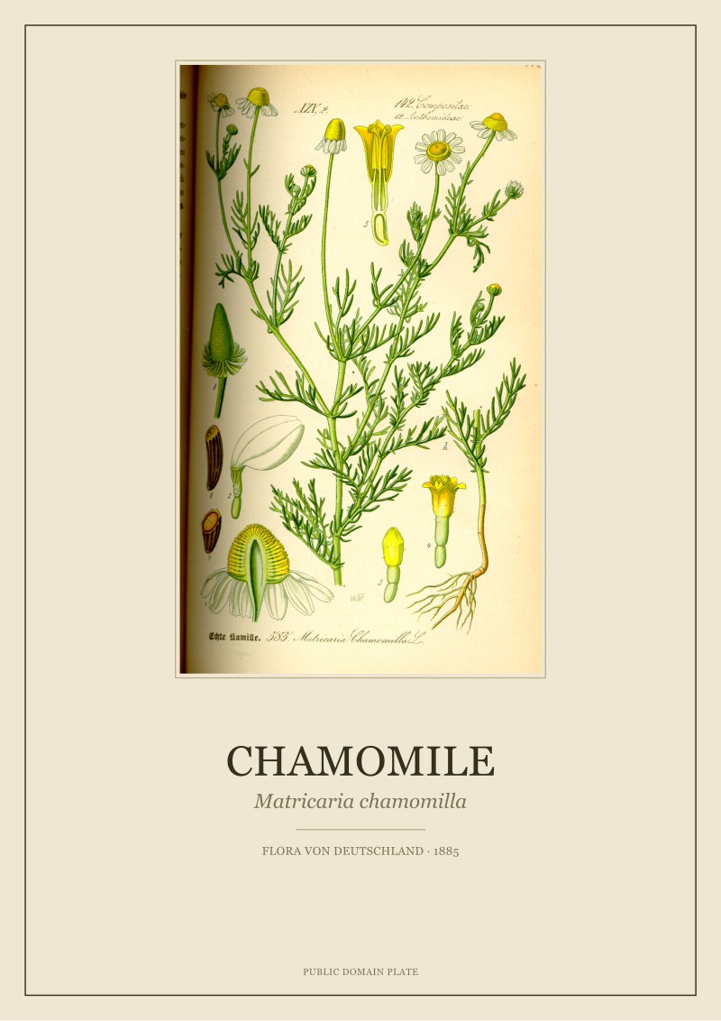 Chamomile
The print from this article · from €29.95
View the print →
Chamomile
The print from this article · from €29.95
View the print →
The Rule I Use Instead: Reading a Thomé Plate as a Diagnostic Document
The rule the studio uses, and the one that changes how a plate hangs on a wall, is this: every element on a Thomé plate is answering a question. Find the question and the plate stops being decoration and starts being a document.
The questions are surprisingly consistent across the four plates in front of us. *How do you tell this plant apart from the two or three species it is most often confused with?* — that is the question the composition answers. *What does the plant look like at the two or three moments in the year when a reader is most likely to encounter it?* — that is the question the multiple flowering states answer. *What are the parts a reader needs to see close up to make an identification stick?* — that is the question the small detail figures at the corner of the sheet answer, the ones the framing industry has spent a hundred years cropping off.
Read this way, the Chamomile plate is a page in an argument. The argument is: here is *Matricaria chamomilla*, and here is how you know it is not one of its lookalikes. The Cornflower plate is a page in a colour-recognition test. The Common Ivy plate is a page about life stages. The Fennel plate is a page about umbel morphology. Each plate is a paragraph in a book that was written to be used.
The studio's practical consequence: when we restore a Thomé plate, we restore the detail figures. The small numbered diagrams in the corner — the seed, the achene, the sectioned flower — are the parts a hundred-year-old framer would trim off to fit a rectangular mount. We put them back. Not because they are pretty (some of them are, some are not) but because without them the sheet is only half of what Thomé sent to press. A restored plate on our shop wall that keeps its detail figures reads, on a modern living-room wall, as a document that happens to be beautiful. A cropped one reads as a picture that has forgotten what it was for.
That is the difference. The decorative reading is not wrong. It is thin. The diagnostic reading does not replace the decorative one — it holds it up.
When the Old Rule Still Wins: A Wall Doesn't Owe Botany an Explanation
There is a version of this argument that goes too far, and we are not going to make it. A wall does not owe botany an explanation. A person who buys a Cornflower plate because the blue matches the sofa is not making an error. They are using the object the way most objects in a home are used — as colour, as pattern, as anchor. The plate can carry that weight because Thomé built it well enough that even the shallow reading works.
What we are arguing is narrower. We are arguing that the plates *reward* a second reading, and that the second reading is available on any well-restored sheet if the detail figures are still there and the label has not been trimmed. Whether a given viewer takes that second reading is not our business. It is available or it is not, and our job is to make sure it is available.
The old rule — hang it because it is beautiful — still wins on any wall where it wins. The new rule is only for the reader who wants the plate to keep talking after the room has stopped noticing it.
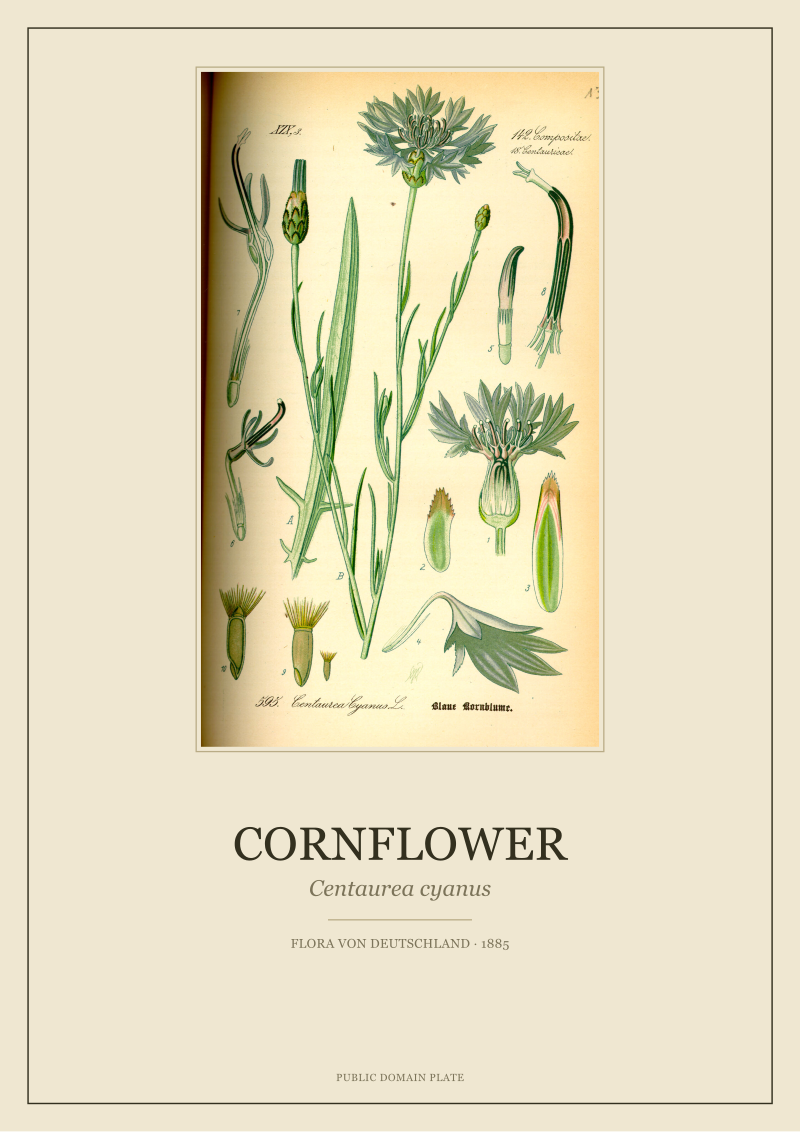 Cornflower
The print from this article · from €29.95
View the print →
Cornflower
The print from this article · from €29.95
View the print →
FAQ
Who was Otto Wilhelm Thomé and what is Flora von Deutschland?
Otto Wilhelm Thomé was the nineteenth-century German botanist and author whose *Flora von Deutschland, Österreich und der Schweiz* appeared in 1885 as a scientific reference flora covering the plants of Germany, Austria and Switzerland. The work is remembered today primarily for its hand-coloured lithographic plates — including species like *Matricaria chamomilla* (Chamomile), *Centaurea cyanus* (Cornflower), *Hedera helix* (Common Ivy) and *Foeniculum vulgare* (Fennel) — which are now in the public domain.
Why are the Thomé plates in the public domain?
The plates in Thomé's 1885 *Flora* have long since passed the copyright horizon that applies to nineteenth-century printed works, which is why every plate discussed here is marked as public domain in the source record. That legal status is what allows a modern studio to restore them, print them, and put them on a wall without licensing anyone. It does not, however, remove the obligation to treat the sheets accurately — public domain is not the same as public property to redraw.
Are the plates in Thomé's Flora original drawings by Thomé himself?
The plates in the 1885 *Flora von Deutschland* are credited to O.W. Thomé as the illustrator of record for the work, which is how they appear in the grounding record we work from. Nineteenth-century botanical publishing often involved teams — an author, a draughtsman, a lithographer, a colourist — but the plates in this specific edition sit under Thomé's name and that is how any museum, library or serious print seller catalogues them today.
What is the difference between a botanical plate and a botanical illustration?
A botanical illustration is any drawing of a plant. A botanical plate, in the nineteenth-century sense, is a printed sheet from a scientific flora — a page designed to be bound into a reference book and used for identification. The Thomé sheets are plates in the second sense. The distinction matters because a plate is built around a diagnostic function first and an aesthetic function second, and reading it as pure illustration misses roughly half of what the artist put on the paper.
Why do restored Thomé plates sometimes look different from Etsy scans?
Most inexpensive scans of Thomé plates on general-purpose marketplaces have been cropped, resized, or auto-colour-corrected in ways that flatten the pigment and remove the small detail figures at the corner of the sheet. A careful restoration preserves the detail figures, the label, and the specific pigment relationships Thomé's colourists chose. The visual difference is subtle at thumbnail size and obvious at print size, which is why the sheets look calmer on a wall than the compressed scans suggest.
Are the plants shown in the Thomé plates medicinal?
The 1885 *Flora* is a botanical reference, not a herbal or pharmacopoeia. It documents plants as species — where they grow, what they look like, how to tell them apart. Historical apothecary use for some of these species is a matter of cultural record from earlier centuries, but the plates themselves make no medicinal claim and neither do we. Anything anyone tells you about the health effects of these plants is a separate conversation from the plates.
Why does the Chamomile plate show the flower from multiple angles?
Because *Matricaria chamomilla* has close lookalikes in the same meadow — related composites that a nineteenth-century field botanist could easily confuse it with. Showing the flower from above, from the side, and in section lets the reader check the ray florets, the disc florets and the receptacle, which together give a reliable identification. What looks like decorative variety in the composition is actually the plate answering a diagnostic question about how to distinguish this species from its neighbours.
What is the best way to display a Thomé plate on a wall?
The studio's honest answer is: give it enough margin that the label and the detail figures at the corner of the sheet are visible, and light it as you would light a document rather than a painting — even, indirect, not raking. The plates were drawn to be read at reading distance, and a wall that lets a viewer step close and actually look at the small figures gets more out of the sheet than a wall that treats it as pure colour block. Everything else is taste.
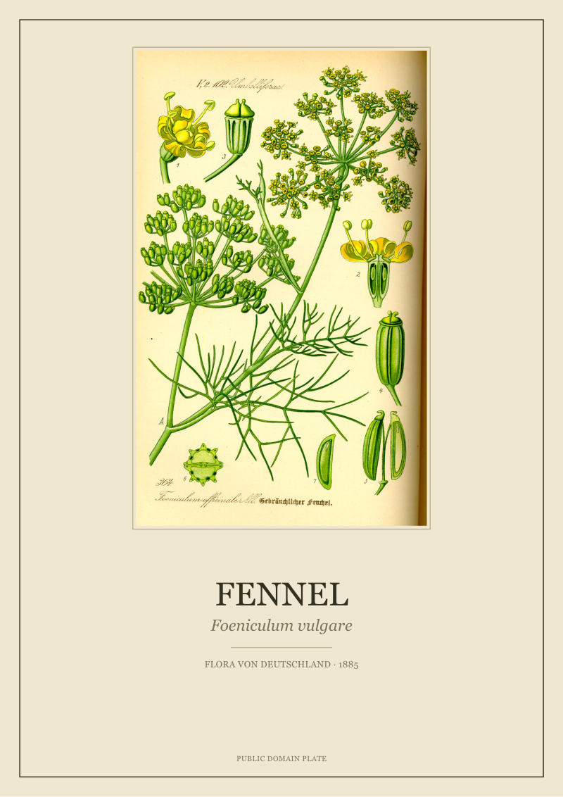
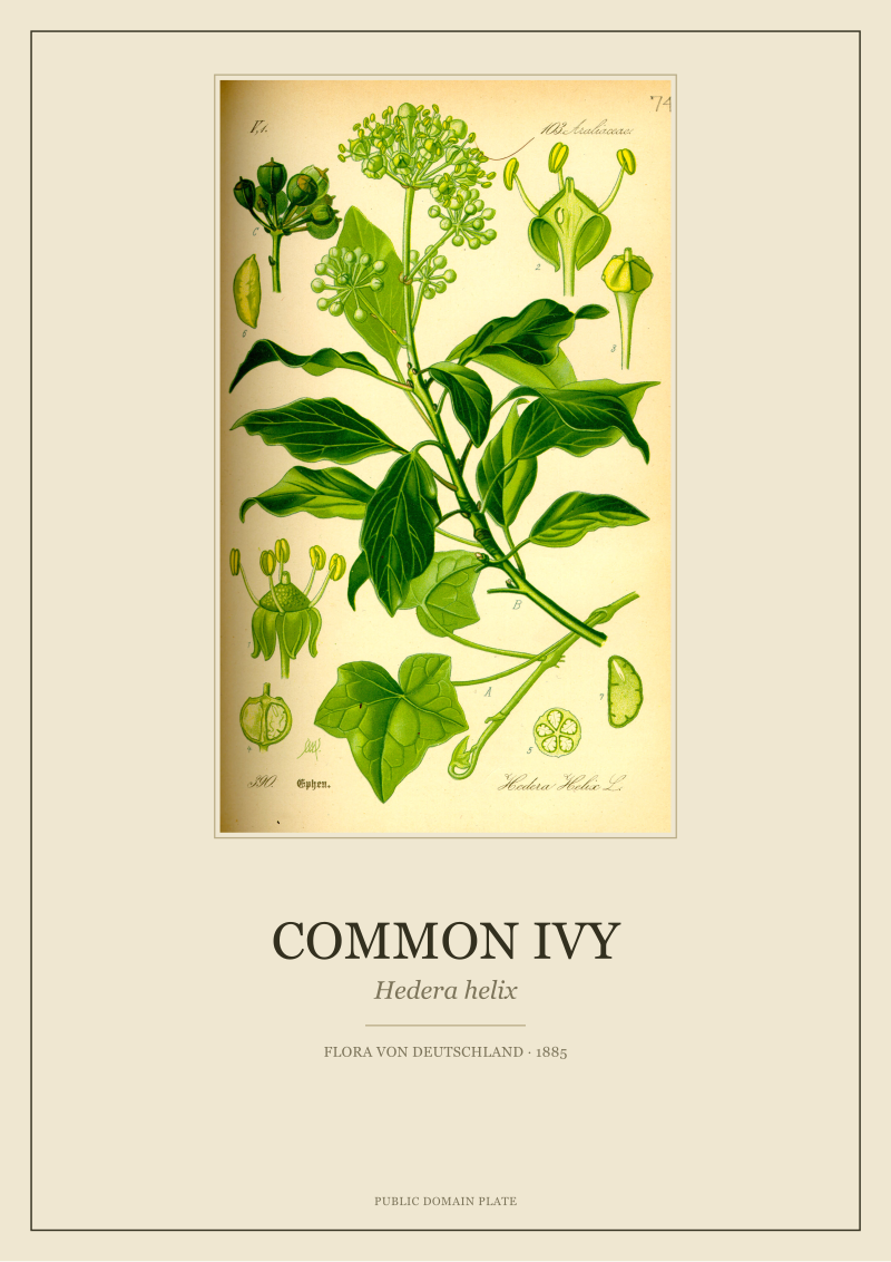
New plates from the archive and 10% off your first print.
One email now with your code. No noise after.