A3 is 297 by 420 millimetres. A2 is 420 by 594 millimetres. On paper the jump sounds modest; on a wall it is not. We restore plates from O.W. Thomé's Flora von Deutschland, Österreich und der Schweiz, published in 1885, and the single question we field more than any other is which of those two sizes belongs on the wall the reader is standing in front of. The honest answer is that it depends on the wall, the plate, and the distance the viewer will most often stand from it. Below, three composite scenarios — hypothetical, illustrative — walk through the decision the way we walk through it in the studio.
Before the scenarios, two numbers worth holding in your head. A2 has 1.41 times the linear dimension of A3, and roughly twice the surface area — 0.249 square metres against 0.124. That factor of two is what changes when you swap one for the other. It changes how far away the plate reads as a plate, how much wall around it needs to be quiet, and how much the botanical detail — the venation on a Hedera helix leaf, the ligulate florets of Centaurea cyanus — asserts itself from across a room. Everything else follows from that ratio.
Scenario 1: The Narrow Hallway With the 1885 Chamomile
Imagine a corridor 1.05 metres wide, running six metres from a front door to a kitchen. One long wall, broken by a single door. The reader wants a Matricaria chamomilla plate — Thomé's chamomile, from the 1885 Flora — hung somewhere along that wall, and cannot decide between A3 and A2.
The math of the corridor decides most of it. In a hallway that narrow, the viewer's eye is never more than about 1.05 metres from the wall on the opposite side. That is closer than most people ever look at a framed print. At that distance the human eye, with roughly one arc-minute of resolving power, can pick out fine line work down to about 0.3 millimetres. Thomé's chamomile plate carries detail well below that threshold: the differentiated ray florets, the finely divided pinnate leaves, the hairline achene section drawn to the side of the main composition. A3 shows all of it. A2 shows all of it larger, which sounds like an improvement and, in a corridor, is not.
Here is why. In a 1.05-metre-wide hallway, an A2 print at 594 millimetres tall dominates the plane. The viewer walking past cannot step back to take it in whole; the eye is forced to scan up and down rather than resting on the composition. The plate stops being a picture and starts being a wall. An A3 at 420 millimetres tall sits inside the field of view naturally, framed on both sides by breathable wall. The chamomile reads as the delicate, almost quiet subject it is on the page.
There is a second consideration: mount and frame. An A3 chamomile with a 60-millimetre mount and a slim frame lands at roughly 470 by 590 millimetres framed. That is already close to A2 in outer dimension. Choose the paper size at A2 and the framed object grows to about 570 by 720 millimetres, which in this corridor is a piece of furniture, not a print.
For this hallway we would frame A3. Not because A2 is worse, but because A2 is designed for a wall the corridor does not offer. The chamomile plate, at A3, framed generously, reads like the Thomé illustration was meant to read — a specimen, not a mural.
Scenario 2: The Bedroom Wall Above the Headboard, Ivy and Cornflower
Picture a standard double bedroom. The wall behind the bed is 3.6 metres long. A headboard 1.6 metres wide sits centred. The reader wants a pair — Hedera helix on one side, Centaurea cyanus on the other — hung above the headboard, and the viewing distance is defined by where the reader stands to make the bed or sits to read: between 1.4 and 2.6 metres.
This is where A2 begins to earn its size. Above a 1.6-metre headboard, two A3 prints, even generously spaced, look apologetic. The visual mass of the paired prints (roughly 1,000 millimetres of combined width including a 160-millimetre gap between them, plus mounts) sits below the width of the headboard beneath. The eye reads that as a mismatch: the furniture asserting more than the art above it. A hierarchy that flatters neither.
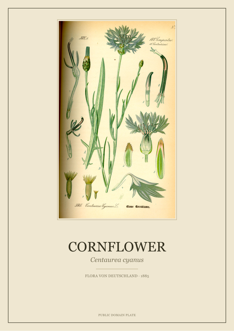
Two A2 prints in the same arrangement occupy roughly 1,340 millimetres of combined width including the gap. That is closer to the headboard width, and the pair reads as a considered composition rather than two small pictures floating above a larger object. The ivy and the cornflower — one a climbing perennial with the clambering, geometric leaf outline Thomé drew from three angles on the plate, the other a slender annual with the ragged blue florets and lanceolate leaves the 1885 illustrator picked out — both benefit from the increased scale. The ivy's habit becomes legible from the far side of the room; the cornflower's floret architecture, which at A3 asks the viewer to walk over and look, at A2 announces itself from the doorway.
There is a caveat we always name in the studio. A2 in a bedroom above a bed is committing. Once framed and hung, the pair defines the wall. If the room is otherwise busy — a patterned wallpaper, several other framed pieces, textiles with strong colour — A2 fights for oxygen. In a room with quiet walls and restrained bedding, A2 gives the arrangement gravity. For this composite scenario, with the reader describing a plain painted wall and a linen headboard, we would frame A2.
One more note. The cornflower plate is national symbolism in parts of central Europe and a humble field weed elsewhere in its range. At A2 the plate begins to read as a portrait of the plant rather than a decorative flourish. That shift matters if the reader cares about the plant, and does not if they do not. Most readers who hesitate between A3 and A2 turn out to care.
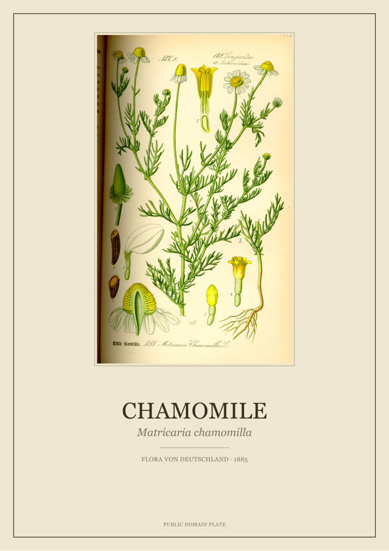 Chamomile
The print from this article · from €29.95
View the print →
Chamomile
The print from this article · from €29.95
View the print →
Scenario 3: The Living Room With One Wall and One Fennel Plate
Let us say the reader has one wall, 4.2 metres long and 2.7 metres high, otherwise empty, in a living room where seating sits 3.2 metres away. They want one plate — Foeniculum vulgare, Thomé's fennel — as the wall's single occupant. A3 or A2.
At a viewing distance of 3.2 metres, resolvable detail drops fast. The one arc-minute threshold means the eye can distinguish features down to about 0.93 millimetres — three times the corridor threshold in Scenario 1. That is still fine enough to read the fennel's characteristic compound umbels and the finely divided, almost hair-like foliage Thomé illustrated. But at that distance, an A3 print on a 4.2-metre wall does not read as art. It reads as a small square of ink adrift on a plaster field. The wall wins, and the plate loses.
A2 changes the argument. At 420 by 594 millimetres, the fennel plate carries enough surface area to hold the wall's attention from the sofa. The umbels — Thomé drew several, in overlapping perspective — resolve as a distinct botanical structure rather than a texture. The stem geometry, one of the most drawing-friendly features of Foeniculum vulgare, becomes readable line work. Framed with a 70-millimetre mount and a slim natural-oak frame, the piece lands at approximately 560 by 734 millimetres framed. On a 4.2-metre wall that is still not large, but it is enough. The plate becomes the object the wall was waiting for.
We would only push above A2 for this configuration if the reader were prepared to commission a larger format — which changes the conversation from restored paper to a different production altogether. Between the two sizes on offer, A2 is not a preference here. It is a requirement of the viewing distance.
There is a temptation, when facing a wall like this, to think a pair or triptych of A3 solves the problem cheaper. It does not solve the same problem. A triptych changes the reading from portrait-of-a-plant to composition-of-plants, which is a different intention. Some readers want that. Most readers who ask about a single fennel plate mean they want a single plate. For them, A2.
What All Three Share
Across the three scenarios, one pattern repeats. Size is not a function of taste; it is a function of the wall's geometry and the viewer's distance. A3 wins in tight spaces where the eye is forced close and the composition is asked to be intimate. A2 wins where the wall is generous and the viewer stands back. In the middle — most bedrooms, most home offices, most stair landings — the paired or grouped arrangement decides it, and A2 begins to earn its space once furniture below it dictates a matching horizontal mass.
The other constant is the mount. Every calculation in the three scenarios assumed a proper mount board — 60 to 80 millimetres of quiet paper between the plate and the frame's inner edge. That mount is not decorative. It is what lets the eye read the plate as a specimen rather than a poster. Skip the mount, or set it too thin, and A3 looks smaller than it is; oversize the mount on A2 and the print starts to feel institutional, more herbarium than home. The 60-to-80-millimetre range is where the 1885 Thomé plates want to sit.
A third pattern, less mechanical but no less real: the plate itself has a preferred scale. Chamomile, with its delicate floret architecture, rewards close reading and holds its dignity at A3. Fennel, with its expansive umbels and airy foliage, wants distance and scale. Ivy sits comfortably at either size but gains from A2 when paired. The Thomé illustrator, working in 1885 for a schoolbook flora, drew each species at a compositional density that carries meaning at a specific scale. Matching that scale to the wall is more of the decision than most readers expect.
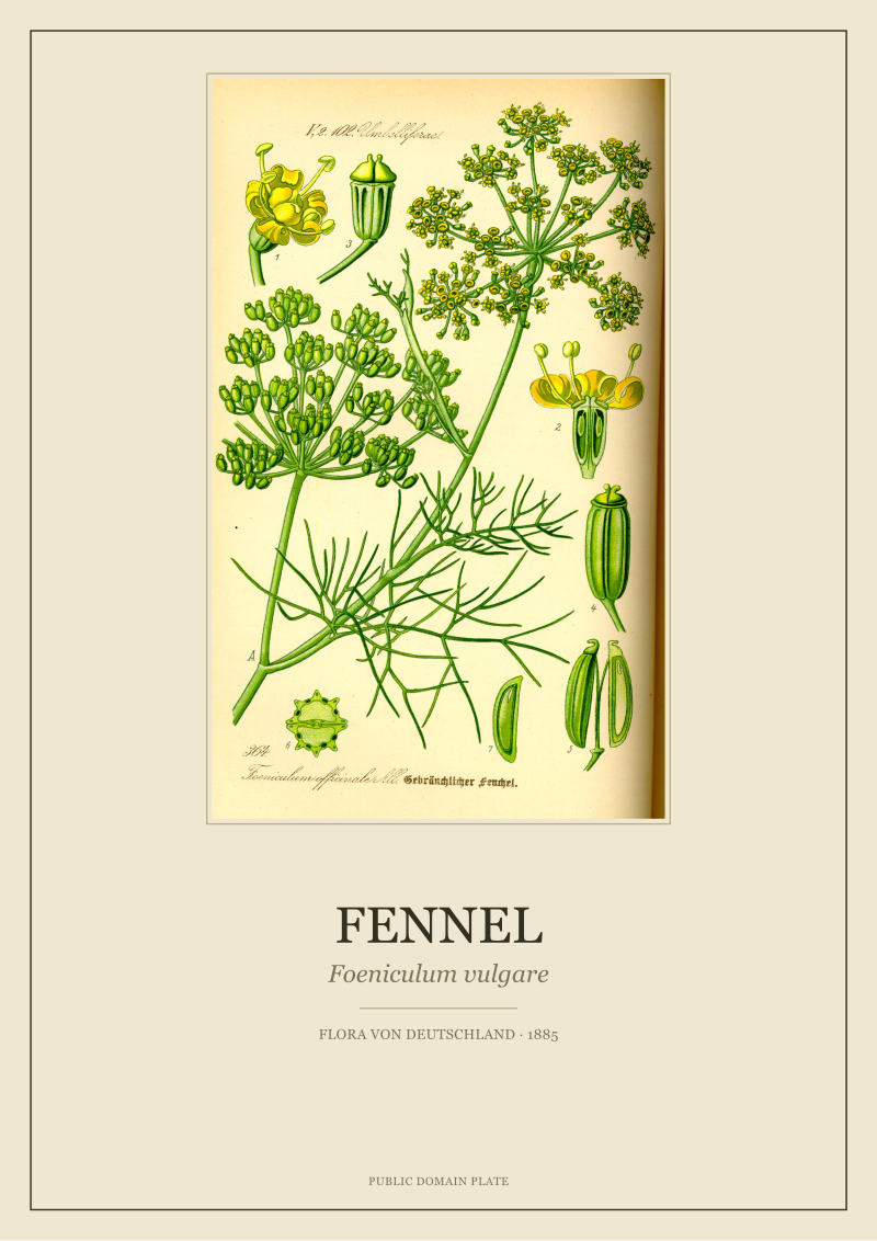 Fennel
The print from this article · from €29.95
View the print →
Fennel
The print from this article · from €29.95
View the print →
Which Scenario Is You
Stand in front of the wall. Measure the distance from the wall to where you will most often be — sofa, bed, the point in the corridor you pass most. If that number is under 1.5 metres, you are in Scenario 1: A3 is the answer, and A2 will overwhelm. If it is between 1.5 and 2.5 metres, and there is furniture beneath the print that defines a horizontal mass wider than 1.3 metres, you are in Scenario 2: A2, probably paired, probably worth the commitment. If it is over 2.5 metres and the wall is largely empty, you are in Scenario 3: A2, and think honestly about whether even that is enough for the room you are describing.
Two secondary checks. Does the wall behind the print have visual competition — busy wallpaper, other framed pieces, strong colour? If yes, A3 forgives more; A2 demands more. Is the plate one you want to read closely or one you want to see across a room? The first is A3's argument, the second is A2's. Between the studio's own restored plates — the chamomile, the ivy, the cornflower, the fennel — the sizing conversation resolves down to those two questions almost every time. Both sizes live at the studio's shop, and the choice is rarely as close as it feels before the measuring tape comes out.
FAQ
Does A2 really need a larger mount than A3, or can I use the same mount width for both?
The mount should scale with the paper. A 60-millimetre mount that reads as generous on an A3 chamomile looks pinched on an A2 fennel, because the eye reads the mount as a proportion of the visible plate, not an absolute width. On A2, 70 to 80 millimetres is where the plate breathes correctly. Under 60 millimetres, the frame starts to feel like it is compressing the illustration rather than presenting it.
How close is too close for A2 in a small room?
Below about 1.5 metres of habitual viewing distance, A2 begins to work against the plate. The viewer cannot take in the composition without scanning, and the illustration reads as fragments rather than a whole. This is why we default to A3 in corridors, bathrooms, and reading nooks — spaces where the eye is repeatedly within arm's length of the wall. The number is not absolute, but 1.5 metres is a practical dividing line.
Do the 1885 Thomé plates look different at A2 than at their original printed size?
The plates in Flora von Deutschland, Österreich und der Schweiz were printed at a schoolbook scale close to A3 in outer trim. At A2 we are enlarging beyond the illustrator's original planned viewing size. Because Thomé's line work and the chromolithographic process carried genuine detail at high density, the enlargement holds — nothing turns to mush at A2 for the four plates we discuss here. But it is an enlargement, not a facsimile.
Which size is safer if I have not decided where the print will hang yet?
A3. It fits more walls, more compositions, and more furniture arrangements without demanding the room reorganise around it. A2 rewards a specific wall and a specific viewing distance; A3 forgives uncertainty. If the print may move rooms in the next year, A3 keeps its options open. We say this to roughly a third of the readers who write in asking for guidance.
Can I mix A3 and A2 in the same room?
Yes, but not on the same wall. On a shared wall the size difference reads as a mistake; in the same room, across different walls, each size can do its own job. An A2 fennel in the living room and an A3 chamomile above a reading chair in the same room work together because the eye never compares them directly. On one wall, choose one size and repeat it.
How do frame and glazing weight change the A3 versus A2 decision?
An A2 framed piece with glass and a solid-wood frame can reach three to four kilograms — heavy enough that plasterboard fixings become a real consideration. An A3 in the same specification typically sits around 1.5 to 2 kilograms. If the wall is plasterboard without a stud behind the intended hanging point, or if you are hanging on old lath and plaster, A3 removes a category of problem that A2 introduces. Not decisive, but worth naming.
Does the plate's subject affect the size choice, or is it purely geometric?
It affects it. Plates dominated by fine, distributed detail — Thomé's chamomile, for example — hold interest at A3 because the eye stays busy at close range. Plates with strong overall silhouette and larger structural elements — the fennel umbels, the ivy in habit — reward the enlargement to A2. Cornflower sits between the two: it works at either size, but pairs particularly well at A2 with another species of similar visual density, as in Scenario 2.
If I can only choose one size for a first purchase, which does the studio recommend?
A3, in most cases. It is the size that most closely matches the original 1885 printing, it suits the widest range of walls, and it invites the close reading that Thomé's illustrations were composed for. A2 is the right answer for specific walls and specific plates, and when it is right it is unambiguously right — but the first plate in a home is usually one the owner wants to live with closely, and A3 is the size that invites that.
New plates from the archive and 10% off your first print.
One email now with your code. No noise after.