There is a pattern we keep seeing in requests for a floral print set: the buyer wants four prints that match, and by "match" they mean four flowers that could have come off the same shelf at the same store on the same afternoon. Hear us out — that is exactly the wrong instinct. The 1885 plates we restore, drawn by O.W. Thomé for Flora von Deutschland, Österreich und der Schweiz, were never made to match. Chamomile, ivy, cornflower and fennel share a hand, a paper and a year. They do not share a colour story, and that is the point of hanging them together.
The Matching Set Trap
The trap is easy to fall into because the modern print market rewards it. Search for a floral print set and the results are almost universally four illustrations produced in the same week by the same designer, using the same three pastel swatches, with the same softened outlines and the same aggressively centred composition. They match the way tiles match. They are, in effect, wallpaper cut into four rectangles and framed. The buyer wanting harmony gets uniformity, and after two weeks on the wall the eye simply stops looking, because there is nothing left to find.
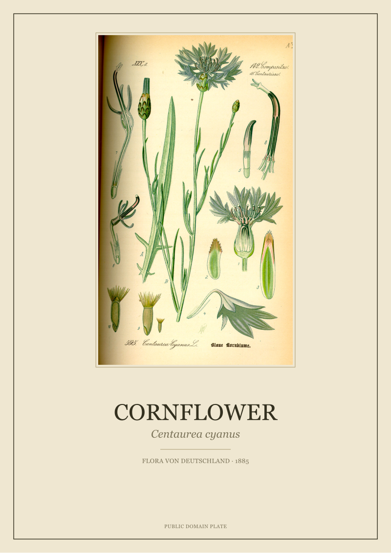
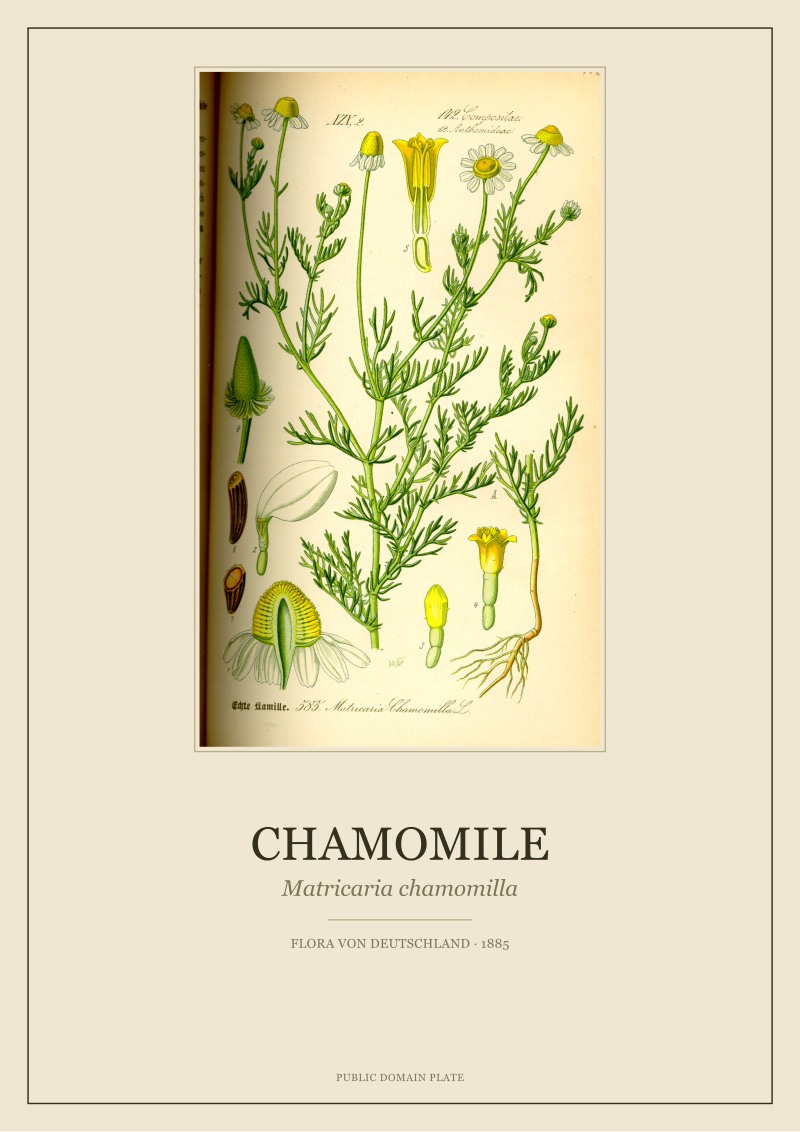
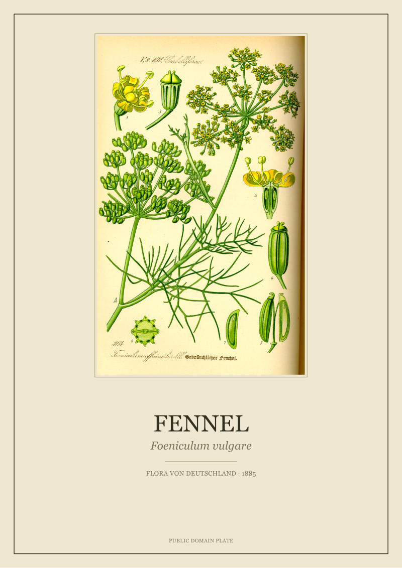
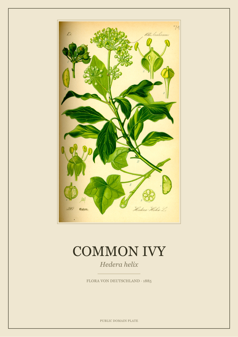
The Thomé plates behave in the opposite way. Chamomile is loose and airy, its ray florets scattered like a handful of small parachutes; the drawing breathes around the stems. Cornflower, on the same page format from the same year, is tight, radial, almost architectural in the way each disc floret is packed. Common Ivy is not a flower at all in the way the other three are — it is a climber, drawn with leaf lobes that dominate the plate and inflorescences pushed almost as an afterthought into a corner. Fennel is nearly transparent: umbels held on stalks so slender the illustrator had to indicate them with the thinnest line his pen would carry. Hung as four, they do not converge into a pattern. They insist on being four different plants, seen honestly, one at a time.
That is what a set means in botanical illustration and always has. It is not a decorative quartet. It is a bounded selection from a larger, ordered record. When you buy four Thomé plates as a "set", you are not buying a matching product. You are buying a quorum from a herbarium, and the wall gets to behave like a page from a flora rather than a tile from a catalogue. The eye keeps working because the plates keep offering different problems: how does a compound umbel hold together, why does a cornflower have that peculiar fringed involucre, what is the difference between a juvenile ivy leaf and a mature one. Matching prints answer nothing. Botanical plates ask.
What "Set" Meant to Thomé in 1885
Otto Wilhelm Thomé did not draw four plates. He drew hundreds, and his Flora von Deutschland, Österreich und der Schweiz, first issued in 1885, was one of the great encyclopedic projects of the late nineteenth-century German-speaking scientific world. The intent was completeness, not curation. Every plant considered part of the regional flora got a plate; every plate got a species name in Latin, a common name in German, a diagram of the whole habit, and where useful, dissections of flower, fruit and seed. A set, inside Thomé's own logic, was any subset of the whole that a reader might turn to at once — three sedges on facing pages, four umbellifers you wanted to compare, all the composites in a chapter.
This matters because the four species we chose to feature together — chamomile, ivy, cornflower, fennel — are not a "romantic wildflower set" or a "cottage garden set", even though a modern shop would file them that way. They are, historically, four plants that any reader of Thomé in 1885 would have encountered inside the same book and would have recognised as living in radically different corners of the same regional botany. Chamomile from disturbed roadsides; cornflower from cornfields, back when there still were cornfields with cornflowers in them; fennel from kitchen gardens and Mediterranean escapes; ivy from anywhere in Central Europe with a wall or a tree tall enough to climb. The set holds because the flora holds — one hand, one paper, one year, one system of drawing — not because the four plants agree on anything else.
There is a further point about "set" that the market has flattened. A Thomé plate is not primarily a picture; it is a diagram. The illustrator's job was to describe the plant so clearly that a botanist opening the book in the field could confirm an identification without touching the specimen. That is why the drawings look composed rather than styled: the composition is doing work. When you hang four of these plates as a set, you are not decorating; you are quoting from a reference work. Fewer floral print sets and more small open herbariums, is how we would put it — and once you see the difference, the shelf-friendly quartets stop being tempting.
Buying four plates that match is buying a wallpaper sample and framing it in four pieces; buying four plates from the same flora is inviting the flora itself into a room.
 Cornflower
The print from this article · from €29.95
View the print →
Cornflower
The print from this article · from €29.95
View the print →
The Scale Mistake That Turns Four Plates Into Wallpaper
The second thing we keep watching happen is a scale mistake. A buyer chooses four plates carefully, drawings that in the book share a page format and are meant to be read at the size of a hand. Then, wanting them to feel important on a wall, they order the largest print size available for each — sixty by ninety centimetres, sometimes larger — and hang them tight, in a two-by-two grid, all four the same dimensions, all four the same frame, all four the same distance apart. The result is the exact wallpaper effect the plates themselves resist. Enlarge a botanical drawing to poster size and you are asking the pen line to hold up at a scale it was never asked to hold. It does not fail. But it stops being a botanical illustration and starts being a decorative graphic of one.
A herbarium page is closer to A3 than to A1. Thomé's original plates read at that size because the line weight was calibrated for it. Ivy leaves at reading distance are dense and legible; ivy leaves at three metres wide become graphic shapes and lose the specific asymmetry that tells you it is ivy and not, say, wild grape. Cornflower's fringed involucre — the small green cup under the blue — is the identification detail. Blown up, it becomes a blur. What we suggest instead, once we understand the plates were meant to be read, is a set of four at a modest size, hung a bit further apart than a decorator's instinct would suggest, at a height that lets a person stand within reading distance of one plate at a time.
The other scale mistake is to demand identical dimensions across the four. The plates in Flora von Deutschland do not have identical compositions. Fennel is tall; the umbel wants vertical room and the drawing pushes upward. Ivy is horizontal in its instinct — the climb reads across, not up. Chamomile is a mid-page cloud; cornflower is a nearly circular event with a straight stem below it. Forcing all four into the same frame proportion crops away the composition the illustrator solved for. It is possible to restore and print them at a shared long-edge — we do this in our own /shop/ when a buyer needs the visual anchor of a common size — but the honest answer is that Thomé's plates hang more truthfully as a set of four related-but-not-identical rectangles than as four clones. The wall gains rhythm rather than losing tidiness.
The Palette Panic, and Why the Paper Solves It
The last thing that drives buyers into matching-quartet territory is palette panic. Four flowers, four colours: chamomile's yellow-and-white, ivy's dark green, cornflower's cornflower blue, fennel's yellow-green. In a modern print reproduced against pure white stock, those four palettes fight. The buyer sees the fight coming and reaches for a designer set instead, where every print is pushed through the same muted filter until they behave. Understandable. Also unnecessary. The paper Thomé's plates were printed on in 1885 was not white, and after a hundred and forty years the surviving copies we scan from have moved further still — into warm cream, into pale ochre where light has touched a margin, into the specific brownish tint that chromolithographic paper takes on as its size ages.
That aged paper is not a defect to correct. It is the palette that reconciles the four flowers. Yellow-and-white chamomile sits down on it. Blue cornflower stops shouting and starts humming. Dark ivy anchors. Fennel's yellow-green, which on brilliant white paper would look almost fluorescent, becomes the delicate herbaceous colour it is meant to be. When we restore a plate, we clean the foxing that has crossed the line into damage, but we do not bleach the paper back to a white it never was. The reason is technical and also aesthetic: the ink was mixed for that paper. Return the ink to modern white and you break the colour balance the illustrator built. Keep the paper honest and the four palettes reconcile themselves without a designer filter in sight.
This is why a "floral print set" from us tends to feel calmer on the wall than the buyer expected, even though nothing about the four species was chosen to co-ordinate. The unifier is not the flowers. It is the paper. The unifier is not a colour story imposed after the fact. It is the historical fact that these four drawings were printed on the same stock in the same year by the same process, and the paper remembers.
Read a floral print set that way — as a small herbarium, four honest plates from one flora, hung at reading scale, unified by the paper rather than by a modern filter — and the instinct to make everything match quietly falls away. What you get instead is a wall that keeps offering something to look at, which is, in the end, the only reason to hang pictures at all.
 Chamomile
The print from this article · from €29.95
View the print →
Chamomile
The print from this article · from €29.95
View the print →
New plates from the archive and 10% off your first print.
One email now with your code. No noise after.